From our sponsor: Leverage AI for dynamic, custom website builds with ease.
When working with 3D transformed elements, you might notice that they don’t have any shading and appear to be very flat. In real life, objects block light and have shadows. Surfaces can be matte, reflective, and everything in between. Indeed, we can do better.
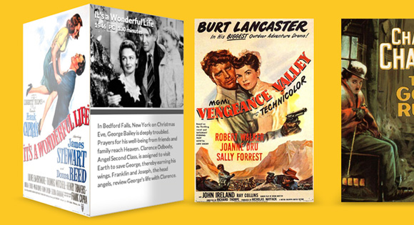
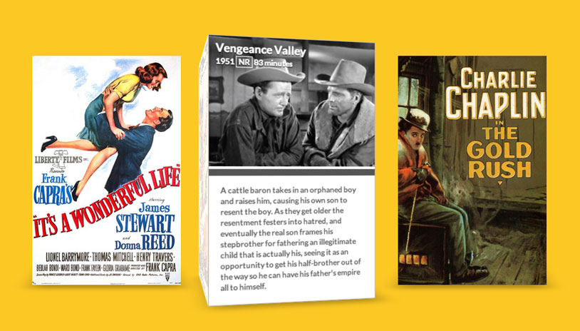
If you need to cast light onto complicated geometry, there are options available such as Photon, but they’re very processor intensive. In this article, I’ll show you a solution that can be applied to objects that only have a few faces. Our example will be a 3D movie gallery with glossy posters and, when the posters are rotated, the sides will contain matte information cards with meta data about the film.
The Markup
Our page is going to have a few different parts. First, we need a simple wrapper to center everything on the page. Next, we’ll create an unordered list that will contain all of our 3D posters. We’ll add the class “stage” to the ul and “scene” to each li. In our CSS, the stage element will act as a container for the scene elements, which will be their own 3D environment with the perspective property applied.
<div class="wrapper">
  <ul class="stage">
    <li class="scene"></li>
    <li class="scene"></li>
    <li class="scene"></li>
  </ul>
</div>
For each li, we need to add quite a bit of markup. This will contain our movie poster as well as all the metadata about each movie. In a more robust movie library, this could be done dynamically with some backend code. We’ll keep things simple for the purposes of this example.
<li class="scene">
  <div class="movie">
    <div class="poster"></div>
    <div class="info">
      <header>
        <h1>It's a Wonderful Life</h1>
        <span class="year">1946</span>
        <span class="rating">PG</span>
        <span class="duration">130 minutes</span>
      </header>
      <p>
        In Bedford Falls, New York on Christmas Eve, George Bailey is deeply troubled. Prayers for his well-being from friends and family reach Heaven. Clarence Odbody, Angel Second Class, is assigned to visit Earth to save George, thereby earning his wings. Franklin and Joseph, the head angels, review George's life with Clarence.
      </p>
    </div>
  </div>
</li>
Our library will contain two more movies in addition to this one. The metadata is a bit lengthy and there are also a few image assets you’ll need, but everything is included in the code download. Let’s get to styling.
The CSS
Note that the CSS will not contain any vendor prefixes, but you will find them in the files.
First, let’s get some of the basics out of the way. We need to center our wrapper and then remove the default list styling from the stage class.
.wrapper {
	margin: 0 auto 100px auto;
	max-width: 960px;
}

.stage {
	list-style: none;
	padding: 0;
}
Next, we want to style the scene class with an explicit width and height (the same as our posters). If you’d like to provide additional detail needed for high resolution displays then you could use images that are twice as large.
The margin between each scene will provide sufficient spacing so that they don’t overlap each other. Then we’ll float all of the list items to the left so that they line up next to one another in a nice gallery. This is similar to how most top-level website navigation is created.
Finally, we’ll add the perspective property. This will allow us to create a 3D scene in the nested elements, and the value of 1000px will give the objects a decent amount of depth. A lower value would be a bit too dramatic, but you can experiment with this and see what works best for you.
.scene {
	width: 260px;
	height: 400px;
	margin: 30px;
	float: left;
	perspective: 1000px;
}
Similar .scene, we also need to set an explicit width and height on .movie. This will help each poster look correct when it’s being transformed. Next, we’ll set the transform-style to preserve-3d so that we can transform elements in 3D space. Finally, we’ll translate it along the Z plane by -130 pixels. This will give the posters a little bit more room to move around and really pop towards the viewer.
.movie {
	width: 260px;
	height: 400px;
	transform-style: preserve-3d;
	transform: translateZ(-130px);
	transition: transform 350ms;
}
Here’s where the movement happens. We’ll apply a transition to the .movie class. The transition timing is set to a rapid 350ms, but if you’d like a more dramatic effect, you could slow it down.
Then we’ll transform each .movie on :hover. This will rotate the 3D poster along the Y axis and then move it towards the screen along the Z plane. You could rotate the poster by a full 90 degrees, but I prefer to leave it slightly offset to maintain the 3D effect while hovered.
.movie:hover {
	transform: rotateY(-78deg) translateZ(20px);
}
Observant coders will notice that, while we have translated the scene, we never actually rotated any elements that would give semblance of geometry and build an object. Let’s create each 3D poster now. Each .poster and .info card needs to be positioned absolutely, otherwise they’ll push one another out of the way. We don’t want that, because we’re going to position them using transforms. Next, we need to set an explicit dimensions on both of the classes so that each of the two sides is exactly the same.
.movie .poster,
.movie .info {
  position: absolute;
  width: 260px;
  height: 400px;
  background-color: #fff;
  backface-visibility: hidden;
}
With the geometry of our posters ready, we can transform them into place. The .poster just needs to be moved 130px along the Z plane (because remember, we moved the .movie back by this amount). The background size has been set to cover so that when we apply our poster backgrounds, they’ll fill the geometry. They should anyway since they’re sized correctly, so this is really just a precautionary measure.
The .info needs to be translated by the same amount as the .poster, but it also needs to be rotated. We want to form a square box, so we’ll rotate it 90 degrees. I’ve added some styling after the transformation, but this is mostly just for aesthetic reasons.
.movie .poster  {
  transform: translateZ(130px);
  background-size: cover;
  background-repeat: no-repeat;
}

.movie .info {
  transform: rotateY(90deg) translateZ(130px);
  border: 1px solid #B8B5B5;
  font-size: 0.75em;
}
We’ll use the pseudo-element ::after to create another face that will have a subtle box shadow beneath the movie box:
.movie::after {
  content: '';
  width: 260px;
  height: 260px;
  position: absolute;
  bottom: 0;
  box-shadow: 0 30px 50px rgba(0,0,0,0.3);
  transform-origin: 100% 100%;
  transform: rotateX(90deg) translateY(130px);
  transition: box-shadow 350ms;
}

.movie:hover::after {
  box-shadow: 20px -5px 50px rgba(0,0,0,0.3);
}
Further down in the CSS, we style the metadata contained inside the .info class. None of this is particularly relevant to this demo, as it’s mostly just formatting some text and imagery. The real magic happens later on.
.info header {
  color: #FFF;
  padding: 7px 10px;
  font-weight: bold;
  height: 195px;
  background-size: contain;
  background-repeat: no-repeat;
  text-shadow: 0px 1px 1px rgba(0,0,0,1);
}

.info header h1 {
  margin: 0 0 2px;
  font-size: 1.4em;
}

.info header .rating {
  border: 1px solid #FFF;
  padding: 0px 3px;
}

.info p {
  padding: 1.2em 1.4em;
  margin: 2px 0 0;
  font-weight: 700;
  color: #666;
  line-height: 1.4em;
  border-top: 10px solid #555;
}
Here’s where we create our pseudo-lighting using the box-shadow property. For the .poster class, we add an inset box shadow with an X and Y offset of 0px. The blur radius will be set to 40px and the shadow is set to rgba(255,255,255,0) (which is white “shadow” set to 100% transparency). Remember, there’s a transition applied to all the children of .movie, so if we set a starting state for the shadow, we can then animate it using a :hover state.
If we :hover over the .movie, it will reset the values of the box-shadow for the .poster and animate them with a transition. In this new state, the poster is still inset, but this time it has an X offset of 300px and an opacity of 0.8 for the white color. This will effectively move the box-shadow over top the poster with some fuzziness along the edge. The transparency will help to gel the shadow with the poster image, which will make the poster look like it has a glossy finish.
.movie .poster,
.movie .info,
.movie .info header {
  transition: box-shadow 350ms;
}

.movie .poster {
  box-shadow: inset 0px 0px 40px rgba(255,255,255,0);
}

.movie:hover .poster {
  box-shadow: inset 300px 0px 40px rgba(255,255,255,0.8);
}
Just like for the poster, we also want to apply a shadow to the other side of the box. For the .info panel, we want a dark shadow to disappear as the element is rotating forward and then reappear when the paper texture recedes back into the gap between each 3D poster. On our page, with the glossy poster on the left and the shadow on the right, it will make it appear as though there’s a light source coming from the left side of the page.
.movie .info,
.movie .info header {
  box-shadow: inset -300px 0px 40px rgba(0,0,0,0.5);
}

.movie:hover .info,
.movie:hover .info header {
  box-shadow: inset 0px 0px 40px rgba(0,0,0,0);
}
Last but not least, we need to add the poster images and still preview images to each movie. I’ve done this using the :nth-child pseudo class, but again, this would probably be done elsewhere in a dynamic website.
.scene:nth-child(1) .movie .poster {
  background-image: url(../img/poster01.jpg);
}

.scene:nth-child(2) .poster {
  background-image: url(../img/poster02.jpg);
}

.scene:nth-child(3) .poster {
  background-image: url(../img/poster03.jpg);
}

.scene:nth-child(1) .info header {
  background-image: url(../img/still01.jpg);
}

.scene:nth-child(2) .info header {
  background-image: url(../img/still02.jpg);
}

.scene:nth-child(3) .info header {
  background-image: url(../img/still03.jpg);
}
You’ll notice that we’ve used Modernizr in the demo to detect support for 3D transforms and provide a simple fallback for browsers that don’t support it.
That’s it! As I suggested in the intro, this technique can be applied to simple geometry. Some of you may be wondering why I didn’t use a gradient to create a more controlled shadow over top the poster images. At the time of this article, transitions cannot be applied to gradients, so while this might work for static geometry, the illusion would be broken as soon as the element is animated.
If you have any questions, comments, or improvements on this technique, I’d love to hear about them in the comments!


On Chrome anyway, this effect can be annoying because it changes the distance of the box shadow and you end up with a weird sort of shortening box-shadow effect. To fix this just use huge values like 0px 4000px 5000px rgba(). The other problem is that in IE10 I’ve encountered issues where the shadow will be pure black. I think this might be a jQuery only problem, or it seems to be when I transition something from 0 0 0 rgba() to none.
Thanks for the tip, Johnny. You have to be careful when using high values for blur radius though, as it can slow down rendering significantly. I had to reduce the blur radius in this example lower than I would have liked to get smooth frame rates.
Wow! i love it!
Amazing Idea, Amazing Work 🙂
Thank you very much!
Just checked the fallback you spoke of and this only seems to work in IE9. IE10 just turns the front cover and nothing else. Was that the intended effect?
This concept works best in Chrome and Safari. IE still requires a bit of work, as 10 does not support the transform-style: preserve-3d property. The core idea of using box-shadows for shading should still work though when applied to elements that don’t require preserve-3D.
Very nice!
Thank you for the cool effect idea, implementation and explanation! But a small notice about the markup:
headerelement with nosection,articleetc. parent, according to the spec, means the header of the whole page. Probably it would be better to use anarticleelement instead ofdivwithclass="movie"?That’s a good point! I intended it to be the header of the information panel, although some sections might have made it more appropriate.
Looks good!
I did wait, but all I get is this when hovering
It should only work on hover. You could trigger the animation using JavaScript events if you wanted to do so.
Great job Nick. I think one good alternative is to use pseudo-element, an example
…with linear gradient and transformations
That’s pretty interesting. There’s quite a few non-semantic elements there, but it’s definitely an interesting technique.
Great tutorial. Really cool effect to build in css3. Is there a way to reduce the jitter/twitch when mousing over the corner? It’s not bad in Chrome but in FF its terrible.
Thanks!
A possible workaround — use
.scene:hover .movieinstead of.movie:hover(and.scene:hover .something-elseinstead of.movie:hover.something-else, respectively).Agreed, the FF performance isn’t quite on par with webkit. I’ve never seen excellent performance from FF in 3D, but if there are any workarounds I’d love to know about them. 🙂
Amazing! It is nice to see you around Nick.
Happy to be here! 🙂
Very cool effect. Wonder if there is a way to make the type rendering (on the hidden side) not so dreadful.
That would be truly awesome. From what I’ve read, the text is actually no longer vector when using transforms, something to do with allowing hardware acceleration.
LOVE it! Cheers and thanks for sharing!
Really nice, clean work. Great job.
Really Cool effect. Thank you for share it Nick;
This is killer. Awesome job, Nick!
F*&$ Amazing!! I absolutely loved it and gonna use it. Thanks mate for sharing your knowledge.
Damn don’t work in IE explorer 🙁
awesome
Nice work… Stunned
Really nice effects, saw this in a few online newsletters, would be a great user experience piece on a platform such as netflix or even a store showing a product, then the hover state showing the details about the film and or product. Just need the support to be there to implement in that commercial setting.
Really nice! Nick Pettit does a nice job at explaining his process and why he makes certain design decisions. I have been following him for a couple of years now and I think he is an extremely accomplished web designer. It is amazing what you can do with just a few lines of code. Love this!
Nice effect, thanks for sharing your code.
This is quite unbeliveable. Excellent Tutorial. Thanks.
This is awesome, Nick! Great idea 🙂 Thanks a lot.
Good work . It does not work on IE. Please suggest fix for it.
Fix : Download Chrome
I guess this does’nt work with IE ? tried it out but it doesnt work as intended. Using IE 10!
Forgive my manners …. But this is a wonderful script work. Thanx for sharing 🙂
I don’t know why but seems it doesn’t work on my google chrome, i was trying the demo on firefox and it works well
Thank you for this tutorial ! but it’ll be perfect if the size of the books was responsive ..
Doesn’t work on my Chrome 29
theres a bug, you see it if you hover on the right edge of a box.
Opera isn’t supported, is it? 🙁
… if have a customer, you know, that insists on using the Opera browser.
Hey, thanks for the amazing work, is there any way i can get it animated on load of the page ? rather than hovering on it?
nice, i need it. thanks Nick
Doesn’t work correctly on Chrome 30, only firefox. Very nice ideea though.
Hi
Thanks a lot for this great script!
It works like a charm on Chrome!
Is there a possibility to get this wonderful script working on IE?
The website I’m using this for gets 80% of the visits from IE, so there is no option to no support it other than not using the script 🙁
Kind regards
Bjorn
Hi Bjorn,
Just wondering when you say it works on Chrome, is it Chrome on windows or Chrome on Mac OSX? Because it doesn’t work on my Chrome on windows…
Best Regards
Really nice!
But, if I have 10+ movies, how would be css with nth-child dynamically?
Nice tutorial. It’s so amazing how easy to follow is this tutorial.
Doesn’t seem to work in IE11.
I love this!!!!
Did anyone ever find a way to reduce the blurryness on the 3d side of the movie element?
awesome…..!
Did Anyone ever make it work in IExplorer 10+ ?
Well, a small hint under the Demo would be nice. Problem is IE10 don’t understand
transform-style: preserve-3d– so the child 3D processing won’t work. So you have to use transform: perspective… for each element in the right way – even the childs. I’ve learnt: try cool looking demos in ALL browsers before implementing it in own projects (except you don’t have to support the IE).I took a shorter way:
– Feature detection of preserve-3d -> write class ‘no-preserve-3d’ in html-Tag (https://github.com/Modernizr/Modernizr/issues/762)
– remove all transitions an transforms if ‘no-preserve-3d’ is present
– make the .movie.poster clickable or do some other nice hover effects -> this is up to you
– Demo in production here
The CSS:
.no-preserve-3d .scene .movie { transform: none; transform-style: none; transition: none; } .no-preserve-3d .scene .movie:hover { transform: none; } .no-preserve-3d .scene .movie .poster { transform: none; } .no-preserve-3d .scene .movie .info { display: none; }Hi, is there a no compress source code file?