
From our sponsor: Leverage AI for dynamic, custom website builds with ease.
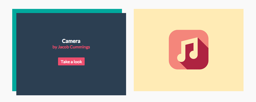
Today we want to show you how to create some simple, yet stylish hover effects for image captions. The idea is to have a grid of figures and apply a hover effect to the items which will reveal a caption with the title, author and a link button. For some of the effects we will use 3D transforms. The aim is to keep the effects subtle and provide inspiration for many different variations.
The images used in the demos are Dribbble shots by talented Jacob Cummings.
Let’s get started.
The Markup
The structure of our grid and the figures will be made of an unordered list and each item will contain a figure element. The figure will contain an image and a figcaption with some text elements and a link:
<ul class="grid cs-style-1">
	<li>
		<figure>
			<img src="images/1.png" alt="img01">
			<figcaption>
				<h3>Camera</h3>
				<span>Jacob Cummings</span>
				<a href="http://dribbble.com/shots/1115632-Camera">Take a look</a>
			</figcaption>
		</figure>
	</li>
	<li>
		<figure>
			<!-- ... -->
		</figure>
	</li>
	<!-- ... -->
</ul>
Please note that using a figure only makes sense if it does not constitute the main content itself but if it’s typically referenced from the main flow of the document and if we can move it away (to an appendix for example). Read more about the figure element in this great HTML5 Doctor article: The figure & figcaption elements.
This is the default structure for all the grid examples. Note that for effect 4 we will have an additional division wrapping the image.
The class for each single effect will be added to the list; so example 1 will have “cs-style-1”, example 2 will have “cs-style-2” and so on. That’s how we will define the effect styles for each single example.
But first let’s define the common styles for all effects.
The CSS
Note that the CSS will not contain any vendor prefixes, but you will find them in the files.
The common styles for all the figures is the following. First, we’ll define the styles for the grid and the list items that will serve as the containers of our figures:
.grid {
	padding: 20px 20px 100px 20px;
	max-width: 1300px;
	margin: 0 auto;
	list-style: none;
	text-align: center;
}

.grid li {
	display: inline-block;
	width: 440px;
	margin: 0;
	padding: 20px;
	text-align: left;
	position: relative;
}
Making the list items display as inline-blocks will allow us to center them be applying a centerd text-align to the parent.
Let’s reset the margins of the figure elements and set the position to relative. Our figcaption will be positioned absolutely, so we need to make sure it will do so inside of the figure:
.grid figure {
	margin: 0;
	position: relative;
}
The image will have a maximum width of 100% which will come in handy when we define a media query to resize the list items:
.grid figure img {
	max-width: 100%;
	display: block;
	position: relative;
}
The figcaption will be positioned absolutely. By default it will be positioned in the top left corner. We won’t define any width or height here as we will do so in all the individual styles:
.grid figcaption {
	position: absolute;
	top: 0;
	left: 0;
	padding: 20px;
	background: #2c3f52;
	color: #ed4e6e;
}
And finally, let’s define some styles for the text elements and the link:
.grid figcaption h3 {
	margin: 0;
	padding: 0;
	color: #fff;
}

.grid figcaption span:before {
	content: 'by ';
}

.grid figcaption a {
	text-align: center;
	padding: 5px 10px;
	border-radius: 2px;
	display: inline-block;
	background: #ed4e6e;
	color: #fff;
}
We’ll add the “by” for the span that contains the author name using the pseudo-class :before. Of course you can add that in the HTML, but this will give you the freedom to change it easily into something like “made by” or “Designer: ” or similar. Be careful not to remove meaning from your HTML, though, by doing something like this.
In the end of our CSS we will also add a media query for smaller screens:
@media screen and (max-width: 31.5em) {
	.grid {
		padding: 10px 10px 100px 10px;
	}
	.grid li {
		width: 100%;
		min-width: 300px;
	}
}
And now let’s start by doing some nice effects.
Note that we will use Modernizr to detect touch. But be aware that this is not 100% bulletproof for testing if you are on a touch device as pointed out here. We will replace the hover for the touch and add a class that will trigger the effects when we have detected touch. So you will always see another rule for that in addition to the :hover. We only want the hover to trigger when we don’t detect touch.
Effect 1
Let’s start with a very simple effect. We want the caption to fade in and move a bit to the right and down, creating the illusion of a 3D layer that comes out of the image.
For that we first need to set the width and height of the figcaption and set the initial opacity to 0:
.cs-style-1 figcaption {
	height: 100%;
	width: 100%;
	opacity: 0;
	text-align: center;
	backface-visibility: hidden;
	transition: transform 0.3s, opacity 0.3s;
}
We also add a transition and set the backface-visibility to hidden to avoid a jump in the text rendering in the end of the transition. You don’t have to use that if you don’t mind the little glitch.
On hover (or on touch) we will set the opacity to 1 and translate the figcaption a bit:
.no-touch .cs-style-1 figure:hover figcaption,
.cs-style-1 figure.cs-hover figcaption {
	opacity: 1;
	transform: translate(15px, 15px);
}
Additionally, we will position the text elements:
.cs-style-1 figcaption h3 {
	margin-top: 70px;
}

.cs-style-1 figcaption span {
	display: block;
}

.cs-style-1 figcaption a {
	margin-top: 30px;
}
Effect 2

This effect will move the image up and reveal the figcaption just like you can see on Minimamente from which it got inspired by.
So let’s add a transition for the transform to the image and make it move up on hover:
.cs-style-2 figure img {
	z-index: 10;
	transition: transform 0.4s;
}

.no-touch .cs-style-2 figure:hover img,
.cs-style-2 figure.cs-hover img {
	transform: translateY(-90px);
}
We’ve set the z-index to 10, so that the image stays on top of the caption.
The figcaption needs a fixed height and a width of 100%. We’ll stick it to the bottom of the figure:
.cs-style-2 figcaption {
	height: 90px;
	width: 100%;
	top: auto;
	bottom: 0;
}
Let’s also position the link button on the right side:
.cs-style-2 figcaption a {
	position: absolute;
	right: 20px;
	top: 30px;
}
Effect 3

A different approach to effect 2 is to hide any overflow when moving the image. Let’s do that and make it appear as if the caption is slightly pushing the image up.
First, we need to set the overflow of the figure to hidden. Like this we won’t see anything that spills out when moving around:
.cs-style-3 figure {
	overflow: hidden;
}
The image needs a transition for the transform and on hover we will translate it 50px up:
.cs-style-3 figure img {
	transition: transform 0.4s;
}

.no-touch .cs-style-3 figure:hover img,
.cs-style-3 figure.cs-hover img {
	transform: translateY(-50px);
}
The figcaption will be a bit higher than in the previous example and we will translate it out of the view of the figure. Let’s also add a transition for the transform and the opacity:
.cs-style-3 figcaption {
	height: 100px;
	width: 100%;
	top: auto;
	bottom: 0;
	opacity: 0;
	transform: translateY(100%);
	transition: transform 0.4s, opacity 0.1s 0.3s;
}
On hover we’ll set to opacity to 1 and translate it up. See how we have added two transitions? One for the normal state and one for the hover? This is how we can control what happens when we hover and when we hover out. The transition here will be applied on hover: we want the element to become opaque quickly while taking 0.4 seconds for the transform. When we hover out, the opacity will be set again to 0 but only after a delay of 0.3 seconds. This will make the effect look consistent and natural.
.no-touch .cs-style-3 figure:hover figcaption,
.cs-style-3 figure.cs-hover figcaption {
	opacity: 1;
	transform: translateY(0px);
	transition: transform 0.4s, opacity 0.1s;
}
Let’s not forget about our link button:
.cs-style-3 figcaption a {
	position: absolute;
	bottom: 20px;
	right: 20px;
}
Effect 4

The forth example will make use of some 3D goodness. The aim is to flip the caption from the left side and push the image to the right.
We will use the list item as a perspective container so that we can play around with 3D transforms:
The CSS
.cs-style-4 li {
	perspective: 1700px;
	perspective-origin: 0 50%;
}
The child needs to have the following transform-style if we want the 3D transforms to work in the other elements:
.cs-style-4 figure {
	transform-style: preserve-3d;
}
As mentioned earlier, this example is going to have another wrapper for the image, Why do we need this? Well, we need to set the image’s parent to overflow hidden, because we don’t want to see the image spilling out of the container when we move it. We could set the overflow of the figure to hidden but then we won’t see the beautiful 3D effect of the caption. So, let’s add another wrapper and set it to overflow hidden instead:
.cs-style-4 figure > div {
	overflow: hidden;
}
Let’s move the image on hover:
.cs-style-4 figure img {
	transition: transform 0.4s;
}

.no-touch .cs-style-4 figure:hover img,
.cs-style-4 figure.cs-hover img {
	transform: translateX(25%);
}
The figcaption will have half of the width of the figure and we’ll set its initial opacity to 0. Now, let’s rotate it 90 degrees on the Y-axis which will make it be flipped towards us with the origin on its left side. We would basically not see it like that. Let’s set a transition for the “hover out” which will work in the same principle like described in the previous example:
.cs-style-4 figcaption {
	height: 100%;
	width: 50%;
	opacity: 0;
	backface-visibility: hidden;
	transform-origin: 0 0;
	transform: rotateY(-90deg);
	transition: transform 0.4s, opacity 0.1s 0.3s;
}
On hover we will fade it in and rotate it to 0 degrees, making it flip like a page of a book from the left side:
.no-touch .cs-style-4 figure:hover figcaption,
.cs-style-4 figure.cs-hover figcaption {
	opacity: 1;
	transform: rotateY(0deg);
	transition: transform 0.4s, opacity 0.1s;
}
Last, but not least, our little link button:
.cs-style-4 figcaption a {
	position: absolute;
	bottom: 20px;
	right: 20px;
}
Effect 5

This effect will make the image shrink and scale the caption in from the back.
Let’s put the image on top of the caption and add a transition for the transform:
.cs-style-5 figure img {
	z-index: 10;
	transition: transform 0.4s;
}
On hover, we want to scale the image down:
.no-touch .cs-style-5 figure:hover img,
.cs-style-5 figure.cs-hover img {
	transform: scale(0.4);
}
The caption will initially scaled to 0.7 and faded out:
.cs-style-5 figcaption {
	height: 100%;
	width: 100%;
	opacity: 0;
	transform: scale(0.7);
	backface-visibility: hidden;
	transition: transform 0.4s, opacity 0.4s;
}
On hover, we will scale it up and fade it in:
.no-touch .cs-style-5 figure:hover figcaption,
.cs-style-5 figure.cs-hover figcaption {
	transform: scale(1);
	opacity: 1;
}
Super-easy. Oh, and of course, the little link button wants to be in the bottom right corner:
.cs-style-5 figure a {
	position: absolute;
	bottom: 20px;
	right: 20px;
}
Effect 6

This effect is a variation of effect 5. There are many possibilities to play around with this type of effect, think about positioning the image in a different place and showing some more text. This effect will position the text and the image in a different place than before and we will not fade the caption in or scale it, it will already be there, creating a different “environment”.
So, let’s again do the same thing for the image, just that on hover we will also translate it up a bit:
.cs-style-6 figure img {
	z-index: 10;
	transition: transform 0.4s;
}

.no-touch .cs-style-6 figure:hover img,
.cs-style-6 figure.cs-hover img {
	transform: translateY(-50px) scale(0.5);
}
So, no transition for the caption this time:
.cs-style-6 figcaption {
	height: 100%;
	width: 100%;
}
And let’s position the text elements:
.cs-style-6 figcaption h3 {
	margin-top: 60%;
}

.cs-style-6 figcaption a {
	position: absolute;
	bottom: 20px;
	right: 20px;
}
Effect 7

The last effect in this tutorial will “grow” the caption from behind the image, making it look like a frame.
Since the frame of the first elements will be overlapping the other list items, we have to make sure that the z-indexes are correct (reversed):
.cs-style-7 li:first-child { z-index: 6; }
.cs-style-7 li:nth-child(2) { z-index: 5; }
.cs-style-7 li:nth-child(3) { z-index: 4; }
.cs-style-7 li:nth-child(4) { z-index: 3; }
.cs-style-7 li:nth-child(5) { z-index: 2; }
.cs-style-7 li:nth-child(6) { z-index: 1; }
Just like in the previous examples, we want the image to be on top of the caption:
.cs-style-7 figure img {
	z-index: 10;
}
The caption will be 100% of the figure and we’ll set the transition for the opacity, height and box-shadow. Why the box shadow? We can easily use the box shadow to create a frame around the caption:
.cs-style-7 figcaption {
	height: 100%;
	width: 100%;
	opacity: 0;
	backface-visibility: hidden;
	box-shadow: 0 0 0 0px #2c3f52;
	transition: opacity 0.3s, height 0.3s, box-shadow 0.3s;
}
On hover we will set the opacity to 1, increase the height and set the box shadow’s spread to 10 pixels:
.no-touch .cs-style-7 figure:hover figcaption,
.cs-style-7 figure.cs-hover figcaption {
	opacity: 1;
	height: 130%;
	box-shadow: 0 0 0 10px #2c3f52;
}
Let’s position the text elements. We want the elements to appear just after we animated the caption’s height but when we “hover out”, we want them to disappear immediately. So we’ll set the transition-duration to 0 seconds for the normal state.
.cs-style-7 figcaption h3 {
	margin-top: 86%;
}

.cs-style-7 figcaption h3,
.cs-style-7 figcaption span,
.cs-style-7 figcaption a {
	opacity: 0;
	transition: opacity 0s;
}

.cs-style-7 figcaption a {
	position: absolute;
	bottom: 20px;
	right: 20px;
}
On hover we will make all elements appear with a delay:
.no-touch .cs-style-7 figure:hover figcaption h3,
.no-touch .cs-style-7 figure:hover figcaption span,
.no-touch .cs-style-7 figure:hover figcaption a,
.cs-style-7 figure.cs-hover figcaption h3,
.cs-style-7 figure.cs-hover figcaption span,
.cs-style-7 figure.cs-hover figcaption a {
	transition: opacity 0.3s 0.2s;
	opacity: 1;
}
And that’s it! I hope you enjoyed this tutorial and got inspired to create many cool caption hover effects.


Nice work.
Amazing effects and nice flat icons.
Great work Mary 🙂
Incredible)))
excellent thank you
cheers
rajani kanth
Magnifique comme d’habitude, Mary Lou tu es Magique !!
Nice visual effects!
lovelly !
this hover stuff is what I love most !
thanks for share Mary, incredible as always !
Weird. Not working for me in Chrome in Win 8. Works fine on IE10 however.
Hi Brian,
I think that might have to do with the touch detection of Modernizr. Check out the issue I linked to on GitHub before I start explaining the first effect. I don’t know why there seems to be a problem on Win 8 Chrome… which version is it?
Thanks,
ML
Relying on modernizrs .no-touch is not the best Solution.
It only detects the availability of the touch api, not actual touch capability and not if touch is the preferred input method.
Why not remove the .no-touch check? Will it break mobile?
@media all and (pointer: coarse) to the rescue! …someday 😉
Yeah, It does not work in Chrome on Windows 8 Touch devices. I have been running into this issue a lot lately. It does however kind of of work if you touch the icons instead of using your mouse. Mary, my Chrome and WIndows 8 versions are both the latest.
Real cool tutorial! But there is a thing with hover…. it’s not really mobile proof. I’m trying to fix effect 3 so that it will also will work on mobile. But setting the Figcaption a to position absolute, w100%, h100%, top, left doesn’t seem to do the trick…
Hi Rene,
clicking on the figure on a mobile phone does not work? It should show the caption when you tap the figure. Please let me know on what device you’ve tried it.
Thanks,
ML
Did you figure out how to make it work properly on mobile devices?
What an awesome hover effects with only CSS, thanks Mary..
Amazing like usual
Awesome!
it is an amazing but unfortunately , it doesn’t work correctly on chrome Version 27.0.1453.110 m.
thanks
loving it! wish i had a copy of you as my private design tutor 😀
using Version 27.0.1453.110 m and its working good!
I have tried in Chrome, that version, and it works perfectly. It works everywhere for me really… on ipad, iphone, samsung tablet… Impressive!
Wonderful effect!
Really nice! – Spanish version: ¡Muy bueno!
Really cool – thanks for sharing this!
Awsome effects I’ll defenetly will create some deigns with this effects 🙂
Good implementations. I think it covers different use cases well i.e. whether image area can be expanded or not
Great tutorial
Can be used for simple ecommerce shopping sites… only thing is, it can’t be used on mobile devices 🙁
Inspire ! I really like this.
WOW !,
amazing (Y)
Awesome designs, I liked 3rd and 6th one a lot 🙂
very nice and clean effects!
I wonder how the z-indices of effect 7 can be made more general for production use?
i don’t want to mess my css up with something like
.cs-style-7 li:first-child { z-index: 6; }
.cs-style-7 li:nth-child(2) { z-index: 5; }
.cs-style-7 li:nth-child(3) { z-index: 4; }
.cs-style-7 li:nth-child(4) { z-index: 3; }
.cs-style-7 li:nth-child(5) { z-index: 2; }
.cs-style-7 li:nth-child(6) { z-index: 1; }
and extend this for more items.
Hi,
Try this.
.cs-style-7 li { z-index: 1; }
.cs-style-7 li:hover { z-index: 2; }
Bring it to front only on hover…
These are soooo cool! But what about mobile?
Awesome effect!!!
Awesome Effects!
As for mobile devices, I’ve tried Ipad2 and Samsung Galaxy S2, they work perfect on touch, tap.
Thanks Mary.
Really awesome!
Thx a lot Mary Lou!
Im trying it with a layout for pics.
Hi it seems that when we integrated style 3 into our website the alignment was wrong because it contained invisible boxes on either side of the figures which was pushing the figures off my page. Can you help?
Wonderful!
Thanks for share.
Hey, i was wondering about using this with quicksand and making a filter/sorting option to this so i can sort different items. Thank you and please let me know.
Great !
I am using firefox, latest update, and nothing happens when I hover my mouse.
Mary You Are the STAR! Thank you for sharing
Not working on iPad for me! Need to figure out a way around it.
Some great effects, great tutorial to, thanks for sharing.
Awesome tutorial as always 😉
Thank You!
4th example of 3d hover effect inspired me. As soon as cursor moved on the image it’s flip the caption from the left side and push the image to the right. I simply loved it.
Does it support in WordPress as well?
Awesome! It’s very easy to use and makes a nice effect
I’m using style 4 and i’m trying to set opacity to figcaption.
I can’t do it without problem, but since the image is displaced to the right, behind the figcaption become a blank without nothing and figcaption will have two colors (half blank, half image).
When I set div background-color property (style 4 needs a div involving ), the div color overlaps the img. Any idea?
For some reason, style 2 doesn’t work for me as is on Chrome; the figcaption stays at the top. Even more puzzling, !important even doesn’t seem to solve this.
A pen of the issue can be found here: http://codepen.io/lozandier/pen/30061f5aa62bfb7899e5a432e4b30925
Style 1 and so on works nonetheless.
Note: Deliberately didn’t use the usual Compass mixins and opted to use prefix-free via Codepen’s settings to focus on the code you provided for the tut for Effect 2
Will this work on mobile? I’m guessing the hovering effect only works on “mouse” hover on the desktop. Will there be any real use of this on mobile sites?
Great job, as always, Mary. Thanks for sharing.
Hi, I am using the style 3 but the figcaption box is wider than the figure (image)…..does anybody know what I am doing wrong?
Thanks for sharing, I’m using “style 3” to my Testimonial Section I Love the smoothness when i hover the images. Here’s my demo site
Good stuff as always. I notice a flicker on style 3 on firefox (mac), even on the demo, any solution / hint?
how to install Caption Hover Effects in wordpress theme ?
because I am still a beginner, please help me ?
thanks