From our sponsor: Leverage AI for dynamic, custom website builds with ease.
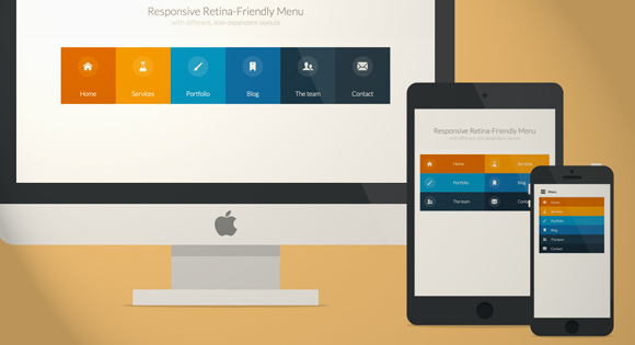
Today we will create a colorful Retina-ready and responsive menu inspired by the colors of the Maliwan manufacturer of the Borderlands game. The menu automatically changes to one of three different layouts depending on the browser window size: a “desktop” inline version, a two columns tablet-optimized version and a mobile version with a menu link to display and hide the navigation for smaller screens. To make the menu fully retina-ready, we will use an icon font so that the icons of the menu won’t get pixelized on resize.
Preparing the icon font
Creating a custom icon font might look a bit complicated, but with tools like IcoMoon it’s just a matter of creating the icons and importing them into the tool. Icon fonts behave like any font, so you can easily change the color, adapt the size and it won’t get pixelized. Perfect for retina devices without having to use multiple assets for different screen resolutions.
The first thing we need to do is to create the icons for the menu. I use Illustrator, but any vector graphics editor like, for example Inkscape, will do. We need to create each icon and export them as a SVG file. To make sure the icon will work properly in every browser, we have to convert all lines into full objects, and merge all the objects into one big shape for each icon. Once all have been exported into nice SVG files, we can import them all into the IcoMoon App tool:
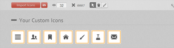
We can also enhance our font with icons from the big library that IcoMoon offers. Once we have all the icons we need, we click on the “Font” button at the bottom of the page to enter the detailed settings. On this page we can choose the encoding settings for the font, and also choose if we want to assign some letters for each icon, or prefer to use the Private Use Area of the font to make sure screen readers won’t be able to output them. I recommend using the default settings that work pretty well.
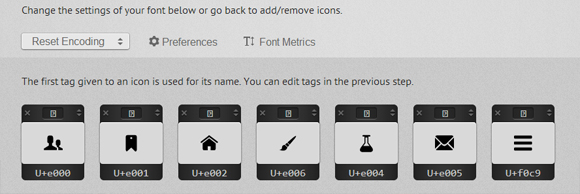
When we click on “Download” we get a ZIP file with 4 font formats (SVG, EOT, TTF and WOFF), the CSS styling and a demo page.
The first thing to do to be able to use the icons is to copy and paste the CSS IcoMoon provides to the top of our CSS file and make sure we also copy the font folder. There’s also a little “hack” to make the fonts look nicer on Chrome Windows you might want to check it out.
The HTML of the menu
Here is what the HTML for our navigation looks like:
<nav  id="menu" class="nav">
	<ul>
		<li>
			<a  href="#" title="">
				<span  class="icon"> <i aria-hidden="true"  class="icon-home"></i></span><span>Home</span>
			</a>
		</li>
		<li>
			<a href="#" title=""><span class="icon"> <i aria-hidden="true" class="icon-services"></i></span><span>Services</span></a>
		</li>
		<li>
			<a  href="#" title=""><span  class="icon"><i  aria-hidden="true" class="icon-portfolio"></i></span><span>Portfolio</span></a>
		</li>
		<li>
			<a  href="#" title=""><span  class="icon"><i  aria-hidden="true" class="icon-blog"></i></span><span>Blog</span></a>
		</li>
		<li>
			<a  href="#" title=""><span  class="icon"><i  aria-hidden="true" class="icon-team"></i></span><span>The  team</span></a>
		</li>
		<li>
			<a  href="#" title=""><span  class="icon"><i  aria-hidden="true" class="icon-contact"></i></span><span>Contact</span></a>
		</li>
	</ul>
</nav>
To use the icon font, we simply use the class “icon-iconname” inside an i element (a span will work as well). Also note that we added a no-js class to the body that will be changed to js with Modernizr. The idea is to be able to leave the menu open if the user has JavaScript disabled. We’ll also use Modernizr to detect touch support.
The CSS & JavaScript
Note that I won’t prefix the CSS3 properties here but you will find the prefixed version in the files.
The global CSS that gets applied to all screen sizes looks as follows:
/* Global CSS that are applied for all screen sizes */

.nav ul {
	max-width: 1240px;
	margin: 0;
	padding: 0;
	list-style: none;
	font-size: 1.5em;
	font-weight: 300;
}

.nav li span {
	display: block;
}

.nav a {
	display: block;
	color: rgba(249, 249, 249, .9);
	text-decoration: none;
	transition: color .5s, background .5s, height .5s;
}

.nav i{
	/* Make the font smoother for Chrome */
	transform: translate3d(0, 0, 0);
}

/* Remove the blue Webkit background when element is tapped */

a, button {
	-webkit-tap-highlight-color: rgba(0,0,0,0);
}
We want a first little transition on the whole navigation that lowers the opacity of all the items, except the one that is being hovered. This is the code for that:
/* Hover effect for the whole navigation to make the hovered item stand out */

.no-touch .nav ul:hover a {
	color: rgba(249, 249, 249, .5);
}

.no-touch .nav ul:hover a:hover {
	color: rgba(249, 249, 249, 0.99);
}
Then we want to add some nice background colors to all of the items. The code below uses a nth-child technique to select the list items. This way, you can add as many list items as you want, the color code will repeat itself.
.nav li:nth-child(6n+1) {
	background: rgb(208, 101, 3);
}

.nav li:nth-child(6n+2) {
	background: rgb(233, 147, 26);
}

.nav li:nth-child(6n+3) {
	background: rgb(22, 145, 190);
}

.nav li:nth-child(6n+4) {
	background: rgb(22, 107, 162);
}

.nav li:nth-child(6n+5) {
	background: rgb(27, 54, 71);
}

.nav li:nth-child(6n+6) {
	background: rgb(21, 40, 54);
}
Using a min-width media query, we can target screens that are bigger than 800px (50em, with a body font size of 15px) to transform our list into a nice horizontal navigation:
@media (min-width: 50em) {

	/* Transforms the list into a horizontal navigation */
	.nav li {
		float: left;
		width: 16.66666666666667%;
		text-align: center;
		transition: border .5s;
	}

	.nav a {
		display: block;
		width: auto;
	}
We continue with the nth-child selecting technique, to add a 4px border with different colors to each of our menu items. We apply it on hover, but also on focus and active to make it work on touch devices and on keyboard access.
	/* hover, focused and active effects that add a little colored border to the different items */

	.no-touch .nav li:nth-child(6n+1) a:hover,
	.no-touch .nav li:nth-child(6n+1) a:active,
	.no-touch .nav li:nth-child(6n+1) a:focus {
		border-bottom: 4px solid rgb(174, 78, 1);
	}

	.no-touch .nav li:nth-child(6n+2) a:hover,
	.no-touch .nav li:nth-child(6n+2) a:active,
	.no-touch .nav li:nth-child(6n+2) a:focus {
		border-bottom: 4px solid rgb(191, 117, 20);
	}

	.no-touch .nav li:nth-child(6n+3) a:hover,
	.no-touch .nav li:nth-child(6n+3) a:active,
	.no-touch .nav li:nth-child(6n+3) a:focus {
		border-bottom: 4px solid rgb(12, 110, 149);
	}

	.no-touch .nav li:nth-child(6n+4) a:hover,
	.no-touch .nav li:nth-child(6n+4) a:active,
	.no-touch .nav li:nth-child(6n+4) a:focus {
		border-bottom: 4px solid rgb(10, 75, 117);
	}

	.no-touch .nav li:nth-child(6n+5) a:hover,
	.no-touch .nav li:nth-child(6n+5) a:active,
	.no-touch .nav li:nth-child(6n+5) a:focus {
		border-bottom: 4px solid rgb(16, 34, 44);
	}

	.no-touch .nav li:nth-child(6n+6) a:hover,
	.no-touch .nav li:nth-child(6n+6) a:active,
	.no-touch .nav li:nth-child(6n+6) a:focus {
		border-bottom: 4px solid rgb(9, 18, 25);
	}
Then we place the icons and the text:
	/* Placing the icon */

	.icon {
		padding-top: 1.4em;
	}

	.icon + span {
		margin-top: 2.1em;
		transition: margin .5s;
	}
We animate the height of the elements when they are hovered:
	/* Animating the height of the element*/
	.nav a {
		height: 9em;
	}

	.no-touch .nav a:hover ,
	.no-touch .nav a:active ,
	.no-touch .nav a:focus {
		height: 10em;
	}

	/* Making the text follow the height animation */
	.no-touch .nav a:hover .icon + span {
		margin-top: 3.2em;
		transition: margin .5s;
	}
Then we position the icons and prepare them for the CSS transition:
	/* Positioning the icons and preparing for the animation*/
	.nav i {
		position: relative;
		display: inline-block;
		margin: 0 auto;
		padding: 0.4em;
		border-radius: 50%;
		font-size: 1.8em;
		box-shadow: 0 0 0 0.8em transparent;
		background: rgba(255,255,255,0.1);
		transform: translate3d(0, 0, 0);
		transition: box-shadow .6s ease-in-out;
	}
To give the visuel effect we want, we transition a box shadow and change its size from 0.8em to 0, and its color from transparent to some color with a high opacity. This is also where we close our first media-query.
	/* Animate the box-shadow to create the effect */
	.no-touch .nav a:hover i,
	.no-touch .nav a:active i,
	.no-touch .nav a:focus i {
		box-shadow: 0 0 0px 0px rgba(255,255,255,0.2);
		transition: box-shadow .4s ease-in-out;
	}

}
We set a second media query to make some little adjustments for screens between 800 and 980px:
@media (min-width: 50em) and (max-width: 61.250em) {

	/* Size and font adjustments to make it fit better */
	.nav ul {
		font-size: 1.2em;
	}

}
Now that we have finished the “desktop” version (with BIG quotation mark since more and more tablets now have 1024px and larger screens), we take care of the “global” CSS for screens that are smaller than 800px which equals to 49.938em here, using a max-width media query.
/* The "tablet" and "mobile" version */

@media (max-width: 49.938em) {

	/* Instead of adding a border, we transition the background color */
	.no-touch .nav ul li:nth-child(6n+1) a:hover,
	.no-touch .nav ul li:nth-child(6n+1) a:active,
	.no-touch .nav ul li:nth-child(6n+1) a:focus {
		background: rgb(227, 119, 20);
	}

	.no-touch .nav li:nth-child(6n+2) a:hover,
	.no-touch .nav li:nth-child(6n+2) a:active,
	.no-touch .nav li:nth-child(6n+2) a:focus {
		background: rgb(245, 160, 41);
	}

	.no-touch .nav li:nth-child(6n+3) a:hover,
	.no-touch .nav li:nth-child(6n+3) a:active,
	.no-touch .nav li:nth-child(6n+3) a:focus {
		background: rgb(44, 168, 219);
	}

	.no-touch .nav li:nth-child(6n+4) a:hover,
	.no-touch .nav li:nth-child(6n+4) a:active,
	.no-touch .nav li:nth-child(6n+4) a:focus {
		background: rgb(31, 120, 176);
	}

	.no-touch .nav li:nth-child(6n+5) a:hover,
	.no-touch .nav li:nth-child(6n+5) a:active,
	.no-touch .nav li:nth-child(6n+5) a:focus {
		background: rgb(39, 70, 90);
	}

	.no-touch .nav li:nth-child(6n+6) a:hover,
	.no-touch .nav li:nth-child(6n+6) a:active,
	.no-touch .nav li:nth-child(6n+6) a:focus {
		background: rgb(32, 54, 68);
	}

	.nav ul li {
		transition: background 0.5s;
	}

}
For screen size between 520px (32.5em) and 799px (49.938em), we want to display our menu into a 2 columns and 3 rows layout. We add some padding to make the elements easy to “tap”, and display the icons on the left and the text on the right.
/* CSS for a 2x3 columns version */

@media (min-width: 32.5em) and (max-width: 49.938em) {

	/* Creating the 2 column layout using floating elements once again */
	.nav li {
		display: block;
		float: left;
		width: 50%;
	}

	/* Adding some padding to make the elements look nicer*/
	.nav a {
		padding: 0.8em;
	}

	/* Displaying the icons on the left, and the text on the right side using inline-block */
	.nav li span,
	.nav li span.icon {
		display: inline-block;
	}

	.nav li span.icon {
		width: 50%;
	}

	.nav li .icon + span {
		font-size: 1em;
	}

	.icon + span {
		position: relative;
		top: -0.2em;
	}
The animation for big screen is too complex to fit into smaller screens, so we adapt it to make it simpler and more discreet and simply animate the border. This is where we close our media query.
	/* Adapting the icons to animate the size and border of the rounded background in a more discreet way */
	.nav li i {
		display: inline-block;
		padding: 8% 9%;
		border: 4px solid transparent;
		border-radius: 50%;
		font-size: 1.5em;
		background: rgba(255,255,255,0.1);
		transition: border .5s;
	}

	/* Transition effect on the border color */
	.no-touch .nav li:hover i,
	.no-touch .nav li:active i,
	.no-touch .nav li:focus i {
		border: 4px solid rgba(255,255,255,0.1);
	}

}
Again, for smaller screens we adapt the font-size and width.
	/* Adapting the font size and width for smaller screns*/
@media (min-width: 32.5em) and (max-width: 38.688em) {

	.nav li span.icon {
		width: 50%;
	}

	.nav li .icon + span {
		font-size: 0.9em;
	}
}
For very small screens, we hide the navigation and display a “menu” button the user can click if he wants to display the navigation. To do this, we rely on some lines of JavaScript:
//  The function to change the class
var changeClass = function (r,className1,className2) {
	var regex = new RegExp("(?:^|\s+)" + className1 + "(?:\s+|$)");
	if( regex.test(r.className) ) {
		r.className = r.className.replace(regex,' '+className2+' ');
    }
    else{
		r.className = r.className.replace(new RegExp("(?:^|\s+)" + className2 + "(?:\s+|$)"),' '+className1+' ');
    }
    return r.className;
};

//  Creating our button for smaller screens
var menuElements = document.getElementById('menu');
menuElements.insertAdjacentHTML('afterBegin','<button type="button" id="menutoggle" class="navtoogle" aria-hidden="true"><i aria-hidden="true" class="icon-menu"> </i> Menu</button>');

//  Toggle the class on click to show / hide the menu
document.getElementById('menutoggle').onclick = function() {
	changeClass(this, 'navtoogle active', 'navtoogle');
}

// document click to hide the menu
// http://tympanus.net/codrops/2013/05/08/responsive-retina-ready-menu/comment-page-2/#comment-438918
document.onclick = function(e) {
	var mobileButton = document.getElementById('menutoggle'),
		buttonStyle =  mobileButton.currentStyle ? mobileButton.currentStyle.display : getComputedStyle(mobileButton, null).display;

	if(buttonStyle === 'block' && e.target !== mobileButton && new RegExp(' ' + 'active' + ' ').test(' ' + mobileButton.className + ' ')) {
		changeClass(mobileButton, 'navtoogle active', 'navtoogle');
	}
}
In order to have a cleaner HTML, I chose to create the “menu” button and insert it in the DOM using JavaScript. The function changeClass helps us to toggle the class between active and no class when the users clicks on the button.
Now that we have all we need for the small screen version, we can style it with CSS. The following code styles the menu button:
/* Styling the toggle menu link and hiding it */
.nav .navtoogle{
	display: none;
	width: 100%;
	padding: 0.5em 0.5em 0.8em;
	font-family: 'Lato',Calibri,Arial,sans-serif;
	font-weight: normal;
	text-align: left;
	color: rgb(7, 16, 15);
	font-size: 1.2em;
	background: none;
	border: none;
	border-bottom: 4px solid rgb(221, 221, 221);
	cursor: pointer;
}

.navtoogle i{
	z-index:-1;
}

.icon-menu {
	position: relative;
	top: 3px;
	line-height: 0;
	font-size: 1.6em;
}
By default, the menu button is hidden. We want to display it for screens smaller than 519px (32.438em):
@media (max-width: 32.438em) {

	/* Unhiding the styled menu link */
	.nav .navtoogle{
		margin: 0;
		display: block;
	}
We animate the height of the navigation when the button is clicked. To close the navigation, we give it a 0em height, to open it, we give it a 30em max-height. If JavaScript is not enabled, we don’t have any button, so we use the no-js class to always display the navigation.
	/* Animating the height of the navigation when the button is clicked */

	/* If JavaScript is disabled, the menu stays open */
	.no-js .nav ul {
		max-height: 30em;
		overflow: hidden;
	}
When JavaScript is enabled we hide the menu by default, and display it when the users clicks on the button which then gets the active class:
	/* When JavaScript is enabled, we hide the menu */
	.js .nav ul {
		max-height: 0em;
		overflow: hidden;
	}

	/* Displaying the menu when the user has clicked on the button */
	.js .nav .active + ul {
		max-height: 30em;
		overflow: hidden;
		transition: max-height .4s;
	}
We adapt the layout for smaller screens, presenting the navigation in a list of items with the icon on the left and the text on the right side:
	/* Adapting the layout of the menu for smaller screens: icon on the left and text on the right */

	.nav li span {
		display: inline-block;
		height: 100%;
	}

	.nav a {
		padding: 0.5em;
	}

	.icon + span {
		margin-left: 1em;
		font-size: 0.8em;
	}
We also add a 8px border on the left of each item with a nice color
	/* Adding a left border of 8 px with a different color for each menu item*/
	.nav li:nth-child(6n+1) {
		border-left: 8px solid rgb(174, 78, 1);
	}

	.nav li:nth-child(6n+2) {
		border-left: 8px solid rgb(191, 117, 20);
	}

	.nav li:nth-child(6n+3) {
		border-left: 8px solid rgb(13, 111, 150);
	}

	.nav li:nth-child(6n+4) {
		border-left: 8px solid rgb(10, 75, 117);
	}

	.nav li:nth-child(6n+5) {
		border-left: 8px solid rgb(16, 34, 44);
	}

	.nav li:nth-child(6n+6) {
		border-left: 8px solid rgb(9, 18, 25);
	}
The navigation looks nice when testing its small version on desktop. But on mobile devices the items might be hard to tap. Using Modernizr we can detect the touch capability of the device. If the device has touch capabilities, a touch class is added to the body. We can use this class to enhance the experience on touch devices and make the navigation items a little bit bigger so that the user can tap them more easily. And here we close our last media query.
	/* make the nav bigger on touch screens */
	.touch .nav a {
		padding: 0.8em;
	}
}
And that’s it, we’ve build a nice, touch-friendly and retina-ready navigation that works fine on desktop, tablet and mobile devices. Hope you liked it!
Image Credits: Featured image created with Minimal Apple Product Templates from WeGraphics.net


Great great great! Thank you 🙂
Was just too much … thanks for sharing your knowledge 😉
Merci beaucoup!
Excellent tutorial, with high quality code. Thanks again !
Really, cool. Very useful for me, nice work !
Really awesome! Thank you!
Very useful. Think i’m going to use this. Thanks for sharing!
cool…, Thanks for sharing.
Nice tutorial!
Beware of touch detection of Modernizr: it detects the touch events api support (for now), not especially a touchscreen device (eg. Internet Explorer on WIndows Phone).
The outcome is absolutely amazing, great tutorial!
Using “.no-touch” to detect mouse input does not work.
Both Chrome and Firefox on my non-touch WIndows 8 Laptop are detected as “touch”, so the nice hover effects are disabled.
Sweet!!! Thank you
Trop cool, but would it be possible to see a non-javascript implementation of this? I would like to see more css-only responsive menu solutions on Codrops.
Thanks for posting.
The problem with non JS solution is that they are hacky and rely on technics using :target for example or other CSS3 techniques like :checked that require dirty HTML.
Beautiful!!
Great tutorial… I would be happy to see same one, but without using icon fonts. This one is a little bit too complicated for beginners.
awesome ))
Super,
Merci Beaucoup !!
Merci beaucoup =D
Did this work for anyone on IE 7 or IE 8? I’m not seeing the backgrounds in either or the graphics in IE7. The button layouts are also not shifting properly.
It’s using CSS3 animations and rgba colors so IE7 might be down yes.
Plus IE7 and IE8 are on no mobile, so you don’t need the layout to shift in responsive. You can use Paul Irish’s Conditionnal’s Classes technique to add a .ie7ie8 class, and change the max-widht to a with for those, so that it can’t resize 🙂
Wow really cool. Thank you
Thanks a lot, great job
It looks great. Thank you.
Ton travail me plait beaucoup. Il est très fin, très intelligent et utile (au moins pour ce qui me concerne). Je te félicite et te souhaite une pleine réussite.
Merci beaucoup.
G.
Hey there
The demo page breaks when trying to go to the most narrow width possible. Using the latest chrome version, I don’t get to see the icons pile in a single column (they disappear instead of simpling piling up correctly as per your screenshot). The ‘narrowest’ I can go before breaking the page is 2 columns for the icons.
Cheers
G
Have you tried clicking on the “menu” link that appears when you get pretty narrow ? Does it work ?
Great tutorial. For the mobile menu, I think it would be better to enable document click to hide the menu.
Sound nice, can you detail a little bit more, I’m mostly a CSS and HTML front-dev, but I’d love to learn more about JavaScript. 🙂
This isn’t perfect, and it’s only been tested on chrome, but here’s a solution:
document.onclick = function(e) {
  var mobileButton = document.getElementById('menutoggle'),
      buttonStyle =  mobileButton.currentStyle ? mobileButton.currentStyle.display :
                              getComputedStyle(mobileButton, null).display

    if(buttonStyle == 'block' && e.target !== mobileButton) {
        changeClass(mobileButton, 'navtoogle active', 'navtoogle');
    }
}
Here’s a jsFiddle to test it out jsFiddle
updated to only toggle if the menu is active: http://jsfiddle.net/vnwmD/5/
Yeah Justin’s technique works pretty fine 🙂
Again a great tutorial from this site. Thanks a lot for sharing with us.
I’ve got everything set correctly except 2 things aren’t working for me and I can’t figure out why:
1. I can’t get the bullets from the list to disappear. They’re all appearing to the left of the box.
2. I only have 4 boxes (instead of 6 like the demo) and I can’t get them to be centered on the screen.
I feel like these are minor problems, but I can’t figure it out for the life of me. Any help?
I figured out how to get them centered. Now I just can’t get rid of those stupid bullets:
.nav ul {
max-width: 1240px;
margin: 0;
padding: 0;
list-style-type: none;
font-size: 1.5em;
font-weight: 300;
}
The style type is set to “none”. Any ideas what’s going on?
Hi,
Great work, I’m having problem though, when you hover and it expands, it shifts the content around on mu page for example if i have 2 divs, it’ll move one down underneath, any ideas to fix it?
Cheers
Hi Adam,
a quick solution
in the html after the
insert
Your Content, whatever
in the css right after
@media (min-width: 50em) {
insert
.nav {
height:210px;
}
Cheers, thank you very much
ups
correction:
in the html after the insert Hier steht wasJason I’m note sure about this but I think list-style-type si no more suported , try just list-style:none.
P.S. sorry for my bad english
Hello everybody,
I want to use for the header menu of all pages but
i don’t know how to include ?
Thx for all
Wow, i didn’t know you where behind this fantastic tuto the first time i read it! Congrats, that’s the kind of post i love: clean code and stunning design!
when i have seen media queries written in px (800 px), you have used em, any specific reason or ?
PLease explain.
The pixel value I gave is equal to the em value after I converted it. For more details about using em media-queries see http://blog.cloudfour.com/the-ems-have-it-proportional-media-queries-ftw/ 🙂
Amazing. Lovely navigation. Bookmarked…Thanks
Is it possible to position the menu? I want to position it in the top right corner of my website but when i try, it just sort of collapses.
I’ve tried to fix it but nothing seems to work.
It’s a great menu but this issue is really frustrating, can someone help me out?
Thanks.
It’s possible to use this menu, only the design, in commercial purpose as a part of a bigger product?
Hi Valentin, that’s not a problem. Please take a look at our licensing page: http://tympanus.net/codrops/licensing/ Thanks, Pedro
Yes you can, but it might be a good idea to personnalize it least the colors, so that it won”t look like all the people that use this menu as it is 😉
It’s always nice to have a touch of personnal identity when re-using code, but that’s not mandatory 🙂
Funny thing is when you do float: right, it also flips the UL in the opposite order. So Home will be last in this case.
Yep, that’s what float:right does on list elements 😉 If you want to make to go on the right side, you might have to apply the float right on the parent of the list
It looks great!, but I remove hover transitions in smaller resolutions, hover state in mobiles doesn’t exist
Hi I add this menu to my home project and it runs well in CHROME on mi pc but when I try to get the page on my iPhone the menu DOES NOT DISPLAY ….
FIDDLER SHOWS THIS WHEN I TRY TO GET THE PAGE FROM MY iphone (I’m working on a ASP MVC 4 ..so I try to get the localhost of my project from my iPhone)
http://localhost:24086/apple-touch-icon-precomposed.png
and the rest of the page load perfect but the menu does not!
HELP PLEASE!
HOW TO IMPLEMENT THIS ON WORDPRESS?
You will need to hack into the loops that create the navigation to be able to add the extra markup. Sorry but WordPress custom dev is far away from my competences 🙂
I love you very very much guys
Thank you for this excellent tutorial.
Think this was asked before but I am not clear…
=> When using on smallest screens the blocks disappear and one must click on the menu button to expand menu. How can I make the menu appear automatically without need to click on menu button?
Many thanks again.
Anyone?
I have searched high and low trying to figure out how to show expanded menu on smaller devices without having to click menu button. Just cannot seem to find what surely must be a simple solution.
Susan
You simply have to remove the class that is added in JS for the menu to close, mais use a max-height pretty high so that the menu will show in its full height
Love the menu and tutorial! I have been fiddling with this for a project and have removed the icons (look great but client didn’t like them), however I have two levels to my menu (ie under Services menu I have Option 1, Option 2 etc). I want the entire menu to show when I click on the menu button…. can anyone give me some hints on how I can achieve that?
I’m really not sure about the two level menu, this was intended to be only a fun demo, not to be used on “real” website so you might have to come up with your own ideas on how to change it for multi-level. I’d be glad too see what you will make out of it, so please share the link with us 😉
Nice , Thanks for sharing….
Thanks for sharing this wonderful tutorial! I am trying to use it for a personal project, the thing is that i need to use 7 icons and for that i just added an extra li element, but then when i test it it shows the extra icon bellow the others but when i hover over lets say the 1 icon the last one kinda move and follow the icon i am hovering onto, so how can i do to align the 7 icons on just one div? Thanks.
Changing the width percentile here so that 100/the number of list items will give you the answer to 10 decimal places.
For 7 list items you would enter width: 14.2857143%
/* For screen bigger than 800px */ @media (min-width: 50em) { /* Transforms the list into a horizontal navigation */ .nav li { float: left; width: 16.66666666666667%; text-align: center; -webkit-transition: border .5s; -moz-transition: border .5s; -o-transition: border .5s; -ms-transition: border .5s; transition: border .5s; }Excellent tutoriel! Merci beaucoup!!!
So pretty!
Its beautiful, thanks a lot.
However, i was thinking that it might have been easier to understand had there been no javascript usage for generating the mobile menu, and it would be pure css.. Just saying cos I am kinda noob.
Amazing tutorial!
Well I’m a JS noob too and admit I asked some people for the JS. The only thing you really have to understand is that is add the class needed to the HTML.
You could this in full CSS, but you would need to use “hacky” techniques like a :target, or add non semantic HTML to do this. Believe me, 3 lines of JS are better for crossbrowser than hacky JS here 😉
Hi Stephanie.. firstly, a big thanks for this article.. learned dozens of new stuff.
Was wondering why you are using ’em’ instead of ‘px’ for media queries. I use px, so is there any advantage/reason to use em instead?
Also, why ‘(min-width: 32.5em) and (max-width: 38.688em)’? what all devices comes under this range? and how much is 38.688em (not mentioned in article)?
Sorry to bother you with basic these questions. as you mite have guessed, your ‘fun demo’ is a word-by-word study tutorial for the likes of me… 🙂
Cheers.
That’s why em instead px…. cheers!
http://www.w3schools.com/cssref/css_units.asp
EXTREMELY good and useful tutorial. Thank you so much for sharing this.
Great menu!….Thanks for that…However
How do i add content below de menu??….like text and images….