From our sponsor: Leverage AI for dynamic, custom website builds with ease.
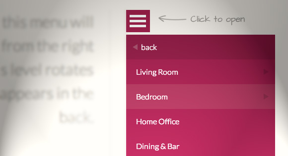
Today we want to share an experimental drop-down menu with you. The main idea is to save space for menus that have a lot of content and sub-levels. Each sub-level in this menu will be shown in its own context, making the “parent” level disappear. This is done with subtle animations that are defined in separate animation classes. The menu is fluid so that it can be used easily in a responsive layout.
Please note: this only works as intended in browsers that support the respective CSS properties.
The structure of the menu contains an unordered list that can have an arbitrary number of sub-lists:
<div id="dl-menu" class="dl-menuwrapper">
	<button class="dl-trigger">Open Menu</button>
	<ul class="dl-menu">
		<li>
			<a href="#">Item 1</a>
			<ul class="dl-submenu">
				<li><a href="#">Sub-Item 1</a></li>
				<li><a href="#">Sub-Item 2</a></li>
				<li><a href="#">Sub-Item 3</a></li>
				<li>
					<a href="#">Sub-Item 4</a>
					<ul class="dl-submenu">
						<li><a href="#">Sub-Sub-Item 1</a></li>
						<li><a href="#">Sub-Sub-Item 2</a></li>
						<li><a href="#">Sub-Sub-Item 3</a></li>
					</ul>
				</li>
				<li><!-- ... --></li>
				<!-- ... -->
			</ul>
		</li>
		<li><!-- ... --></li>
		<li><!-- ... --></li>
		<!-- ... -->
	</ul>
</div><!-- /dl-menuwrapper -->
Animations are defined in animation classes:
.dl-menu.dl-animate-out-1 {
	animation: MenuAnimOut1 0.4s linear forwards;
}

@keyframes MenuAnimOut1 {
	50% {
		transform: translateZ(-250px) rotateY(30deg);
	}
	75% {
		transform: translateZ(-372.5px) rotateY(15deg);
		opacity: .5;
	}
	100% {
		transform: translateZ(-500px) rotateY(0deg);
		opacity: 0;
	}
}

.dl-menu.dl-animate-in-1 {
	animation: MenuAnimIn1 0.3s linear forwards;
}

@keyframes MenuAnimIn1 {
	0% {
		transform: translateZ(-500px) rotateY(0deg);
		opacity: 0;
	}
	20% {
		transform: translateZ(-250px) rotateY(30deg);
		opacity: 0.5;
	}
	100% {
		transform: translateZ(0px) rotateY(0deg);
		opacity: 1;
	}
}
And the plugin is called as following:
$( '#dl-menu' ).dlmenu({
	animationClasses : { classin : 'animation-class-name', classout : 'animation-class-name' }
});
We hope you like this little experiment and find it inspiring!