From our sponsor: Leverage AI for dynamic, custom website builds with ease.
One of the less talked about features of newer browsers is increasing support for the SVG file format. If you are unfamiliar with SVG, it stands for Scalable Vector Graphics. Unlike raster image formats like PNG, JPG or GIF, the vector graphics contained within SVG files are completely scalable to any size and will display at any resolution or screen density without quality loss. In many cases, SVG files will also be much smaller in filesize and download quicker.
But one of the really cool things that some developers do not realize is that SVG is built on the XML specification, which at the end of the day means that its plain old markup, and can be worked with in a similar manner to HTML. It also means that we can access and manipulate graphics and elements within the SVG file using technologies like CSS and JavaScript that web developers are already familiar with.
With the right techniques and modern browser support, developers can now produce some pretty impressive animations, effects and interactions using SVG. Today we will explore the possibilities of SVG and test the capabilities of modern browsers by creating an interactive vector infographic for the web.
Preparing an SVG file
There are tons of ways to create SVG graphics, and while it is possible to do some SVG coding “by hand”, for more complex graphics we will want to have some type of vector editing software that can export as SVG. A popular choice of course among designers may be the familiar Adobe Illustrator, but there are other free/open source applications such as Inkscape that in some ways may even be more suited for our purpose.
Whatever software you choose, it is essential to have the ability to group objects together, and be able to name those groups (assign the id attribute). This allows us to organize our SVG into an appropriate hierarchy that we can later access as needed using CSS and/or JavaScript. Both Illustrator and Inkscape have the ability to do so by selecting multiple graphic elements and choosing Object > Group (or Ungroup) from the top menu.
Any object or group can then be assigned a name. This becomes the id attribute of the group or object when exported, so avoid spaces or special characters. Also, avoid duplicates.
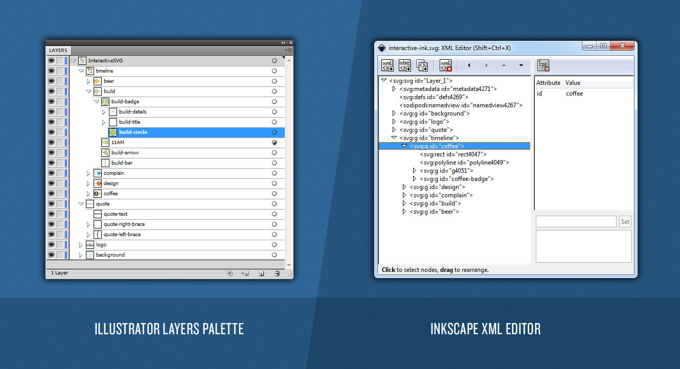
In Illustrator, this can be done from the layers palette. Simply navigate to the object you wish to name within the palette, double-click it, and enter the id you wish to use. In Inkscape, use the Object > Object Properties panel to assign an object or group an id. Alternatively, it is possible do so from the Edit > XML Editor panel, which provides even more control of the output and even has the ability to assign classes, not just id’s
In our example, when we save our SVG and open it in a text editor, it will have the following type of structure:
<g id="background">
	<g id="bg-lines-left"> <!-- left background lines --> </g>
	<g id="bg-lines-right"> <!-- right background lines -->  </g>
</g>
<g id="logo"> <!-- logo graphics -->  </g>
<g id="quote">
	<g id="quote-left-brace"> <!-- left quote brace -->  </g>
	<g id="quote-right-brace"> <!-- right quote brace --> </g>
	<g id="quote-text"> <!-- quote text --> </g>
</g>
<g id="timeline">
	<g id="coffee">
		<rect id="coffee-bar" />
		<polyline id="coffee-arrow" />
		<g id="coffee-time"> <!-- time text --> </g>
		<g id="coffee-badge">
			<circle id="coffee-circle" />
			<g id="coffee-title"> <!-- title text --> </g>
			<g id="coffee-details"> <!-- icon, description --> </g>
		</g>
	</g>
	<g id="design">
		<rect id="design-bar" />
		<polyline id="design-arrow" />
		<g id="design-time"> <!-- time text --> </g>
		<g id="design-badge">
			<circle id="design-circle" />
			<g id="design-title"> <!-- title text --> </g>
			<g id="design-details"> <!-- icon, description --> </g>
		</g>
	</g>
	<g id="build">
		<rect id="build-bar" />
		<polyline id="build-arrow" />
		<g id="build-time"> <!-- time text --> </g>
		<g id="build-badge">
			<circle id="build-circle" />
			<g id="build-title"> <!-- title text --> </g>
			<g id="build-details"> <!-- icon, description --> </g>
		</g>
	</g>
	<g id="complain">
		<rect id="complain-bar" />
		<polyline id="complain-arrow" />
		<g id="complain-time"> <!-- time text --> </g>
		<g id="complain-badge">
			<circle id="complain-circle" />
			<g id="complain-title"> <!-- title text --> </g>
			<g id="complain-details"> <!-- icon, description --> </g>
		</g>
	</g>
	<g id="beer">
		<rect id="beer-bar" />
		<polyline id="beer-arrow" />
		<g id="beer-time"> <!-- time text --> </g>
		<g id="beer-badge">
			<circle id="beer-circle" />
			<g id="beer-title"> <!-- title text --> </g>
			<g id="beer-details"> <!-- icon, description --> </g>
		</g>
	</g>
</g>
The markup shown above has been stripped down to simply show the structure we are going for, but it is a good idea to take a few moments to analyze the SVG output of the actual file in a text editor and become familiar with the markup. You will notice a lot of familiar things to HTML, and some new things as well.
As we can see in our SVG markup, each <g> tag indicates a new group of objects, which can be nested inside other groups. Of course, when creating an SVG, it is not necessary to assign an id to every object/group, it simply makes it most convenient to access later via CSS or JavaScript and also easier to recognize when looking at the markup.
Loading SVG into HTML using JavaScript
The HTML
There are a number ways to embed or place SVG into HTML. It is possible do it using the <img> tag, the <embed> tag, or even by using CSS’ background-image property. For our purpose though, we need access to the actual DOM within our SVG, so we will make use of HTML5’s inline SVG capabilities and load it directly into our page using jQuery.
First, we’ll create a placeholder div in our HTML document:
<div id="stage"> <!-- Fallback Text Content can go here --> </div>
The JavaScript
Then, using jQuery.load, we’ll load the SVG file into our #stage div and give it the class svgLoaded which we’ll later use to trigger our intro animation:
$(function(){

	$("#stage").load('interactive.svg',function(response){

		$(this).addClass("svgLoaded");

		if(!response){
			// Error loading SVG!
			// Make absolutely sure you are running this on a web server or localhost!
		}

	});
});
Important: We load the SVG using JavaScript to gain access to its DOM. Chrome (and maybe other browsers) will not let you do this locally; it only works when run from the HTTP protocol for security reasons. So if you are having issues getting the SVG to load, be sure you are testing from a web server or running on localhost
The CSS
Note that the CSS throughout this tutorial will not contain any browser-specific styles or vendor prefixes, but you will find them in the files.
The first thing to do is set some styles for the container div. The default behavior of an SVG when it is loaded is to scale to the size of its container, so it’s important to set the container dimensions appropriately to the size of the SVG canvas.
	#stage {
		width: 1024px;
		height: 1386px;
	}
Styling SVG elements: Setting transform-origins
The key to animating elements within our SVG Canvas lies in the transform-origin property. By default, all transformations to any element in our SVG occur from (0px, 0px) of the SVG canvas. For any element that we wish transform (eg. scale, rotate), we need to set the appropriate transform-origin relative to the top left of the SVG canvas. The origin will be different for each element depending on the desired effect/animation, but in most cases will be equal to the center point of where the element is already positioned. This can be fairly tedious, but simple enough to do by copying the coordinate information provided in our vector editing software.
#coffee {
	transform-origin: 517px 484px;
}
#coffee-badge {
	transform-origin: 445px 488px;
}
#coffee-title {
	transform-origin: 310px 396px;
}
#coffee-details {
	transform-origin: 311px 489px;
}

#design {
	transform-origin: 514px 603px;
}
#design-badge {
	transform-origin: 580px 606px;
}
#design-title {
	transform-origin: 712px 513px;
}
#design-details {
	transform-origin: 710px 620px;
}

#build {
	transform-origin: 511px 769px;
}
#build-badge {
	transform-origin: 445px 775px;
}
#build-title {
	transform-origin: 312px 680px;
}
#build-details {
	transform-origin: 310px 790px;
}

#complain {
	transform-origin: 512px 1002px;
}
#complain-badge {
	transform-origin: 586px 1000px;
}
#complain-title {
	transform-origin: 718px 921px;
}
#complain-details {
	transform-origin: 717px 1021px;
}

#beer {
	transform-origin: 513px 1199px;
}
#beer-badge {
	transform-origin: 444px 1193px;
}
#beer-title {
	transform-origin: 313px 1097px;
}
#beer-details {
	transform-origin: 316px 1202px;
}
Apply some initial transformations
In the art we created in our vector software, we laid it out showing the “hover” state of each timeline section. So we need to set some initial styles that reposition some things and hide certain objects that we don’t want to show until hovered for interactivity.
To do this we will make use of some advanced CSS selectors. Basically, we’re selecting objects based on their id “suffix” (whatever the id ends with).
[id$=badge] { /* Any element with an id that ends in "badge" */
	transform: scale(0.5, 0.5);
}
[id$=title] {
	transform: scale(1.8) translate(0px, 48px);
}
[id$=details] {
	transform: scale(0, 0);
}
Note: In Inkscape it is alternatively possible to assign a class attribute, which would allow CSS selection by class. While it is always possible to add classes into the SVG manually, Illustrator will strip out such foreign attributes on save, meaning no further modifications would be possible.
Add in the :hover styles & apply transitions
We select the elements of a hovered group inside the timeline that have the badge,details and title id suffixes, and transform them back to the original position. We then set a nice 0.25s transition for a cool animated effect.
#timeline > g:hover [id$=badge], #timeline > g:hover [id$=details] {
	transform: scale(1, 1);
}
#timeline > g:hover [id$=title] {
	transform: scale(1) translate(0px, 0px);
}
[id$=badge], [id$=title], [id$=details] {
	transition: transform 0.25s ease-in-out;
}
The Intro Animation
To set up a nice animated intro sequence, we will use some CSS animations. In order to do this, we’ll first need to create some keyframes that will allow us to animate some different CSS properties:
@keyframes left-brace-intro {
	0% {
		transform: translateX(220px);
		opacity: 0;
	}
	50% {
		opacity: 1;
		transform: translateX(220px);
	}
	100% {
		transform: translateX(0px);
	}
}
@keyframes right-brace-intro {
	0% {
		transform: translateX(-220px);
		opacity: 0;
	}
	50% {
		opacity: 1;
		transform: translateX(-220px);
	}
	100% {
		transform: translateX(0px);
	}
}
@keyframes fade-in {
	0% {
		opacity: 0;
	}
	100% {
		opacity: 1;
	}
}
@keyframes grow-y {
	0% {
		transform: scaleY(0);
	}
	100% {
		transform: scaleY(1);
	}
}
@keyframes grow-x {
	0% {
		transform: scaleX(0);
	}
	100% {
		transform: scaleX(1);
	}
}
@keyframes grow {
	0% {
		transform: scale(0, 0);
	}
	100% {
		transform: scale(1, 1);
	}
}
Creating an Animated Intro Sequence
With our keyframe animations now made, we can set up a nice animated intro by simply applying the animations to various elements. Since we only want the intro animation to play when the SVG is first loaded, we can use descendant selectors based on the svgLoaded class that we applied earlier.
To lay out a nice animation sequence, we’ll adjust the animation-delay properties, and set animation-fill-mode: backwards so that the animations remain paused on the 0% keyframe during the animation-delay.
.svgLoaded #logo {
	animation: fade-in 0.5s ease-in-out;
}
.svgLoaded #quote-text {
	animation: fade-in 0.5s ease-in-out 0.75s;
	animation-fill-mode: backwards;
}
.svgLoaded #quote-left-brace {
	animation: left-brace-intro 1s ease-in-out 0.25s;
	animation-fill-mode: backwards;
}
.svgLoaded #quote-right-brace {
	animation: right-brace-intro 1s ease-in-out 0.25s;
	animation-fill-mode: backwards;
}
.svgLoaded #background {
	animation: grow-y 0.5s ease-in-out 1.25s;
	transform-origin: 512px 300px;
	animation-fill-mode: backwards;
}
.svgLoaded #background > g {
	animation: grow-x 0.25s ease-in-out 1.75s;
	animation-fill-mode: backwards;
}
.svgLoaded #background > g:last-of-type {
	transform-origin: 458px 877px;
}
.svgLoaded #background > g:first-of-type {
	transform-origin: 563px 877px;
}
.svgLoaded #coffee, .svgLoaded #design, .svgLoaded #build, .svgLoaded #complain, .svgLoaded #beer {
	animation: grow 0.25s ease-in-out;
	animation-fill-mode: backwards;
}
.svgLoaded #coffee {
	animation-delay: 2s;
}
.svgLoaded #design {
	animation-delay: 2.25s;
}
.svgLoaded #build {
	animation-delay: 2.5s;
}
.svgLoaded #complain {
	animation-delay: 2.75s;
}
.svgLoaded #beer {
	animation-delay: 3s;
}
Web Fonts
Since we have use non-standard fonts within our SVG, we have to include them in our web page in order for them to display properly. When doing this, it is important to get the correct font name that was used when the SVG was exported. We’ll open our SVG file in a text editor and simply find a text node where our font was used and look for the font-family property:
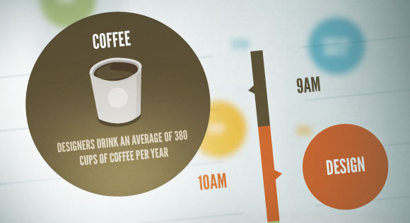
<!-- ... -->
<text font-family="'LeagueGothic'" font-size="28">12PM</text>
<!-- ... -->
As we can see, the SVG was exported using the font-family name ‘LeagueGothic’. So we simply have to define a webfont in our CSS using that same exact name. This is exactly the same process as using web fonts in any regular HTML page.
@font-face {
	font-family: 'LeagueGothic';
	url("../fonts/league-gothic/league-gothic.eot.woff") format("woff");
 }
And that’s it! I hope you enjoyed this tutorial and found it useful and informative! I’d love to hear your comments about using SVG interactively, and would love to see what other folks come up with too!


Wow Adam, this is one hell of an awesome tutorial! Thanks 🙂
Great work, Adam! Looks like a typical day for me!
Great example, but the favorite beer stat still shocks me! 😉
wow, nice:D
Looks awesome.
Getting a weird kind of effect in Firefox on Win. After an animation is done, there’s a second where it looks like it’s aliasing. It gets nudged by a pixel, and the text sharpens.
Smooth as butter on Chrome.
(And no animation in IE 9-10)
You guys make the bestest experiments evah 😉
Typical that Heineken is the ‘beer of choice’ for Web designers. Probably because of their clever, classy commercials and not so much the taste.
Absolutely great. Simple, but effective, the way it should be.
Awesome! and thanks =)
Smart…wish to live that way everyday…
Great work Adam….. 🙂
Super, super tutorial.
Awesome mann!!
Great tut on these W3C standard technologies, thanx.
Like other commentators, I appreciated the technical part of the job as much as the outcome! Sooo true..! 😉
One point though: the only animation I can see on FF11 is the title’s one, the badges remain full size w/ the inside text visible. Hovering effects work properly on Chrome 24.0.1312.57 m (both browsers run on Win7 64bits).
Keep the great job, and the tuts. 😉
Very Nice Adam!
Thanks =)
Cool tutorial! Want to try it out now
I was wondering if someone could explain how to create a simply sprite roll over effect using an svg?
Similar to using css background images. (Is there a way to call a svg from the css using a background image?)
Sorry if this is an easy thing to do. Not to familiar with .svg’s yet and have searched Google, but have had no luck finding a proper tutorial. Any help would be appreciated.
http://jsfiddle.net/adamco/D9CyY/
@Adam Coulombe – Thanks Man!
Super useful! I can totally make use of this for my website. Thanks for this awesome tutorial!
Heineken sucks, that’s pisswater not beer
LOL, fake stats 🙂
Thanks for this great article (and for the infographic). But I never drink coffee to focus on work. That a bad habit. And not a beer yet (I’m 14)
There were lots of cool infographics last year and I learnt quite a lot from them, however static infographics didn’t feel like they would get anywhere. I really like how it’s come out to be more interactive. Great tutorial, thanks!
Beautifull tutotrial Adam, very good.
Ps: Am i the only web designer that drink tea instead coffee and doesn’t like beer? XD.
This is very impressive , thanks 🙂 gonna work on something of my own now 🙂
This is just great, I am going to use this for inspiration.
Thanks a lot for this tutorial.
wow true scripts that animate web things.
awesome tutorial…. thank you so much for this tutorial..
i loved!!! too bad that doesn’t work in internet explorer 8 or lower….
Great tutorial; thanks for taking the time to explain everything so clearly.
Annoying that IE7/8 don’t support SVG when, for several reasons, we have to support them in-house. I guess one could just export the InkScape file as a PNG for an easy IE7/8 fallback with conditional comment added styles on body (.ie7) used as descendant selectors to pick whether the .png or .svg should be used.
67% of statistics are made up.
Awesome tutorials, hope you will write a similar article with more tips. I think this article isn’t enough for an infographic. Thanks!
This is excellent. Some great inspiration here! Thanks.
Hey! This has been super fun for me! Really enjoyed making my own versions. I noticed however through testing that the animations don’t work in Safari. Any clues why?
Beautifull tutorial Adam, very good.Looks awesome,Great work,Great Examples.
Wow this is amazing!! Is there any way to make it into a wordpress plugin?
how to make this svg responsive? so we can view it in mobile device .. any idea?
thanks
Hi,
i’ve tried and seems like transform scaleX and scaleY not working with latest Opera
any hack for this?
amazing trick
Excelent Source! Thanks 🙂
Nice and Awesome code ….we are go through this code we got excellent result…
Really like this tutorial. If I wanted to implement it in to a wordpress theme what would the file structure look like?
this is REALLY a great tutorial! thanks 🙂
Wow! Simply brilliant.. Get so many ideas churning, when you see this.
Am I going to use and abuse this nifty tutorial, or what!
Thanks a lot!
Amazing work i have no more words . Let know can i use them for my commercial website
you made it again . I loved this tutorial. But the problem what i had is that, I already asked you to please help me in putting the above mentioned code in blogger template… Please requesting to help me on this issue. you can send me email .
Anyone who know how to use this kindly help me : my email id : tharun782@gmail.com
Thanks in advance..
Great Tutorial..!
No…
why don’t you help yourself.
DIY is the simplest and most straightforward way to actually learn something… you will learn nothing by just asking other people to do things for you… you have been given a sound example now do the hard work yourself…
figure it out…
Nice… i like it))
Great tut I love it!!! just wondering if this can be done with a responsive #stage ?? thanks!
This is fantastic. Is there any way to make it work in IE 10?
🙂 yoo it blow my mind first time i look at it, very nice piece of example code with explanation… Thanks.
this is awesome! is there any way to use it in a wordpress page?
Bitching about IE increases production time 71%
Hi thanks for the tutorial. I’m experimenting a lot at the moment with svg possibilities.
I tried to use your tutorial as a basis for a simple interactive infographic.
You use g:hover for your action how would I add a click event??
I can’t seem to find literature anywhere :-/
Any help really appreciated.
Thanks.
Create a new class with the styles you want applied onClick, then assign the new class dynamically to the clicked element using jquery.
This is just a guess based on my experience using CSS3 transforms with events other than :hover
You can also find some working examples of this technique on codrops
Let me know if this works for you
You can wrap the group in an anchor link,and then use the :focus pseudo-class in your CSS like so:
(svg)
<a> ... </a> <code> (css) <code> a:focus g{ ... }(great. couldn’t escape the html when wrapping it in code brackets in the previous comment)
(svg)
a xlink:href="#"

    g

        ...

   /g

/a
This is such a great tutorial! I’m a newbie to .svg- where do I add the .css code to animate on WordPress?
Thanks, nice job! This is not working on IE10, is it totally incompatible or there are some hacks to make it work?