From our sponsor: Leverage AI for dynamic, custom website builds with ease.
Today we want to share another 3D experiment with you: a gallery room in 3D. The idea is to create a realistic environment for an image exposition using CSS 3D transforms. Images are “hanged” along a wall which will have an end. Once the end of the wall is reached, a rotation will happen and we’ll be turned to the next wall whith more images. To give a real sensation of being in a room, we only have four walls and corners. Each image will have a little description tag with a small-sized font and when clicking on it, a larger version will appear from below.
Please note that this is highly experimental and probably very buggy.
We recommend to view the demos in Google Chrome, they perform best there.
We use the following initial structure for adding figures and their captions:
<div id="gr-gallery" class="gr-gallery">

	<div class="gr-main">

		<figure>
			<div><img src="images/11.jpg" alt="img01" /></div>
			<figcaption>
				<h2><span>Penn. Station, Madison Square Garden and Empire State Building</span></h2>
				<div><p>New York City, 2009, by <a href="http://www.flickr.com/photos/thomasclaveirole">Thomas Claveirole</a></p></div>
			</figcaption>
		</figure>

		<figure>
			<!-- -->
		</figure>

		<!-- -->
	</div>

</div>
We will first transform it into the following structure that will contain a “room” with a main “wall”:
<div id="gr-gallery" class="gr-gallery">

	<div class="gr-main" style="display: none;">
		<!-- -->
	</div>

	<div class="gr-room">
		<div class="gr-wall-main">
			<div class="gr-floor" style="width: 3382px;"></div>
			<figure></figure>
			<figure></figure>
			<!-- -->
		</div>
	</div>

	<nav>
		<span class="gr-prev">prev</span>
		<span class="gr-next">next</span>
	</nav>

	<div class="gr-caption">
		<span class="gr-caption-close">x</span>
	</div>

</div><!-- /gr-gallery -->
The main wall will get a width so that a certain amount of images fits inside. The default number of images per wall are the total number divided by four since we have four walls to spread them on. We can also set the number of items per wall by initializing the layout array, as see in the demos:
Gallery.init( {
	layout : [3,2,3,2]
} );
Now, when we reach the end of a wall and rotate to see the next one, we’ll add another wall dynamically and set the right transforms so that it’s in the right angle towards the main wall.
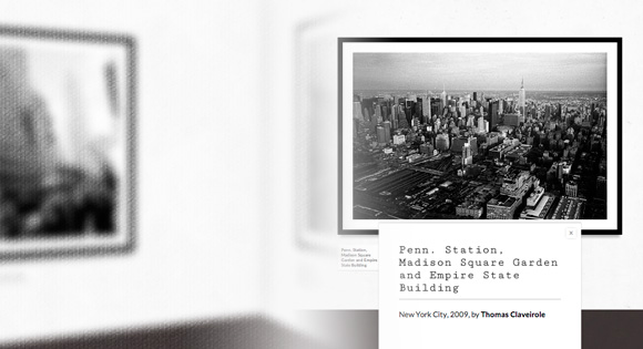
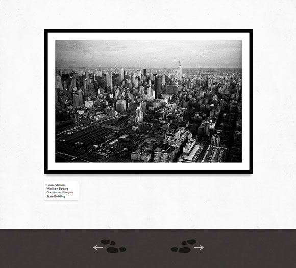
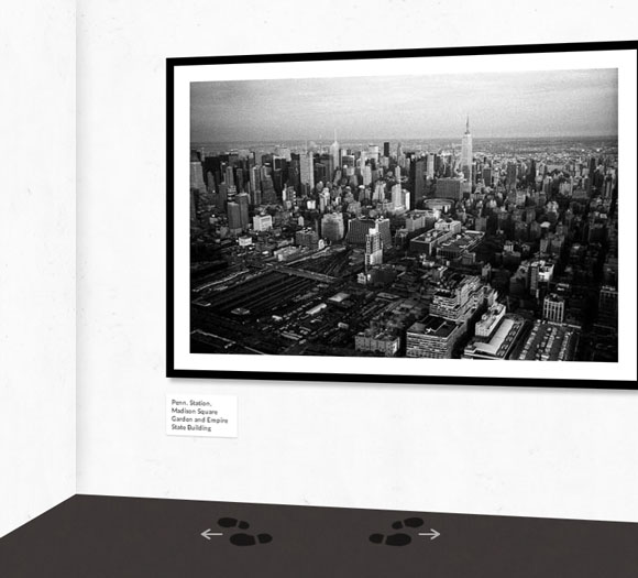
Let’s take a look at some screenshots. The gallery starts by looking at the first image which will be centered in the viewport. With a very large screen, we will be able to see the neighboring images as well, depending on the wall size of course:
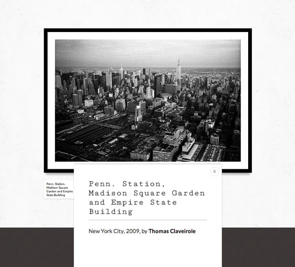
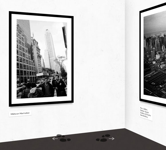
When clicking on the little description, a larger version will slide in from the bottom of the screen:
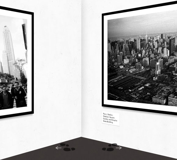
When clicking on a navigation arrow (we click to go to the right) we will move to the next or previous picture. When the end of the wall is reached, we’ll give a turn:
The next image is placed into another wall a positioned accordingly:
When we turn fully, the walls will be reset and we’ll again have only the main wall:
The biggest problem for these kind of extreme experiments is the different handling of 3D transforms in the browsers and of course the performance. When playing with extreme widths and perspective, there can be glitches in viewing because an element might be rotated “right into your face” 🙂 The larger the element is in width, the higher the perspective value needs to be (at least for Firefox).
Sadly, the performance suffers when adding something like a box shadow, so we have stripped the demos down to their bare style and not added too much fanciness. It does look a bit ugly, but we simply wanted to show the 3D effect and the smoothness is more important for us in this experiment.
Anyway, we hope you enjoyed this little experiment and find it inspiring!