
From our sponsor: Leverage AI for dynamic, custom website builds with ease.
Building a color scheme is a lot like building a house or building; you need to start with a solid foundation, build your structure and then finish it off with a good coat of paint. There is a ton of tools out there that can help you build your color scheme but all too often designers forget the fundamentals – the basics. Avoid the “hey, that looks good.” mentality and let’s go over some of the basics to building a color scheme. That way you can be confident your color scheme has a solid foundation.
Set the Foundation: Selecting a Base Color
Finding the right base color for your color scheme is important, it truly is the foundation for any color scheme and it can heavily impact your design as a whole. A base color will represent your design, it will create the mood of the design and can determine the user’s first impression of what your design or website is.
Make sure that when you are selecting the base color that you select a color that represents your project and that it represents the purpose and meaning for what you are trying to accomplish or what your user is trying to accomplish. Colors have meanings and users will assign meaning to your website or project based upon what colors they see and what these colors mean to them.
Black
 Black is generally associated with negative things like death, darkness or evil but it also represents elegance, power, strength or prestige. Black can make a great base color for your color scheme because it contrasts really well with almost every other color including bright colors and it is a great anchor for any color scheme. But be careful when using black in large quantities, it tends to make text harder to read and can be hard on the eyes when viewing for long periods of time.
White
 A white color scheme can represent cleanliness, purity, perfection and space. It makes a great base color because it contrasts well with any color just as black does, but it doesn’t overwhelm the contrasting color making it easier on the eyes. White is a great color for charities, religious groups or volunteer organizations because of its clean and pure representation and it makes a great background color to showcase art and photography for a portfolio site. If you are looking for a clean design with plenty of negative space, play around with white more.
Red
 A red color scheme is bold, fiery, aggressive and screams for your attention. Since red is such and strong, passionate color, it makes a great call-to-action color and can convince the user. Red pops out of the design against pretty much any other color – including black. Color is also associated with energy and so red can also be effective in moving the users eye and can be used for very high energy, high impact color schemes and designs. Red is a really powerful marketing color that can be used to grab the user’s attention and get them to click on an ad or register for a product.
Orange
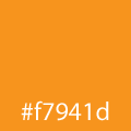 An orange color scheme speaks happiness. It’s a tropical color that is often associated with joy, passion and energy minus the aggression of red. Orange is a very friendly color, a warm color that is inviting and can be another very effective color for call-to-actions. Orange also has one of the highest visibility rates so elements that contain orange will stand out and grab the user’s attention and can effectively highlight important elements of any design.
Yellow
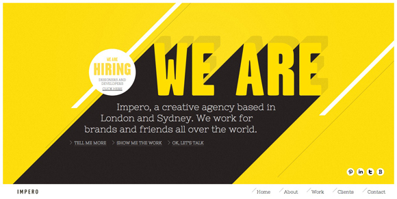
 Yellow mean happiness, it’s bright, airy and playful. A yellow color scheme can create warmth and comfort and can be a great contrasting color for darker colors like blacks and greys. Yellow makes a great highlight color for showing off important elements and grabbing the user’s attention without whacking them over the head with red. However, large quantities of yellow will enhance its unpredictability, so if you’re looking for a safe, stable color scheme avoid heavy uses of yellow.
Green
 A green color scheme is peaceful and natural and is usually associated with growth, harmony, peace, strength and stability. Green is a great base color for creating a calming design because it’s the most restful color on the human eye. Since green is the opposite of red, it portrays a feeling of safety and trust rather than danger and this makes it great when designing for corporations, banks and other financial institutions.
Blue
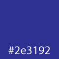 Blue means stability and depth and is a great color for creating a calm clean environment. Blue symbolizes confidence, faith, hope, wisdom, knowledge and trust. Blue is also generally preferred by males so it’s a great corporate branding color. However, blue is not a good color for grabbing the user’s attention because it doesn’t stand out as much against contrasting colors. Another interesting point abut blue is that it suppresses the appetite so don’t use it when trying to sell any food products.
Raise the Frame: Color Harmonies
Color harmonies are color combinations or a color scheme that is built using the almighty color wheel. Color harmonies aren’t real scientific, they are actually pretty easy to follow and they are a great guide to finding out what color scheme is going to work best. Most online color scheme tools use color harmonies to build color schemes so it’s a good idea to know a little about what they are and how they are created.
The most used color harmonies are:
- Monocromatic
- Complementary
- Triadic
- Tetradic (compound or split complementary)
- Analogous
Monochromatic
This color harmony is built by using differing shades and saturation levels of one particular color, sounds boring, huh? Well it’s not. Monochromatic color schemes are really simple, easy to manage color schemes. They tend to be more polished or elegant and are great for creating a particular mood or just adding some color to a black and white scheme.
The only real problem with monochromatic schemes is that they can be very plain due to the lack of contrast. If you think your monochromatic color scheme is too bland try out an analogous color scheme. This way you can add some contrast without losing the simple polish.
Complementary
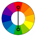 If you need a really powerful contrast, you’ll want to use a complementary color scheme. Basically, the complementary color scheme is two color families that are opposite of each other on the color. For example, if your key color is green, then red would be its complement. Complementary color schemes are great if you really want high contrast and are best used if your complement is used more as an accent color where your key color is more dominant.
The high contrast of the complement color scheme is great if you need your scheme to be highly visible, but it can be somewhat obnoxious if you are looking for something more subtle and elegant. Sporting teams tend to use complementary color schemes for uniforms or logos. Complementary harmonies are also popular in advertising.
Triadic
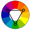 Triadic color schemes are built on three color families that are evenly spaced along the color wheel. These schemes have good contrast while also maintaining the harmony that the complementary color scheme lacks. Like the complementary color scheme, it’s best to select one dominant color that is used more heavily than the other two colors.
If you are looking for the vibrancy and contrast of a complementary color scheme but still want the same unity the monochromatic color scheme offers, then the triadic or tetradic color scheme is probably what you’ll need.
Tetradic (compound or split complementary)
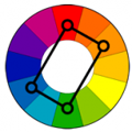 The tetradic, AKA the double complementary color scheme uses 4 color families to form a rectangle on the color wheel. It is basically made up of 2 complementary pairs so it’s a very vibrant color scheme as well as balanced, if you can balance it. The tetradic color scheme can be difficult to balance so it’s a good idea to let one color family dominate over the other three colors.
Analogous
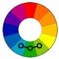 This color scheme uses three or more color families that sit next to each other on the color wheel and are great if you are looking to create a calming, comfortable color scheme. This color scheme is found in nature and is very unifying and please to the eye. But, it’s not the color scheme you want if your looking for high contrast, although it creates more contrast then the monochromatic color scheme.
When using the analogous color scheme, it is best to select a dominant color, with a supporting color of the same color family and then the third color should be used to complement the other two. Example: if green is dominant use greenish-yellow to support and blue for contrast.
Do the Finish Work: Tones, Shades and Tints
The final polish of any color scheme is selecting the right tone, shades and tints for each color in the scheme. Generally, you’ll want to stick with the same tones, shades and tints within the color scheme to unify the colors. But it’s not illegal to experiment with differing tones or tints within a color scheme. Tones, shades and tints are often confused or talked about as being the same, but they are not.
Tint
The tint of any color is basically just how light the color is from its pure hue. To lighten the tone of any color simply add more white to the color.
Shade
The shade of a color is simply how dark the color is from its pure color hue. Add black the color if you want to achieve a deeper shade of that color.
Tone
The tone of a color is how light and dark a color is, as well as warm or cool a color is from its pure hue. Adding grey to a color will add a cooler tone or subtracting grey will create a more warm tone.
Enjoy!
Base color, harmony, tones, shades and tints are all hugely important to constructing your color scheme. Each concept can drastically change what you are trying to say with your web site design so instead of just winging it with Kuler, or finding a theme from colorschemer, why not try to build your next color scheme from the ground up? If anything, it will be real fun to experiment with a little color.






Nice one! Thanks
Nice article 🙂
Always is difficult to create the almost perfect color scheme, but knowing this is much easier… thanks!
P.S.: kuler link is pointing to another website
Wooo ! This is the most brilliant color overview I have never read 🙂
Everything is clear, Well done !
Thanks for the kind words! Much appreciated.
Wow! I was searching for it for long time.
This is really good material. I’m definitely gonna use this template!
Cheers!
Great article…. thanks !!!
Great article, exactly what I was looking for… thanks!!
Very well done Patrick, great article, thank you!
excellent article, thanks.
Very well written…!!! 🙂
I wish creating or even selecting a colour scheme/palette was as intuitive and simple as this awesome article was. Sigh!
Ha, ya, I feel the same way most of the time – but I’ve found that when I get bogged down it’s best to return back to basics.
Fantastic article this stuff goes way back before the internet nice to see the knowledge is not lost. My only comment is what is “winging” it about kuler? The create side of it is a marvellous tool that illustrates, and calculates, the colour rules you have documented:
I find this a fantastic tool for building your own colour scheme in exactly the way that you mention by starting with a colour and working up.
+1 for Kuler create.
Ya, Kuler is a great tool! I wasn’t trying to get down on it I use it all the time. I just meant that it’s kind of easy use these tools to just find a color scheme with out really any thought to how/why the color scheme works or not. It is such a great tool that I feel like we all need to know a bit more about color scheme creation and relationships to really take advantage of it. It’s truly a wonderful tool for building color schemes and playing around.
I usually stick to monochromatic schemes built with tools like colllor.com.
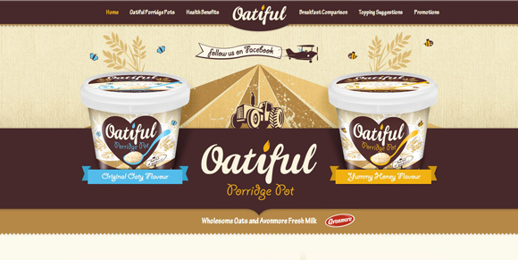
Hi ! Thanks for this article ! I love your website ! But I noticed that the link to “Kuler” in the last paragraph is not good… It’s redirect to oatiful.ie… 😉
I’m mostly a fan of monochromatic and triadic color schemes, but I really enjoy the work that goes into finding the right scheme for the right situation. I love that it isn’t always the obvious one. Of course, with the global nature of the web, we should also be aware of what certain colors mean in different cultures. Not to the point of obsession, but it’s significant enough to consider in our designs.
That is very true. We do need to keep in mind who our audience is when we create color schemes, don’t want to offend an entire audience out of ignorance, especially if it’s just a simple color change or something. Thanks for the info!
Working with color has always been hard for me, thanks for explaining all the terminology and giving a great intro to color!
Thank for this good article, this is what I need. Ctrl+D
Well done Patrick! Now this’s one of my favourite posts!
Good work. That said, i have my doubts about what you said about RED color. I don’t think its usage is suggested for call to action buttons as it is often a negative color, signifying danger in day to day life. To tell the truth, that is what i read and logic favors the point. Rest, article is fine.
I liked this article Patrick. I usually go for some shades of gray, and then a brighter highlight color. It always seems to work well.
I’ve had this page open in one of my 30 tabs for months since I really wanted to read it and never got a chance and I just did.
This was a very nice review. I’d love to see more articles like these in the future that also could help people like me with color deficiencies.
Good article and I actually may write an article about the topic I just mentioned.