From our sponsor: Leverage AI for dynamic, custom website builds with ease.
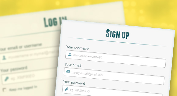
In this tutorial we are going to create two HTML5 forms that will switch between login and registration using the CSS3 pseudo class :target. We will style it using CSS3 and an icon font. The idea behind this demo is to show the user the login form and provide a link to “switch” to the registration form.
Note that this is for demo purpose only, it will only work in browser supporting the :target pseudo class, and you should not use this code on a live website without providing solid fallback.
In the following, we will be going through Demo 1.
The HTML
In the HTML, we will put both forms, hiding the second one with CSS. Here is the code, I’ll explain some of the interesting parts later.
<div id="container_demo" >
	<!-- hidden anchor to stop jump http://www.css3create.com/Astuce-Empecher-le-scroll-avec-l-utilisation-de-target#wrap4  -->
	<a class="hiddenanchor" id="toregister"></a>
	<a class="hiddenanchor" id="tologin"></a>
	<div id="wrapper">
		<div id="login" class="animate form">
			<form  action="mysuperscript.php" autocomplete="on">
				<h1>Log in</h1>
				<p>
					<label for="username" class="uname" data-icon="u" > Your email or username </label>
					<input id="username" name="username" required="required" type="text" placeholder="myusername or mymail@mail.com"/>
				</p>
				<p>
					<label for="password" class="youpasswd" data-icon="p"> Your password </label>
					<input id="password" name="password" required="required" type="password" placeholder="eg. X8df!90EO" />
				</p>
				<p class="keeplogin">
					<input type="checkbox" name="loginkeeping" id="loginkeeping" value="loginkeeping" />
					<label for="loginkeeping">Keep me logged in</label>
				</p>
				<p class="login button">
					<input type="submit" value="Login" />
				</p>
				<p class="change_link">
					Not a member yet ?
					<a href="#toregister" class="to_register">Join us</a>
				</p>
			</form>
		</div>

		<div id="register" class="animate form">
			<form  action="mysuperscript.php" autocomplete="on">
				<h1> Sign up </h1>
				<p>
					<label for="usernamesignup" class="uname" data-icon="u">Your username</label>
					<input id="usernamesignup" name="usernamesignup" required="required" type="text" placeholder="mysuperusername690" />
				</p>
				<p>
					<label for="emailsignup" class="youmail" data-icon="e" > Your email</label>
					<input id="emailsignup" name="emailsignup" required="required" type="email" placeholder="mysupermail@mail.com"/>
				</p>
				<p>
					<label for="passwordsignup" class="youpasswd" data-icon="p">Your password </label>
					<input id="passwordsignup" name="passwordsignup" required="required" type="password" placeholder="eg. X8df!90EO"/>
				</p>
				<p>
					<label for="passwordsignup_confirm" class="youpasswd" data-icon="p">Please confirm your password </label>
					<input id="passwordsignup_confirm" name="passwordsignup_confirm" required="required" type="password" placeholder="eg. X8df!90EO"/>
				</p>
				<p class="signin button">
					<input type="submit" value="Sign up"/>
				</p>
				<p class="change_link">
					Already a member ?
					<a href="#tologin" class="to_register"> Go and log in </a>
				</p>
			</form>
		</div>

	</div>
</div>
We’ve added some HTML5 goodness here and used some of the new inputs. The input type=password automatically hides what the user is typing and replaces it with dots (depending on browser). The input type=email enables the browser to check if what the user entered has the format of a valid email address. We’ve also used the require=required attribute; browsers that support this attribute will not let the user submit the form until this field is filled, no JavaScript required.
The autocomplete=on attribute will prefill values based on earlier user input. We also used some nice placeholders for the inputs that will show some guiding value when the input is not filled.
Now the two tricky parts. You might have noticed the two <a href> links at the top of the form. This is a little trick that will make our form behave nicely when playing with anchors, so that it won’t “jump” on long pages when we click on the switching link and trigger the :target pseudo-class.
The second little trick is related to the use of the icon font. We will be using a data-attribute to display the icons. By setting data-icon=”icon_character” with the according character in the HTML we will just need one CSS attribute selector to style all the icons. Read more about this technique on 24 Ways: Displaying Icons with Fonts and Data- Attributes.
The CSS
For the clearness of the code in this tutorial, I will omit all the vendor prefixes, but you will, of course, find them in the files. Once again, I’m using some pretty advanced CSS3 tricks that might not work in all browsers. Let’s get started.
Styling both forms using CSS3
First, let’s give our two forms some general styling for the container.
#subscribe,
#login{
	position: absolute;
	top: 0px;
	width: 88%;
	padding: 18px 6% 60px 6%;
	margin: 0 0 35px 0;
	background: rgb(247, 247, 247);
	border: 1px solid rgba(147, 184, 189,0.8);
	box-shadow:
		0pt 2px 5px rgba(105, 108, 109,  0.7),
		0px 0px 8px 5px rgba(208, 223, 226, 0.4) inset;
	border-radius: 5px;
}
#login{
	z-index: 22;
}
We’ve added a nice box shadow that’s made of two shadows: an inset one to create the inner blue glow, and an outside shadow. We’ll explain the z-index in a bit.
In the following we will style the header with some background clipping:
/**** general text styling ****/
#wrapper h1{
	font-size: 48px;
	color: rgb(6, 106, 117);
	padding: 2px 0 10px 0;
	font-family: 'FranchiseRegular','Arial Narrow',Arial,sans-serif;
	font-weight: bold;
	text-align: center;
	padding-bottom: 30px;
}

/** For the moment only webkit supports the background-clip:text; */
#wrapper h1{
	background:
	-webkit-repeating-linear-gradient(-45deg,
		rgb(18, 83, 93) ,
		rgb(18, 83, 93) 20px,
		rgb(64, 111, 118) 20px,
		rgb(64, 111, 118) 40px,
		rgb(18, 83, 93) 40px);
	-webkit-text-fill-color: transparent;
	-webkit-background-clip: text;
}

#wrapper h1:after{
	content:' ';
	display:block;
	width:100%;
	height:2px;
	margin-top:10px;
	background:
		linear-gradient(left,
			rgba(147,184,189,0) 0%,
			rgba(147,184,189,0.8) 20%,
			rgba(147,184,189,1) 53%,
			rgba(147,184,189,0.8) 79%,
			rgba(147,184,189,0) 100%);
}
Note that at this moment only webkit browsers support background-clip: text, so we will create a stripped background only for webkit here, and clip it to the text to add the stripes to the H1 title. Since the background-clip: text property currently only works in Webkit browsers, I decided to go only with the webkit prefix. That’s the reason why I split the CSS declaration into two parts, and use a webkit prefixed gradient only. Only using the –webkit- prefix is bad practice, it’s only for demo purpose, and you should never do this on real a website! That’s also where the -webkit-text-fill-color: transparent comes in handy: it enables us to only have a transparent background on the webkit browsers, all the other ones will ignore it and give us the provided text color fallback.
We also created a fading line under the title with the help of the :after pseudo-class. We use a 2px height gradient and fade the background to 0 opacity at both ends.
Now let’s style our inputs and give them a nicer look.
/**** advanced input styling ****/
/* placeholder */
::-webkit-input-placeholder  {
	color: rgb(190, 188, 188);
	font-style: italic;
}
input:-moz-placeholder,
textarea:-moz-placeholder{
	color: rgb(190, 188, 188);
	font-style: italic;
}
input {
  outline: none;
}
First we style the inputs, and remove the outline. But be careful here; the outline helps the user know which input is focused, so if you remove it, you should provide some :active and :focus states for the inputs.
/* all the input except submit and checkbox */
#wrapper input:not([type="checkbox"]){
	width: 92%;
	margin-top: 4px;
	padding: 10px 5px 10px 32px;
	border: 1px solid rgb(178, 178, 178);
	box-sizing : content-box;
	border-radius: 3px;
	box-shadow: 0px 1px 4px 0px rgba(168, 168, 168, 0.6) inset;
	transition: all 0.2s linear;
}
#wrapper input:not([type="checkbox"]):active,
#wrapper input:not([type="checkbox"]):focus{
	border: 1px solid rgba(91, 90, 90, 0.7);
	background: rgba(238, 236, 240, 0.2);
	box-shadow: 0px 1px 4px 0px rgba(168, 168, 168, 0.9) inset;
}
Here we used the :not pseudo class, to style all inputs, except the checkbox. I provided a :focus and :active state, since I decided to remove the outline.
And now the fun part: the icon font. Since we can’t use :before and :after pseudo classes on inputs, we’ll have to cheat a little bit: we’ll add the icon to the label, and then place it in the input. I’m using the fontomas library which puts together some nice icons. You can rearrange them to set the icon to a specific letter. Remember the data-icon attribute? It’s where you should put the letter. I used data-icon=’u’ for user, ‘e’ for email, ‘p’ for password. Once I chose the letters, I downloaded the font, and used the fontsquirrel font generator to transform it into a @font-face compatible format.
@font-face {
    font-family: 'FontomasCustomRegular';
    src: url('fonts/fontomas-webfont.eot');
    src: url('fonts/fontomas-webfont.eot?#iefix') format('embedded-opentype'),
         url('fonts/fontomas-webfont.woff') format('woff'),
         url('fonts/fontomas-webfont.ttf') format('truetype'),
         url('fonts/fontomas-webfont.svg#FontomasCustomRegular') format('svg');
    font-weight: normal;
    font-style: normal;
}

/** the magic icon trick ! **/
[data-icon]:after {
    content: attr(data-icon);
    font-family: 'FontomasCustomRegular';
    color: rgb(106, 159, 171);
    position: absolute;
    left: 10px;
    top: 35px;
	width: 30px;
}
Yeah, that’s it folks, you don’t need to have a class for each icon. We used content: attr(data-icon) to retrieve the letter from the data-icon attribute, so we only have to declare the font, choose a nice color and position it.
Now let’s style the submit button for both forms.
/*styling both submit buttons */
#wrapper p.button input{
	width: 30%;
	cursor: pointer;
	background: rgb(61, 157, 179);
	padding: 8px 5px;
	font-family: 'BebasNeueRegular','Arial Narrow',Arial,sans-serif;
	color: #fff;
	font-size: 24px;
	border: 1px solid rgb(28, 108, 122);
	margin-bottom: 10px;
	text-shadow: 0 1px 1px rgba(0, 0, 0, 0.5);
	border-radius: 3px;
	box-shadow:
		0px 1px 6px 4px rgba(0, 0, 0, 0.07) inset,
		0px 0px 0px 3px rgb(254, 254, 254),
		0px 5px 3px 3px rgb(210, 210, 210);
	transition: all 0.2s linear;
}
#wrapper p.button input:hover{
	background: rgb(74, 179, 198);
}
#wrapper p.button input:active,
#wrapper p.button input:focus{
	background: rgb(40, 137, 154);
	position: relative;
	top: 1px;
	border: 1px solid rgb(12, 76, 87);
	box-shadow: 0px 1px 6px 4px rgba(0, 0, 0, 0.2) inset;
}
p.login.button,
p.signin.button{
	text-align: right;
	margin: 5px 0;
}
The trick here is to use the box-shadow in order to create some extra borders. You can only use one border, but as many box-shadows as you want. We will use the length value to create a “fake” second white border, 3px wide, with no blur.
Then we’ll style the checkbox, nothing very special here:
/* styling the checkbox "keep me logged in"*/
.keeplogin{
	margin-top: -5px;
}
.keeplogin input,
.keeplogin label{
	display: inline-block;
	font-size: 12px;
	font-style: italic;
}
.keeplogin input#loginkeeping{
	margin-right: 5px;
}
.keeplogin label{
	width: 80%;
}
We will style the bottom of the form using repeating linear gradients to create a striped background.
p.change_link{
	position: absolute;
	color: rgb(127, 124, 124);
	left: 0px;
	height: 20px;
	width: 440px;
	padding: 17px 30px 20px 30px;
	font-size: 16px	;
	text-align: right;
	border-top: 1px solid rgb(219, 229, 232);
	border-radius: 0 0  5px 5px;
	background: rgb(225, 234, 235);
	background: repeating-linear-gradient(-45deg,
	rgb(247, 247, 247) ,
	rgb(247, 247, 247) 15px,
	rgb(225, 234, 235) 15px,
	rgb(225, 234, 235) 30px,
	rgb(247, 247, 247) 30px
	);
}
#wrapper p.change_link a {
	display: inline-block;
	font-weight: bold;
	background: rgb(247, 248, 241);
	padding: 2px 6px;
	color: rgb(29, 162, 193);
	margin-left: 10px;
	text-decoration: none;
	border-radius: 4px;
	border: 1px solid rgb(203, 213, 214);
	transition: all 0.4s  linear;
}
#wrapper p.change_link a:hover {
	color: rgb(57, 191, 215);
	background: rgb(247, 247, 247);
	border: 1px solid rgb(74, 179, 198);
}
#wrapper p.change_link a:active{
	position: relative;
	top: 1px;
}
Now you’ll notice that we’ve got two nice forms, but we really want only one to show at a time. So now is time for some animations!!
Creating the switching animation
The first thing to do is to hide the second form by setting the opacity to 0:
#register{
	z-index: 21;
	opacity: 0;
}
Remember that our login form had a z-index of 22? We will give the second form a z-index of 21, to put it “under” the login form.
And now the really good part: switching the forms using the :target pseudo class. What you really have to understand about :target, is that we will use anchors to make the transition. The normal behavior of an anchor link, is to jump to the target in the page. But we don’t want to jump anywhere, we only want to switch the forms. And here comes our trick using the two links at the top of the page. Instead of directly linking to the second form, and risking getting a “jumping” effect, we actually put the two links at the top of the page and give them display: none. This will avoid any page jump. Credit where credit’s due: I found this trick on CSS3 create (in French).
#toregister:target ~ #wrapper #register,
#tologin:target ~ #wrapper #login{
	z-index: 22;
	animation-name: fadeInLeft;
	animation-delay: .1s;
}
So this is what happens: when we click on the Join us button, we trigger the #toregister. We then do the animation, by using the sibling selector ~ to find our #register element. We use an animation called fadeInLeft. Since we “hide” the form using zero opacity, we will use an animation that fades in, to make it appear. We’ve also changed the z-index, to make it appear on top of the other form.
The same happens for the other form.
And here is the code for the animation. We are using the CSS3 animation framework from Dan Eden and adapted it for this tutorial.
.animate{
	animation-duration: 0.5s;
	animation-timing-function: ease;
	animation-fill-mode: both;
}
@keyframes fadeInLeft {
	0% {
		opacity: 0;
		transform: translateX(-20px);
	}

	100% {
		opacity: 1;
		transform: translateX(0);
	}
}
The form that is “disappearing” will have another animation which will make it fade out to the left:
#toregister:target ~ #wrapper #login,
#tologin:target ~ #wrapper #register{
	animation-name: fadeOutLeftBig;
}

@keyframes fadeOutLeft {
	0% {
		opacity: 1;
		transform: translateX(0);
	}

	100% {
		opacity: 0;
		transform: translateX(-20px);
	}
}
You can now use other animations from Dan Eden’s animate.css: just adjust your .animate class and replace the animation names. You will also find some custom animations at the end of the animate-custom.css file.
Well, that’s it folks. I hope you enjoyed the tutorial!
Please note, that in some browsers background-clip: text is not supported. In Internet Explorer 9 the transitions and animations don’t work, so there will be no fancy form switching. In Internet Explorer 8 and below the :target pseudo-class is not supported, so it won’t work at all (you’ll just see the login form).