From our sponsor: Leverage AI for dynamic, custom website builds with ease.
In the last few years, we’ve seen a lot of single page websites lying around the internet, most of them using JavaScript for some transitions effect. Well, now I’m gonna teach you how you can have your own, but instead I’ll be using CSS Transitions and the :target property to do all the magic.
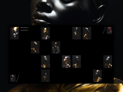
The Dribbble shots used in the demos are by Matt Kaufenberg. Check out his Dribbble profile or visit his An Illustration-a-Day Blog.
Markup
The HTML will contain five main divisions: a header and the four content sections. Each of the content sections is going to have an ID and the class panel. Moreover, we will add another division inside which will have the class content. The first content section which is #home will only have the content class and will not require an extra division:
<!-- Home -->
<div id="home" class="content">
	<h2>Home</h2>
	<p>Some content</p>
	<!-- ... -->
</div>
<!-- /Home -->

<!-- Portfolio -->
<div id="portfolio" class="panel">
	<div class="content">
		<h2>Portfolio</h2>
		<p>Some content</p>
		<!-- ... -->
	</div>
</div>
<!-- /Portfolio -->

<!-- About -->
<div id="about" class="panel">
	<div class="content">
		<h2>About</h2>
		<p>Some content</p>
		<!-- ... -->
	</div>
</div>
<!-- /About -->

<!-- Contact -->
<div id="contact" class="panel">
	<div class="content">
		<h2>Contact</h2>
		<p>Some content</p>
		<!-- ... -->
	</div>
</div>
<!-- /Contact -->
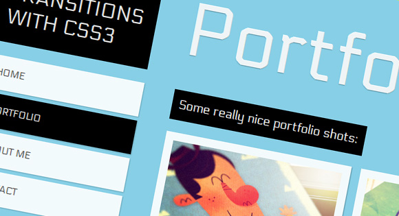
In the header we will have the main heading and the navigation:
<!-- Header with Navigation -->
<div id="header">
	<h1>Page Transitions with CSS3</h1>
	<ul id="navigation">
		<li><a id="link-home" href="#home">Home</a></li>
		<li><a id="link-portfolio" href="#portfolio">Portfolio</a></li>
		<li><a id="link-about" href="#about">About Me</a></li>
		<li><a id="link-contact" href="#contact">Contact</a></li>
	</ul>
</div>
The reason for having such an “unordered” structure by adding the header to the end, is that we make the navigation “reachable” using the general sibling selector (~), so that we can color the respective items differently.
Now, the main idea is to use the pseudo-class :target in order to add a transition to the current section. In this example, we will be sliding up and down our sections.
CSS
First we will give style to our header and the navigation. We want to keep these on the same spot at all the time, even though everything else will be moving.
#header{
	position: absolute;
	z-index: 2000;
	width: 235px;
	top: 50px;
}
#header h1{
	font-size: 30px;
	font-weight: 400;
	text-transform: uppercase;
	color: rgba(255,255,255,0.9);
	text-shadow: 0px 1px 1px rgba(0,0,0,0.3);
	padding: 20px;
	background: #000;
}
#navigation {
	margin-top: 20px;
	width: 235px;
	display:block;
	list-style:none;
	z-index:3;
}
#navigation a{
	color: #444;
	display: block;
	background: #fff;
	background: rgba(255,255,255,0.9);
	line-height: 50px;
	padding: 0px 20px;
	text-transform: uppercase;
	margin-bottom: 6px;
	box-shadow: 1px 1px 2px rgba(0,0,0,0.2);
	font-size: 14px;
}
#navigation a:hover {
	background: #ddd;
}
All the sections except #home have the panel class. Here we will be using the transition whenever an element with this class gets “targeted”. The trick is to use a negative margin in the “normal” class and no margin at all in the :target pseudo-class. Adding a transitions will make the panel slide from the top whenever one is “selected”:
.panel{
	min-width: 100%;
	height: 98%;
	overflow-y: auto;
	overflow-x: hidden;
	margin-top: -150%;
	position: absolute;
	background: #000;
	box-shadow: 0px 4px 7px rgba(0,0,0,0.6);
	z-index: 2;
	-webkit-transition: all .8s ease-in-out;
	-moz-transition: all .8s ease-in-out;
	-o-transition: all .8s ease-in-out;
	transition: all .8s ease-in-out;
}
.panel:target{
	margin-top: 0%;
	background-color: #ffcb00;
}
Next, let’s style the content class that all our sections have:
.content{
	right: 40px;
	left: 280px;
	top: 0px;
	position: absolute;
	padding-bottom: 30px;
}
.content h2{
	font-size: 110px;
	padding: 10px 0px 20px 0px;
	margin-top: 52px;
	color: #fff;
	color: rgba(255,255,255,0.9);
	text-shadow: 0px 1px 1px rgba(0,0,0,0.3);
}
.content p{
	font-size: 18px;
	padding: 10px;
	line-height: 24px;
	color: #fff;
	display: inline-block;
	background: black;
	padding: 10px;
	margin: 3px 0px;
}
In order to change the color of the current item in the navigation, we’ll use the :target pseudo-class with the general sibling selector to “get to” the respective navigation item:
#home:target ~ #header #navigation #link-home,
#portfolio:target ~ #header #navigation #link-portfolio,
#about:target ~ #header #navigation #link-about,
#contact:target ~ #header #navigation #link-contact{
	background: #000;
	color: #fff;
}
And that’s all you need. Check out the demos and you’ll see other examples of how you can do this.
Hope you liked this tutorial and maybe you can experiment with your own effects.
¡Hasta la próxima!