From our sponsor: Leverage AI for dynamic, custom website builds with ease.
Hola, amigos. For the last month or so, I’ve been experimenting with the power of CSS pseudo-elements, specially when it comes to mixing them with buttons and that way recreating some great effects that were only possible to do with sprites, in the past.
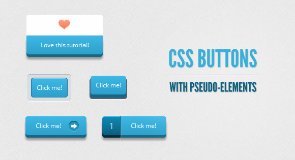
In this tutorial, I’ll show you how to create buttons with a twist, using just one anchor tag per button and the great power of CSS.
The font used is ‘Open Sans’ by Steve Matteson.
Disclaimer:
I’ll not be using CSS vendor prefixes in this tutorial or else it would be crazy long, but you will find them in the downloadable files.
I avoided CSS transitions since, right now, Firefox is the only browser that supports them on pseudo-elements. Plus, I believe that these buttons work just fine without them.
Markup
The structure of all these buttons needs just one anchor tag for it to work, since we will be creating the other elements with the ::before pseudo-class.
Click me!
Example 1

I think this is the easiest one, with a very regular CSS.
CSS
First of all, we will give the general style of the button, including its active state. It is important to notice the relative positioning, since it will help us later with the positioning of the ::before element:
.a_demo_one {
	background-color:#ba2323;
	padding:10px;
	position:relative;
	font-family: 'Open Sans', sans-serif;
	font-size:12px;
	text-decoration:none;
	color:#fff;
	border: solid 1px #831212;
	background-image: linear-gradient(bottom, rgb(171,27,27) 0%, rgb(212,51,51) 100%);
	border-radius: 5px;
}

.a_demo_one:active {
	padding-bottom:9px;
	padding-left:10px;
	padding-right:10px;
	padding-top:11px;
	top:1px;
	background-image: linear-gradient(bottom, rgb(171,27,27) 100%, rgb(212,51,51) 0%);
}
Then, we create the gray container using the ::before pseudo-element. Absolute positioning makes our life easier to, believe it or not, position our element:
.a_demo_one::before {
	background-color:#ccd0d5;
	content:"";
	display:block;
	position:absolute;
	width:100%;
	height:100%;
	padding:8px;
	left:-8px;
	top:-8px;
	z-index:-1;
	border-radius: 5px;
	box-shadow: inset 0px 1px 1px #909193, 0px 1px 0px #fff;
}
Example 2

This one is a little bit more complex because of the 3D’ish look. This button is outside of its ‘container’, but when you click it, it goes down:
CSS
.a_demo_two {
	background-color:#6fba26;
	padding:10px;
	position:relative;
	font-family: 'Open Sans', sans-serif;
	font-size:12px;
	text-decoration:none;
	color:#fff;
	background-image: linear-gradient(bottom, rgb(100,170,30) 0%, rgb(129,212,51) 100%);
	box-shadow: inset 0px 1px 0px #b2f17f, 0px 6px 0px #3d6f0d;
	border-radius: 5px;
}

.a_demo_two:active {
	top:7px;
	background-image: linear-gradient(bottom, rgb(100,170,30) 100%, rgb(129,212,51) 0%);
	box-shadow: inset 0px 1px 0px #b2f17f, inset 0px -1px 0px #3d6f0d;
	color: #156785;
	text-shadow: 0px 1px 1px rgba(255,255,255,0.3);
	background: rgb(44,160,202);
}
And here’s the tricky part:
Since the position of the pseudo-element depends on its parent, once the parent moves down a few pixels, you have to move up the pseudo-element that same amount of pixels.
.a_demo_two::before {
	background-color:#072239;
	content:"";
	display:block;
	position:absolute;
	width:100%;
	height:100%;
	padding-left:2px;
	padding-right:2px;
	padding-bottom:4px;
	left:-2px;
	top:5px;
	z-index:-1;
	border-radius: 6px;
	box-shadow: 0px 1px 0px #fff;
}

.a_demo_two:active::before {
	top:-2px;
}
Example 3
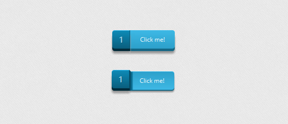
I think this one is my favorite since it was the first one I ever made this way and people seem to really like it. It is a divided button that “breaks” once you click it.
CSS
Again, the first thing we have to do is create the lighter part. In here, you’ll notice a right margin, this is in order to compensate for the width of the pseudo-element if you want to center the button. You don’t need it if that is not a problem for you.
.a_demo_three {
	background-color:#3bb3e0;
	font-family: 'Open Sans', sans-serif;
	font-size:12px;
	text-decoration:none;
	color:#fff;
	position:relative;
	padding:10px 20px;
	border-left:solid 1px #2ab7ec;
	margin-left:35px;
	background-image: linear-gradient(bottom, rgb(44,160,202) 0%, rgb(62,184,229) 100%);
	border-top-right-radius: 5px;
	border-bottom-right-radius: 5px;
	box-shadow: inset 0px 1px 0px #2ab7ec, 0px 5px 0px 0px #156785, 0px 10px 5px #999;
}

.a_demo_three:active {
	top:3px;
	background-image: linear-gradient(bottom, rgb(62,184,229) 0%, rgb(44,160,202) 100%);
	box-shadow: inset 0px 1px 0px #2ab7ec, 0px 2px 0px 0px #156785, 0px 5px 3px #999;
}
And then the pseudo-element’s CSS:
.a_demo_three::before {
	content:"·";
	width:35px;
	max-height:29px;
	height:100%;
	position:absolute;
	display:block;
	padding-top:8px;
	top:0px;
	left:-36px;
	font-size:16px;
	font-weight:bold;
	color:#8fd1ea;
	text-shadow:1px 1px 0px #07526e;
	border-right:solid 1px #07526e;
	background-image: linear-gradient(bottom, rgb(10,94,125) 0%, rgb(14,139,184) 100%);
	border-top-left-radius: 5px;
	border-bottom-left-radius: 5px;
	box-shadow:inset 0px 1px 0px #2ab7ec, 0px 5px 0px 0px #032b3a, 0px 10px 5px #999 ;
}

.a_demo_three:active::before {
	top:-3px;
	box-shadow:inset 0px 1px 0px #2ab7ec, 0px 5px 0px 0px #032b3a, 1px 1px 0px 0px #044a64, 2px 2px 0px 0px #044a64, 2px 5px 0px 0px #044a64, 6px 4px 2px #0b698b, 0px 10px 5px #999 ;
}
Example 4
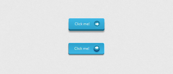
This time, we will use the pseudo-element as a pointer, using one image as a background, though you can use some of those great icon fonts.
CSS
.a_demo_four {
	background-color:#4b3f39;
	font-family: 'Open Sans', sans-serif;
	font-size:12px;
	text-decoration:none;
	color:#fff;
	position:relative;
	padding:10px 20px;
	padding-right:50px;
	background-image: linear-gradient(bottom, rgb(62,51,46) 0%, rgb(101,86,78) 100%);
	border-radius: 5px;
	box-shadow: inset 0px 1px 0px #9e8d84, 0px 5px 0px 0px #322620, 0px 10px 5px #999;
}

.a_demo_four:active {
	top:3px;
	background-image: linear-gradient(bottom, rgb(62,51,46) 100%, rgb(101,86,78) 0%);
	box-shadow: inset 0px 1px 0px #9e8d84, 0px 2px 0px 0px #322620, 0px 5px 3px #999;
}

.a_demo_four::before {
	background-color:#322620;
	background-image:url(../images/right_arrow.png);
	background-repeat:no-repeat;
	background-position:center center;
	content:"";
	width:20px;
	height:20px;
	position:absolute;
	right:15px;
	top:50%;
	margin-top:-9px;
	border-radius: 50%;
	box-shadow: inset 0px 1px 0px #19120f, 0px 1px 0px #827066;
}

.a_demo_four:active::before {
	top:50%;
	margin-top:-12px;
	box-shadow: inset 0px 1px 0px #827066, 0px 3px 0px #19120f, 0px 6px 3px #382e29;
}
Example 5
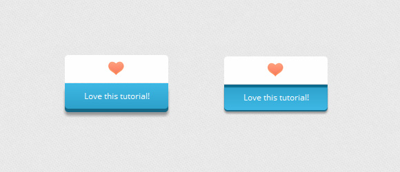
This example is a bit cheesy, I know, but you can use it in so many and really useful ways.
CSS
.a_demo_five {
	background-color:#9827d3;
	width:150px;
	display:inline-block;
	font-family: 'Open Sans', sans-serif;
	font-size:12px;
	text-decoration:none;
	color:#fff;
	position:relative;
	margin-top:40px;
	padding-bottom:10px;
	padding-top:10px;
	background-image: linear-gradient(bottom, rgb(168,48,232) 100%, rgb(141,32,196) 0%);
	border-bottom-right-radius: 5px;
	border-bottom-left-radius: 5px;
	box-shadow: inset 0px 1px 0px #ca73f8, 0px 5px 0px 0px #6a1099, 0px 10px 5px #999;
}

.a_demo_five:active {
	top:3px;
	background-image: linear-gradient(bottom, rgb(168,48,232) 0%, rgb(141,32,196) 100%);
	box-shadow: inset 0px 4px 1px #7215a3, 0px 2px 0px 0px #6a1099, 0px 5px 3px #999;
}

.a_demo_five::before {
	background-color:#fff;
	background-image:url(../images/heart.gif);
	background-repeat:no-repeat;
	background-position:center center;
	border-left:solid 1px #CCC;
	border-top:solid 1px #CCC;
	border-right:solid 1px #CCC;
	content:"";
	width:148px;
	height:40px;
	position:absolute;
	top:-30px;
	left:0px;
	margin-top:-11px;
	z-index:-1;
	border-top-left-radius: 5px;
	border-top-right-radius: 5px;
}

.a_demo_five:active::before {
	top: -33px;
	box-shadow: 0px 3px 0px #ccc;
}
In the end
And well, this is it, for now. Remember that these buttons are still kind of experimental, so not every browser supports them that well.
Thank you for reading this tutorial and I hope that you find it useful.


Thank you for this great tutorial.
Really like the button!
Great buttons, thanks.
Great works, fine buttons and clear design. The best, thanks so much :-).
Nice buttons 🙂 Thanks!
Thank you! it so beautiful!!
Awesome! I Just posted buttons like this moments ago. 🙂
Great man these are really awesome buttons
Incredible tutorial and effect is just awesome!
Thank you for that.
Really nice !
Love it !!!!
Thanks 😉
VERY nice effects at work here – I am now officially in love with the particular shades of blue 🙂
I do worry about CSS bloat with effects like this – not to mention the various shims, plugins, and conditionals that would be required to make them work (or at least degrade more gracefully) on more than just the best browsers.
Nice tutorial, real shame that not even Opera supports this fully… when the buttons are depressed and released, Opera kinda splits the button in half – I think it’s just not redrawing (I have turbo off). Unless I’m missing a vendor prefix somewhere?
Gutted that most of our customers are (enterprise) IE users – will be some time before I can use this kind of technique on the commercial sites :-/
WOW!!! what’s an amazing magic of CSS, am redesigning one of my client website and l will surely use of these.
The 1st button might do it, so l can escape browser issues. check my website to see if it works.
Old website: http://www.longlegbroadcast.com
New website: http://www.longlegbroadcast.com/web. these one is live but not finish. or search google. “ayo radio station”.
Thanks men keep it up.
sip….good
I just took your button CSS and combined with mine CSS and HTML to make a toggle function. NO JAVASCRIPT
http://webstutorial.com/html5-css3-toggle-slideup-slidedown/html-5
Is it possible to make these buttons vertical just with css?
Wow! I love the 3D buttons! 🙂
Check out my tutorial for CSS3 Google buttons http://liljosh.com/css3-google-buttons/
Good! Thanks!
very nice ! it looks so good ! it worked on <a> , but when I want to use it on input[type=”submit”] input[type=”button”] , I set appearance:none; but the ::before element won’t display -_- what’s the problem, thx~
Gracias! Excelentes botones. Me lo llevo porque me gustaron el ejemplo 4 y 5.
Saludos.
Hi there,
I am having trouble changing the color of the buttons. I know that it must be quite simple, but I just can’t figure it out.
Help?
Terrence
wooowww really love this post, I will add this on my site, thanks for sharing.
Wow really awesome 3D buttons with CSS only!.. looks very realistic
Hi there,
These buttons are really nice!
But whenever I change the colors of the buttons, it only seems to work in Chrome and Firefox, IE9 just keeps the standard blue color.
I know this is just an experiment, but maybe some can help to resolve this problem, or already has figured it out?
Greets,
yesse.
I found a sort of bug in Demo 2. If you put the button into a div with a background the ‘ .a_demo_two::before ‘ will disappear behind it. How can i fix this?
Very well done! It is amazing how underestimated the power of buttons on a site is. Adding little points of flare like this really do make or break a page. I will certainly be keeping up here at codrops to see what other nifty ideas you dream up…so helpful!
Wow…that’s great ! ^^
Very nice article, i like it!!!
How would you change the color? I mean I know how to in CSS, but whenever I try to make a red or green one the colors look off and not as good as the original blue one. Do you have any tips on how to do this?
this is superb!! if only I knew how to change the colors 🙁