From our sponsor: Leverage AI for dynamic, custom website builds with ease.
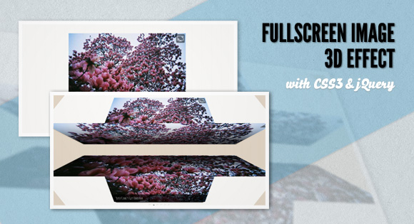
Today we want to share one of our CSS 3D Transforms experiments with you. The idea is to show an image’s fullscreen version by rotating two blocks in three-dimensional space. The faces of the blocks being rotated to the front will show the fullscreen image.
Please note that you can only see the cool 3d effect in a browser that supports those CSS3 properties (currently Chrome and Safari).
You can check out the video of the effect here: http://www.screenr.com/Onls
We’ll be using Modernizr in order to know if the browser supports the used CSS3 properties. For the ones that don’t we’ll use a simple fallback.
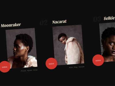
The images used in the demo are by Jeeheon. They are licensed under the Attribution 2.0 Generic (CC BY 2.0) License.
How it works
In our little experiment, we’ll add out images to a wrapper with the class fd-wrapper:
HTML
<div id="fd-wrapper" class="fd-wrapper">
	<img src="images/medium/1.jpg" data-bgimg="images/large/1.jpg" alt="image01" title="Love Will Tear Us Apart" />
	<img src="images/medium/2.jpg" data-bgimg="images/large/2.jpg" alt="image02" title="Just Can't Get Enough" />
	<img src="images/medium/3.jpg" data-bgimg="images/large/3.jpg" alt="image03" title="In a Manner of Speaking" />
	<img src="images/medium/4.jpg" data-bgimg="images/large/4.jpg" alt="image04" title="Guns of Brixton" />
	<img src="images/medium/5.jpg" data-bgimg="images/large/5.jpg" alt="image05" title="This Is Not a Love Song" />
	<img src="images/medium/6.jpg" data-bgimg="images/large/6.jpg" alt="image06" title="Making Plans for Nigel" />
</div>
The information about the fullscreen image’s path will be in the data-bgimg attribute.
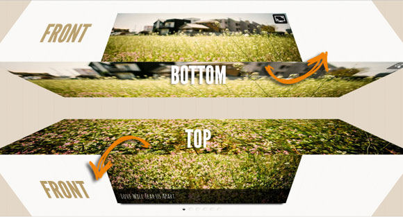
We’ll use the images in an HTML structure that we define in a jQuery template. That structure will consist of two boxes, an upper and a lower one, each having six faces of which the frontal ones are shown initially.
When we click on the icon to show the fullscreen image, the upper rectangle will rotate up, revealing its bottom face, while the lower box will rotate down, showing us its top face. The bottom face of the upper rectangle will have the upper part of the fullscreen image as a background image and the top face of the lower rectangle will have the lower part of it:
Options
There are the following default options:
current		: 0,
// index of current image

width		: 600,
// image's width

height		: 400,
// image's height

perspective	: 550,
// the webkit-perspective value

speed		: 750,
// rotation transition speed

easing		: 'ease-in-out',
// rotation transition easing

onLoad		: function() { return false; }
// fired when the slideshow is initialized
Don’t forget to check out the video of the effect here if your browser doesn’t support the CSS3 properties: http://www.screenr.com/Onls
We hope you like our little experiment and find it inspiring!

I love you guys!!!
Awesome effect, great work and it degrades nicely in Firefox too.
Awesome !!!
@Ralph this awessome animation works in your FF?? what version.
I use the last one 7.0.1 and it doesnt similar to chrome. Can anyone confirm that??
Great effect. Keep up the excellent work.
Doesn’t work on Firefox 7.0.1. Works on chrome, perfect job.
Haha you guys are amazing.
Cool effect!
Absolutely ridiculous. Love it……
Super
OMG, but not for FF, in Safari and chrome it´s look very nice. Nice work!!!!!
beautiful image 🙂
i have chrome , but when i press the icon i see the brown background??
all of your other effects in the website work?? update????
Nice effect. I m gr8 fan of ur site…
..:)
Its not getting minimized to small on MAC Chrome 🙁
On safari on mac when you click on bullets don’t make animation. Nice work… like always
Very pleasant effect, the best congratulations.
@Pedror: with degrades, I meant that it didn’t break or anything like that in FF. Just the the big photo as fallback.
finally managed to see the effect in Safari, because in Opera, FF and Chrome i had no chance. is looking very good.
you are crazy man fantastic !!!
Chrome 15.0.874.106 fails to display the amazing effect.
I can see the brown background once I click the “full screen” button on the top right corner.
Same problem as @9ALE7 above.
I have chrome 15.0.874.106 and works! I see 3d effect. Very nice! Firefox 7.0.1 works good but no 3d effect. Great work!
just like bladeleaf,
i can’t see the effect . . .
chrome 15.0.874.106
i see just the brown background.
In FF on Mac there is a 1px line at the center of the image.
Great work, only works in Safari. Way to go!
http://www.screenr.com/XkDs 🙂
@PEDRO BOTELHO
I never had a doubt that it didn’t work with google chrome when you were testing it, but i still just get the brown background. I’m sorry i don’t have the time to make a video to show you. I would really like to know if this is some google chrome bug, whatever.
I saw the video you made, the effect looks amazing, it’s elegant and very usable in my opinion.
@PEDRO BOTELHO
if it helps, with this example it’s the same, i only see the fallback, not the actual 3d-effect, even though i am using the latest chrome version.
http://tympanus.net/Development/Slicebox/index2.html
Not working for me. I’m under Chrome 15 in linux.
Absolutely loved it. You guys never cease to amaze. 🙂
Great effort looking forward to work in IE lower versions , simply great man
nice…
That’s nice, awesome. I hope other browsers(firefox,ie, opera) will adopt the html5 and css3 properties soon, then we all can use this magic uses of the new web techs
very nice….but only on Safari, with Chrome 16.0.912.77 don’t work, only brown background
Chrome 17.0.963.56 m – zoom out doesn’t work 🙁