From our sponsor: Leverage AI for dynamic, custom website builds with ease.
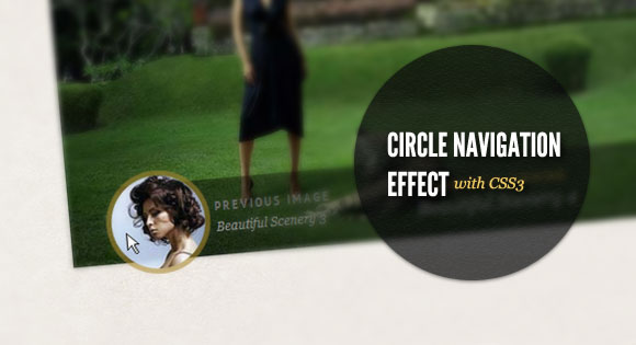
Today we want to show you how to create a beautiful hover effect for an image navigation using CSS3. The idea is to expand a circular navigation with an arrow and make a bubble with a thumbnail appear. In our example we will be showing the thumbnail of the next and previous slider image on hovering the arrows. The effect is done with CSS3 transitions.
The beautiful images are by Andrey & Lili and they are licensed under the CC BY-NC 3.0 License.
The Markup
For this little CSS3 effect we will have a navigation structure that looks like the following:
<div class="cn-nav">
	<a href="#" class="cn-nav-prev">
		<span>Previous</span>
		<div style="background-image:url(../images/thumbs/1.jpg);"></div>
	</a>
	<a href="#" class="cn-nav-next">
		<span>Next</span>
		<div style="background-image:url(../images/thumbs/3.jpg);"></div>
	</a>
</div>
In our demo we will make a jQuery template out of this and dynamically add the thumbnails for the previous and next images of the slider. But to show you how the expanding circle effect is done, we will only show you this part.
The CSS
Let’s see now, how to add the style for this navigation.
Assuming that we have some relative surrounding container, we will set the link elements’ position to absolute. The height and width will be 70 pixels so that we have a not too small area for the hover effect:
.cn-nav > a{
    position: absolute;
    top: 0px;
    height: 70px;
    width: 70px;
}
a.cn-nav-prev{
    left: 0px;
}
a.cn-nav-next{
    right: 0px;
}
The span element, which will contain the arrows as a background image will have an initial height and width of 46 pixel. In order to make it look like a circle, we need to set the border radius to half of its width/height. With the 50% and negative margin trick, we set it into the center of the link element. Then we define the transition which will take all properties into account with a duration of 400ms and with ease as the easing function:
.cn-nav a span{
    width: 46px;
    height: 46px;
    display: block;
    text-indent: -9000px;
    -moz-border-radius: 23px;
    -webkit-border-radius: 23px;
    border-radius: 23px;
    cursor: pointer;
    opacity: 0.9;
    position: absolute;
    top: 50%;
    left: 50%;
    background-size: 17px 25px;
    margin: -23px 0 0 -23px;
    -webkit-transition: all 0.4s ease;
	-moz-transition: all 0.4s ease;
	-o-transition: all 0.4s ease;
	-ms-transition: all 0.4s ease;
	transition: all 0.4s ease;
}
The spans’ background image (righ and left arrow):
.cn-nav a.cn-nav-prev span{
    background: #666 url(../images/prev.png) no-repeat center center;
}
.cn-nav a.cn-nav-next span{
    background: #666 url(../images/next.png) no-repeat center center;
}
The div with the thumbnail as background image is initially going to have a height and width of 0 pixel. It’s going to be absolute and also positioned in the center of the link element. Border radius and margins are going to be 0 initially. The background image will fill all the element, hence we will give the background-size of 100% width and height. The transition for this element will be for all properties with a duration of 200ms and with the ease-out easing function:
.cn-nav a div{
    width: 0px;
    height: 0px;
    position: absolute;
    top: 50%;
    left: 50%;
    overflow: hidden;
    background-size: 100% 100%;
    background-position: center center;
    background-repeat: no-repeat;
    margin: 0px;
    -moz-border-radius: 0px;
    -webkit-border-radius: 0px;
    border-radius: 0px;
    -webkit-transition: all 0.2s ease-out;
	-moz-transition: all 0.2s ease-out;
	-o-transition: all 0.2s ease-out;
	-ms-transition: all 0.2s ease-out;
	transition: all 0.2s ease-out;
}
Now, let’s define what the elements will look like on hover.
The span will increase to 100 pixels in width and height and accordingly, we will set the negative margins and the border radius to half of that. We’ll increase the size of the background image a little bit. Additionally, we’ll change the background color and the opacity:
.cn-nav a:hover span{
    width: 100px;
    height: 100px;
    -moz-border-radius: 50px;
    -webkit-border-radius: 50px;
    border-radius: 50px;
    opacity: 0.6;
    margin: -50px 0 0 -50px;
    background-size: 22px 32px;
    background-color:#a8872d;
}
And finally, the little thumbnail div element will expand to 90 pixels, so that we can still see the span element around, appearing as a border to the thumb. We’ll also increase the background size a bit and set the negative margins and the border radius to half of the element’s width:
.cn-nav a:hover div{
    width: 90px;
    height: 90px;
    background-size: 120% 120%;
    margin: -45px 0 0 -45px;
    -moz-border-radius: 45px;
    -webkit-border-radius: 45px;
    border-radius: 45px;
}
And that’s it! A slick effect with CSS3 only! Check out the demo to see how it looks integrated in a slider with showing the previous and next thumbail (with a modern browser, sorry IE9 is not included)! I hope you enjoyed this little tutorial and find it useful.


Just a big THANK YOU Mary Lou !!! It’s perfect !
wow simple idea, big impact. you rock Manoela!
Completely awesome!
I can’t express with words my incredibly astonishment. All you are effin awesome.
Thanks a lot and keep doing that good work!
(I could marry any of your articles anytime. Anytime.)
Are you a Goddess?
awesome trick, out of words..thanks for the tutorial..it` just mind blowing 🙂
100% CSS.. Sugoi/Amazing
This is fantastic!
Absolutely Awesome!
One word: FANTASTIC!
Really nice concept!!.
Hover Effect is just like flash animation effect
Great!!. Awesome navigation
Really Amazing…Nice work…
Hi
Thanks for nice tutorial as always.
But som font don’t render in Safari for me, where is problem?
Even in IE7 renders ok: http://www.webpagetest.org/result/111010_KE_1VACW/1/screen_shot/
In Safari looks like this: https://skitch.com/e-sach/f9tx7/circle-in-safari
Whaohhhhhhhhhhhhhhhhh
Amazing, thank you Mary Lou!
Love it as always
Really!!
This is just another incredible idea, you just rock!
Thank so much for such great inspiration and scripts.
You left my mouth open!
Really,
very nice effect!
Welldone Mary Lou 🙂
thanks for sharing!
Wooahh, looks very nice and original!
Thank you Mary. Your tuts are amazing.
Nice tutorial. Good work.
Hi Mary Lou!
Thank you for your superb tutorials!! hehe.. :))
Thank you for this… will be perfect for a new project I’m developing in my head. Except, instead of hot chicks, the pictures are of trash men…. hahaha. Guess it’s something I’ll have to get opinions on when I’m done.
Thank you! Nice work 🙂
Very nice tutorial
i think, this is can be more blink² with Swipe/Shimmer Effect With CSS Transitions by NealGrosskopf
awesome \m/
ty mary lou ?
Simply fantastic Mary
very nice tutorial .:-)
It works in IE9!
There was a comment about it not working in Safari, I just checked and it looks fine in Safari.
Which slider did you use. Did you have a tutorial for a slider, like the slider you used in this demo?
Awesome job, by the way!
Very nice, interesting and in step with actual practice! Awesome idea and thx for sharing!
Thank you, Mary Lou!
los mejores tutoriales…que he visto..;)
Thank you
It is great
Nice Mary ^_^
Un-Freakin’-Believable!
This ROCKS!!!
I’ve been following you guys for a while now, and this is pushing limits!
Rock On!
Excellent tutorial, very nice effects too.
How in this example to make slideshow automatically?
for wordpress???? there is a problem..in gallery the thumbmail don’t view…sorry for my english
impressive!
is there any option to make it auto play?
This is awesome. Thank You.
This is very impressive effect! Love it & tnx for sharing this!
…css3 is so cool 🙂
LMdigital
Thank you, Mary Lou!
It is great
Please how to make loop AutoPlay
Hi
I want insert this css3 gallery in other html, but i dont know how can i do this.
If you can help me, please
Thanks
Hi. thanks for this lovely tutorial.. one thing.. i wanted to remove this..Previous image
Currently viewing
Next image.. but unable to find anywere in the code.. could you highlight were i can find this
Hi,
It’s great but I would like to include a link on each pic of the slideshow, to allow images to be clicked ? How is it possible to do this ? Could you help ?
Thanks
@LEWER
That part of the code is in the header of the index page. Just delete those div tags
As someone else mentioned; Do you think you could show us how to make the images or the text be clickable?
Thanks for all of your work that you share with us. I’ve used quite a few tutorials already and I just found your site a few days ago.
@INOX
I have solved this “problem” with this code(jquery):
————–
$(function() {
$(‘#slide-show img’).click(function(){
var link = $(this).attr(“link”); $(window.location).attr(‘href’, link);
return false;
})
});
————–
and the html code for img(look for the new LINK atribute):
You maybe coud change this too in CSS:
.cn-images img{cursor: pointer;}
Work for me! Hope help you.
I still can seem to link images? I know im not a wizard at this but what could i be doing wrong?
Thanks,
a