From our sponsor: Leverage AI for dynamic, custom website builds with ease.
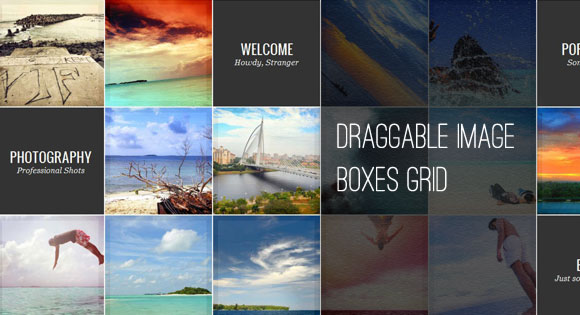
Today we want to create a template with a fullscreen grid of images and content areas. The idea is to have a draggable grid that shows boxes of thumbnails and menu like items. Once clicked, the thumbnail will expand to the full size image and the menu item box will expand to a fullscreen content area.
The main idea for this template and its effects comes from the beautiful Flash-based website of Stephen Hamilton.
To make the grid draggable, we used jQuery.kinetic by Dave Taylor. The jQuery plugin allows smooth drag scrolling and it’s just what we need in our grid.
The beautiful images in the demo are by Ibrahim Iujaz. Check out his Flickr photostream.
So, let’s begin!
The Markup
The main container will be a div with the class and ID ib-main-wrapper. We will add another div element inside since we will need this structure for applying the jQuery.kinetic plugin. Inside of that div which has the class ib-main, we will place two types of link elements: the thumbnail links and the content links. The content links are the menu like boxes that will expand to a fullscreen content area:
<div id="ib-main-wrapper" class="ib-main-wrapper">
	<div class="ib-main">
		<a href="#">
			<img src="images/thumbs/1.jpg" data-largesrc="images/large/1.jpg" alt="image01"/>
			<span>Crabbed Age and Youth</span>
		</a>
		<a href="#">
			<img src="images/thumbs/2.jpg" data-largesrc="images/large/2.jpg" alt="image02"/>
			<span>Cannot live together</span>
		</a>
		<a href="#" class="ib-content">
			<div class="ib-teaser">
				<h2>Welcome <span>Howdy, Stranger</span></h2>
			</div>
			<div class="ib-content-full">
				<!-- Some content -->
			</div>
		</a>
		...
	</div>
</div>
The boxes for the content will have the class ib-content. The path to the large image for the thumbnails will be saved in the data attribute data-largesrc.
For the content and image preview we will use jQuery templates. The template for the large image preview is the following:
<div id="ib-img-preview" class="ib-preview">
	<img src="${src}" alt="" class="ib-preview-img"/>
	<span class="ib-preview-descr" style="display:none;">${description}</span>
	<div class="ib-nav" style="display:none;">
		<span class="ib-nav-prev">Previous</span>
		<span class="ib-nav-next">Next</span>
	</div>
	<span class="ib-close" style="display:none;">Close Preview</span>
	<div class="ib-loading-large" style="display:none;">Loading...</div>
</div>
We will have the large image, the navigation buttons, a closing cross and a loading element.
The template for the fullscreen content preview looks like this:
<div id="ib-content-preview" class="ib-content-preview">
	<div class="ib-teaser" style="display:none;">{{html teaser}}</div>
	<div class="ib-content-full" style="display:none;">{{html content}}</div>
	<span class="ib-close" style="display:none;">Close Preview</span>
</div>
Now, let’s style the grid.
The CSS
First, we will style the wrapping container. It will occupy all the page’s width and we will set the height dynamically to fit the visible area:
.ib-main-wrapper{
    width: 100%;
    overflow: hidden;
    margin-top: 40px;
    outline: none;
    /*height dynamic*/
}
The main container will have a preset width. We chose this value because we want most visitors to be able to actually drag the grid. If you would set it to less and the user has a larger screen, then the container would be too small:
.ib-main{
    position: relative;
    width: 2546px;
}
Each box element will be floating and have a background image (for the thumbs) that we’ll stretch to be a bit larger than the box. We’ll add a nice transition which will make the background image contract on hover:
.ib-main a{
    float: left;
    width: 210px;
    height: 210px;
    position: relative;
    overflow: hidden;
    margin: 0px 0px 2px 2px;
    cursor: move;
    background: #fff url(../images/thumb_bg.jpg) no-repeat center center;
    background-size: 110% 110%;
    -webkit-transition: all 0.2s ease-in-out;
    -moz-transition: all 0.2s ease-in-out;
    -o-transition: all 0.2s ease-in-out;
    -ms-transition: all 0.2s ease-in-out;
    transition: all 0.2s ease-in-out;
}
.ib-main a:hover{
    background-size: 100% 100%;
}
The thumbnail will be slightly transparent so that we can see the background image (which is a thick border). We’ll also add some CSS3 transition here to animate the opacity on hover:
.ib-main a img{
    opacity: 0.95;
    -webkit-transition: all 0.2s ease-in-out;
    -moz-transition: all 0.2s ease-in-out;
    -o-transition: all 0.2s ease-in-out;
    -ms-transition: all 0.2s ease-in-out;
    transition: all 0.2s ease-in-out;
}
.ib-main a:hover img{
    opacity: 0.8;
}
The description will be positioned absolutely and we’ll place it out of the box. Then, on hover, we will make it slide in:
.ib-main > a > span{
    display: block;
    position: absolute;
    width: 100%;
    height: 20px;
    line-height: 22px;
    text-align: center;
    font-size: 11px;
    bottom: -20px;
    left: 0px;
    text-shadow: 1px 1px 1px rgba(0,0,0,0.4);
    -webkit-transition: all 0.2s ease-in-out;
    -moz-transition: all 0.2s ease-in-out;
    -o-transition: all 0.2s ease-in-out;
    -ms-transition: all 0.2s ease-in-out;
    transition: all 0.2s ease-in-out;
}
.ib-main a:hover > span{
    bottom: 0px;
}
When we click on the thumbnail box, we’ll change the background image in order to show the loading image:
.ib-main a.ib-loading,
.ib-main a.ib-loading:hover{
    background: #fff url(../images/ajax-loader.gif) no-repeat center center;
    background-size: 31px 31px;
}
.ib-main a.ib-loading img,
.ib-main a.ib-loading:hover img{
    opacity: 0.5;
}
When the thumbnail is in the loading state, we don’t want to show the description:
.ib-main > a.ib-loading > span,
.ib-main a.ib-loading > span{
    display: none;
}
Now we’ll style the content boxes. The background is going to be dark:
.ib-content{
    background: #f9f9f9;
}
The teaser is the text we’ll be showing in each content box. On hover we want to animate the background color:
.ib-content .ib-teaser{
    text-align: center;
    background: #333;
    width: 100%;
    height: 100%;
    -webkit-transition: all 0.2s ease-in-out;
    -moz-transition: all 0.2s ease-in-out;
    -o-transition: all 0.2s ease-in-out;
    -ms-transition: all 0.2s ease-in-out;
    transition: all 0.2s ease-in-out;
}
.ib-content .ib-teaser:hover{
    background: #000;
}
The headline and the subline will have the following style:
.ib-teaser h2{
    color: #fff;
    font-size: 26px;
    line-height: 26px;
    padding-top: 40%;
    text-shadow: 1px 0px 2px rgba(0,0,0,0.2);
}
.ib-teaser h2 span{
    text-transform: none;
    font-size: 16px;
    font-family: Georgia, serif;
    font-style: italic;
    display: block;
}
When the content area gets expanded, we will show the preview container and it will have an absolute position and a dynamic height:
.ib-content-preview{
    position: absolute;
    top: 44px;
    left: 0px;
    background: #000;
    width: 100%;
    /* height dynamic*/
    display: none;
}
The text elements will get some styling:
.ib-content-preview .ib-teaser h2{
    font-size: 50px;
    padding: 85px 40px 20px 40px;
}
.ib-content-preview .ib-teaser span{
    padding: 20px 0px 0px 5px;
    font-size: 22px;
}
.ib-content-full{
    font-family:'Oswald', serif;
    text-transform: none;
    line-height: 26px;
    margin: 0px 40px;
    border-top: 1px solid #333;
    padding: 20px 0px;
	font-size: 16px;
}
.ib-content-full p{
	padding: 5px 0px;
}
The large preview for the thumbnails will also be of absolute position
.ib-preview{
    overflow: hidden;
    position: absolute;
    top: 40px;
    display: none;
}
The description for the large image will be placed in the bottom left corner. We want big letters:
.ib-preview-descr{
    position: absolute;
    bottom: 30px;
    left: 10px;
    z-index: 999;
    font-size: 50px;
    text-shadow: 1px 0px 2px rgba(0,0,0,0.2);
}
The image itself will be absolute and the width and height will be set dynamically in the JavaScript:
.ib-preview img{
	position: absolute;
}
The navigation for the images will be placed on the left and the right side of the screen:
.ib-nav span{
	width: 53px;
	height: 87px;
	position: absolute;
	top: 50%;
	margin-top: -43px;
	cursor: pointer;
    text-indent: -9000px;
	opacity: 0.6;
	z-index: 999;
    background: transparent url(../images/nav.png) no-repeat top right;
	right: 10px;
	-webkit-user-select: none;
	-khtml-user-select: none;
	-moz-user-select: none;
	-o-user-select: none;
	user-select: none;
}
.ib-nav span.ib-nav-prev{
	background-position: top left;
	left: 10px;
    right: auto;
}
The closing element will be at the top right corner:
.ib-close{
	top: 7px;
	right: 7px;
	background: transparent url(../images/close.png) no-repeat center center;
	position: absolute;
	width: 24px;
	height: 24px;
	cursor: pointer;
	opacity: 0.2;
	z-index: 999;
    text-indent: -9000px;
}
.ib-nav span:hover, .ib-close:hover{
	opacity: 1;
}
Last, but not least, we’ll style the loading element for the large image. We’ll place it in the center of the screen with our 50% and negative margin trick and give it some rounded borders:
.ib-loading-large{
    text-indent: -9000px;
    width: 60px;
    height: 60px;
    background: #fff url(../images/ajax-loader.gif) no-repeat center center;
    position: absolute;
    top: 50%;
    left: 50%;
    margin: -30px 0 0 -30px;
    z-index: 999;
    -moz-border-radius: 10px;
    -webkit-border-radius: 10px;
    border-radius: 10px 10px 10px 10px;
    opacity: 0.9;
}
And that was all the style. Now, let’s take a look at the JavaScript.
The JavaScript
Let’s define our template function:
var $ibWrapper	= $('#ib-main-wrapper'),

	Template	= (function() {
		...
})();

Template.init();
First, we will set some variables and cache some elements:
var kinetic_moving				= false,
	// current index of the opened item
	current						= -1,
	// true if the item is being opened / closed
	isAnimating					= false,
	// items on the grid
	$ibItems					= $ibWrapper.find('div.ib-main > a'),
	// image items on the grid
	$ibImgItems					= $ibItems.not('.ib-content'),
	// total image items on the grid
	imgItemsCount				= $ibImgItems.length,
The init function will add a class to all the image items and call the jQuery.kinetic plugin and initialize our main events:
init						= function() {

		// add a class ib-image to the image items
		$ibImgItems.addClass('ib-image');
		// apply the kinetic plugin to the wrapper
		loadKinetic();
		// load some events
		initEvents();

	},
loadKinetic will set the size of the main wrapper and apply the jQuery.kinetic plugin:
loadKinetic					= function() {

	setWrapperSize();

	$ibWrapper.kinetic({
		moved	: function() {

			kinetic_moving = true;

		},
		stopped	: function() {

			kinetic_moving = false;

		}
	});

},
setWrapperSize will set the height of the main wrapper by taking the window height and removing the top bar and the bottom bar (which is our demo header actually):
setWrapperSize				= function() {

	var containerMargins	= $('#ib-top').outerHeight(true) + $('#header').outerHeight(true) + parseFloat( $ibItems.css('margin-top') );
	$ibWrapper.css( 'height', $(window).height() - containerMargins )

},
initEvents calls the openItem function when we click on a box (unless we are dragging) and takes care of the resizing when we change the window size:
initEvents					= function() {

	// open the item only if not dragging the container
	$ibItems.bind('click.ibTemplate', function( event ) {

		if( !kinetic_moving )
			openItem( $(this) );

		return false;

	});

	// on window resize, set the wrapper and preview size accordingly
	$(window).bind('resize.ibTemplate', function( event ) {

		setWrapperSize();

		$('#ib-img-preview, #ib-content-preview').css({
			width	: $(window).width(),
			height	: $(window).height()
		})

	});

},
When we click on an item, depending on which item we clicked, we’ll load a full image or a content area:
openItem					= function( $item ) {

	if( isAnimating ) return false;

	// if content item
	if( $item.hasClass('ib-content') ) {

		isAnimating	= true;
		current	= $item.index('.ib-content');
		loadContentItem( $item, function() { isAnimating = false; } );

	}
	// if image item
	else {

		isAnimating	= true;
		current	= $item.index('.ib-image');
		loadImgPreview( $item, function() { isAnimating = false; } );

	}

},
If we click on a thumbnail, we’ll load and expand to the respective large image. We will use the jQuery template for the large image preview and set it to the same position like the currently clicked item. Initially having the same size, it will then expand first in width to fit the window and then in height:
loadImgPreview				= function( $item, callback ) {

	var largeSrc		= $item.children('img').data('largesrc'),
		description		= $item.children('span').text(),
		largeImageData	= {
			src			: largeSrc,
			description	: description
		};

	// preload large image
	$item.addClass('ib-loading');

	preloadImage( largeSrc, function() {

		$item.removeClass('ib-loading');

		var hasImgPreview	= ( $('#ib-img-preview').length > 0 );

		if( !hasImgPreview )
			$('#previewTmpl').tmpl( largeImageData ).insertAfter( $ibWrapper );
		else
			$('#ib-img-preview').children('img.ib-preview-img').attr( 'src', largeSrc );

		//get dimentions for the image, based on the windows size
		var	dim	= getImageDim( largeSrc );

		$item.removeClass('ib-img-loading');

		//set the returned values and show/animate preview
		$('#ib-img-preview').css({
			width	: $item.width(),
			height	: $item.height(),
			left	: $item.offset().left,
			top		: $item.offset().top
		}).children('img.ib-preview-img').hide().css({
			width	: dim.width,
			height	: dim.height,
			left	: dim.left,
			top		: dim.top
		}).fadeIn( 400 ).end().show().animate({
			width	: $(window).width(),
			left	: 0
		}, 500, 'easeOutExpo', function() {

			$(this).animate({
				height	: $(window).height(),
				top		: 0
			}, 400, function() {

				var $this	= $(this);
				$this.find('span.ib-preview-descr, span.ib-close').show()
				if( imgItemsCount > 1 )
					$this.find('div.ib-nav').show();

				if( callback ) callback.call();

			});

		});

		if( !hasImgPreview )
			initImgPreviewEvents();

	} );

},
With the same effect of expanding, we’ll open a content area, too. Here we have to take care of the text elements:
loadContentItem				= function( $item, callback ) {

	var hasContentPreview	= ( $('#ib-content-preview').length > 0 ),
		teaser				= $item.children('div.ib-teaser').html(),
		content				= $item.children('div.ib-content-full').html(),
		contentData			= {
			teaser		: teaser,
			content		: content
		};

	if( !hasContentPreview )
		$('#contentTmpl').tmpl( contentData ).insertAfter( $ibWrapper );

	//set the returned values and show/animate preview
	$('#ib-content-preview').css({
		width	: $item.width(),
		height	: $item.height(),
		left	: $item.offset().left,
		top		: $item.offset().top
	}).show().animate({
		width	: $(window).width(),
		left	: 0
	}, 500, 'easeOutExpo', function() {

		$(this).animate({
			height	: $(window).height(),
			top		: 0
		}, 400, function() {

			var $this	= $(this),
				$teaser	= $this.find('div.ib-teaser'),
				$content= $this.find('div.ib-content-full'),
				$close	= $this.find('span.ib-close');

			if( hasContentPreview ) {
				$teaser.html( teaser )
				$content.html( content )
			}

			$teaser.show();
			$content.show();
			$close.show();

			if( callback ) callback.call();

		});

	});

	if( !hasContentPreview )
		initContentPreviewEvents();

},
A little helper function for preloading images:
// preloads an image
preloadImage				= function( src, callback ) {

	$('<img/>').load(function(){

		if( callback ) callback.call();

	}).attr( 'src', src );

},
The next function takes care of loading the events for the large image preview : navigation, close button, and window resize:
initImgPreviewEvents		= function() {

	var $preview	= $('#ib-img-preview');

	$preview.find('span.ib-nav-prev').bind('click.ibTemplate', function( event ) {

		navigate( 'prev' );

	}).end().find('span.ib-nav-next').bind('click.ibTemplate', function( event ) {

		navigate( 'next' );

	}).end().find('span.ib-close').bind('click.ibTemplate', function( event ) {

		closeImgPreview();

	});

	//resizing the window resizes the preview image
	$(window).bind('resize.ibTemplate', function( event ) {

		var $largeImg	= $preview.children('img.ib-preview-img'),
			dim			= getImageDim( $largeImg.attr('src') );

		$largeImg.css({
			width	: dim.width,
			height	: dim.height,
			left	: dim.left,
			top		: dim.top
		})

	});

},
For the content preview we’ll also have to load the event for the closing functionality:
initContentPreviewEvents	= function() {

	$('#ib-content-preview').find('span.ib-close').bind('click.ibTemplate', function( event ) {

		closeContentPreview();

	});

},
Next, we’ll define the function that takes care of navigating through the large images in fullscreen:
// navigate the image items in fullscreen mode
navigate					= function( dir ) {

	if( isAnimating ) return false;

	isAnimating		= true;

	var $preview	= $('#ib-img-preview'),
		$loading	= $preview.find('div.ib-loading-large');

	$loading.show();

	if( dir === 'next' ) {

		( current === imgItemsCount - 1 ) ? current	= 0 : ++current;

	}
	else if( dir === 'prev' ) {

		( current === 0 ) ? current	= imgItemsCount - 1 : --current;

	}

	var $item		= $ibImgItems.eq( current ),
		largeSrc	= $item.children('img').data('largesrc'),
		description	= $item.children('span').text();

	preloadImage( largeSrc, function() {

		$loading.hide();

		//get dimentions for the image, based on the windows size
		var	dim	= getImageDim( largeSrc );

		$preview.children('img.ib-preview-img')
						.attr( 'src', largeSrc )
						.css({
			width	: dim.width,
			height	: dim.height,
			left	: dim.left,
			top		: dim.top
						})
						.end()
						.find('span.ib-preview-descr')
						.text( description );

		$ibWrapper.scrollTop( $item.offset().top )
				  .scrollLeft( $item.offset().left );

		isAnimating	= false;

	});

},
The following function is for closing the fullscreen image preview:
closeImgPreview				= function() {

	if( isAnimating ) return false;

	isAnimating	= true;

	var $item	= $ibImgItems.eq( current );

	$('#ib-img-preview').find('span.ib-preview-descr, div.ib-nav, span.ib-close')
					.hide()
					.end()
					.animate({
						height	: $item.height(),
						top		: $item.offset().top
						}, 500, 'easeOutExpo', function() {

						$(this).animate({
							width	: $item.width(),
							left	: $item.offset().left
							}, 400, function() {

								$(this).fadeOut(function() {isAnimating	= false;});

						} );

					});

},
For the content preview we will also need such a function:
// closes the fullscreen content item
closeContentPreview			= function() {

	if( isAnimating ) return false;

	isAnimating	= true;

	var $item	= $ibItems.not('.ib-image').eq( current );

	$('#ib-content-preview').find('div.ib-teaser, div.ib-content-full, span.ib-close')
							.hide()
							.end()
							.animate({
								height	: $item.height(),
								top		: $item.offset().top
							}, 500, 'easeOutExpo', function() {

								$(this).animate({
									width	: $item.width(),
									left	: $item.offset().left
								}, 400, function() {

									$(this).fadeOut(function() {isAnimating	= false;});

								} );

							});

},
getImageDim will get the size of an image and make it centered in fullscreen:
getImageDim					= function( src ) {

	var img     	= new Image();
	img.src     	= src;

	var w_w	= $(window).width(),
		w_h	= $(window).height(),
		r_w	= w_h / w_w,
		i_w	= img.width,
		i_h	= img.height,
		r_i	= i_h / i_w,
		new_w, new_h,
		new_left, new_top;

	if( r_w > r_i ) {

		new_h	= w_h;
		new_w	= w_h / r_i;

	}
	else {

		new_h	= w_w * r_i;
		new_w	= w_w;

	}

	return {
		width	: new_w,
		height	: new_h,
		left	: (w_w - new_w) / 2,
		top		: (w_h - new_h) / 2
	};

};
And that’s it! I hope you enjoyed making this template with me and find it useful!


mary…Ur are just a superfulous genius…***Mwaahhhh…***
these kind of things just rock the place out ..
Amazing!
We are used to your creativity Marie – Thank you very much
MARY LOU, TU É D+! PARABÉNS PELO TRABALHO.
Very nice! Looks awesome! But on my i7 i would say it is on slow side, tried on tablet and it is just 2fps slideshow… would like to know what we can optimize here to make it faster.
I love it.. Superb..
Keep up the great work Mary…
Sweet:)
Nice work thanks for sharing
Will you marry me Mary 🙂
Thanks a lot Mary , its a amazing .
OMG! This is so nice!.. Good Job!!!!
superb.
would love it even more if you could somehow integrate the history plugin / back button into this.
exelente articulo.. sigan asi…;)
Awesome job!
AMAZING!!! How about keyboard navigation? any suggestions on how to integrate it?
waduh 0_0
good \m/
Hi guys.
I’m the developer of the Stephen Hamilton site. It’s definitely interesting to see the effect translated into javascript. Bravo on a job well done.
Thanks for sharing.
as usual, kewl!!
This is so nice! Awesome job! Thanks for sharing.
Someone please make a WP theme out of this. Superb.
great work marry, congrats, really fit for portfolio site
Absolutely Stunning Work!
Found a bug after i close an expanded image, if i open another the text is not changed.
@W thanks for letting us know. I have already fixed it and updated the zip file! Cheers!
You only program beautiful things Mary 🙂 Love this one, like the effects after opening/closing the image, you’re kicking flash in the . . . well 🙂
It seems to me that the whole picture is not visible, when i compare the thumbnail i clicked an the the opened picture, i can’t see the top of the image. Is this intentional or?
hi,
it’s fantastic, i really would to use only the draggable grid and so i put the code until “initEvents” function but doesn’t works!
any idea?! thank you very much
Very nice!
Is it possible to easy add keyboard control?
@MARY LOU
Yap, it’s working fine now. Thanks!
P.S.: I’m going to try to implement this on Codeigniter (or WordPress) see how it goes. 🙂
Very cool .. would need to make it more mobile friendly some how !
first thank you very much for Your great efforts really this is the best blog i have ever seen .
for css3 radius on ie use pie solution
http://css3pie.com/
Finally Sought excuse me, I do not speak English
Very nice!
I have a question: How can I open the images at their original size instead of making them full-screen ?
Thanks!
Kick a$$! nice work.
If this was used on a blog style site, could this be easily altered so that each image or post had a permalink to lead directly to it??
(so that visitors could share & bookmark content.)
Awesome!!! ^_^
you always kill it….simply SUPERB!
Hi Mary Lou I have tried in the top downloads page of my website, amazing. How to add links within : D
this is my top download draggable _http://www.wallsave.com/top/
thank you 🙂
Thank you so much for the fabulous tutorial.
I wonder if there is a possibility to implement Mansonry effect on the initial layout.
Thank YOU!
Mary Lou you’re simply amazing.
This tutorial rooooooocks 😉
But i have one question. I tried it on the ipad, scrolling works great but images or content don’t open when you hit on them.
Thanks again for this awesome work.
Hi Mary,
Very good tutorial, I really appreciate it. I was wondering if there is a way to automatically move the grid according to mouse position like on this flash photo wall: http://www.flashxml.net/photo-wall.html
Thank you.
Beautifully done. I’d love to see this adapted for touch devices.
—One tap for caption, another for full screen.
Hi there, this is absolutely brilliant.
This may sound a bit silly, but is there a way to remove the draggable section, but keep all the rest? I’d like to make the boxes 4×4 in the center of the page, with all of the lovely transitions if possible.
Really appreciate some help, thanks.
This is great I am new to web design and am finding my way around the code and css I would like add video content in the content sections. I seem to not be able to add any type of linked content can anyone help please.
I’m in the same situation. I can not find an answer. You find a solution? What is the solution please? thank you very much
Any chance of a version that doesn’t use template?
http://api.jquery.com/category/plugins/templates/
Hey I just want you to know that I’m using your beautiful code for my site! http://www.agriturismolatintoria.it
I hope you like it!
I think this is really awesome. I too have questions about integrating hyperlinks in the content area. If you have any tips to accomplish that, please let us know.
Hey @TUDOUJ my site http://www.agriturismolatintoria.it already do that, give a look at the code, i added some html5 and you can easily add link inside content!
@Luca
Please can you show me how exactly i can place links inside the content area?
thanks a lot
Grazie Luca! That’s just what I needed! Thank you for sharing.
Really awesome!
Very nice tutorial Mary, loved the concept and the final demo really stands out. Even tried a slightly adapted approach as a proof of concept: http://fresta.net/ultimas/drag
It is an awesome design. I was trying to use it for my website. But i am getting a bug.
When i enlarge any image for the first time it is not displayed, when i close and load it again it gets loaded. The same applies for all the images. The problem is that the image that is opened first is not displayed.
@Mary Lou: Thank your for this awesome work.
I just want you to know that I’m using your code for my wedding site: http://2ourday.com