From our sponsor: Leverage AI for dynamic, custom website builds with ease.
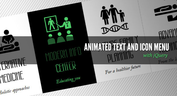
Today we want to show you how to create a slick menu with a nice animation feature on hover. The idea is to make some elements slide out, change and animate the background color of the item and then slide the elements back in with a different color.
The inspiration for this menu comes from the website of the Pelican Miami Beach Hotel: http://www.pelicanhotel.com/
The icons are taken from the incredible Noun Project that “collects, organizes and adds to the highly recognizable symbols that form the world’s visual language, so we may share them in a fun and meaningful way”. Visit the website of The Noun Project.
So, let’s get started!
The Markup
Our HTML will be an unordered list where each list item will contain an anchor element with the three elements inside that we’ll animate:
<ul id="sti-menu" class="sti-menu">
	<li data-hovercolor="#37c5e9">
		<a href="#">
			<h2 data-type="mText" class="sti-item">
				Some text
			</h2>
			<h3 data-type="sText" class="sti-item">
				Some more text
			</h3>
			<span data-type="icon" class="sti-icon sti-icon-care sti-item">
			</span>
		</a>
	</li>
	<li>...</li>
	...
</ul>
The data-hovercolor will be used to set the color of the text on hover. Also, we’ll give some data-type attribute to each heading and the icon span. We’ll use that later in our JavaScript.
Now, let’s make it stylish!
The CSS
Remember, we always reset our CSS with a reset.css that we’ll add to our main style.
First, we’ll style the unordered list and give it a fixed width so that we can center it on the page:
.sti-menu{
	width:1010px;
	position:relative;
	margin:60px auto 0 auto;
}
The list elements will be floating and a little margin:
.sti-menu li{
	float:left;
	width:200px;
	height:300px;
	margin:1px;
}
Now we’ll style the anchor. We’ll hide all the overflow because we want to animate the elements outside of the anchor:
.sti-menu li a{
	display:block;
	overflow:hidden;
	background:#fff;
	text-align:center;
	height:100%;
	width:100%;
	position:relative;
	-moz-box-shadow:1px 1px 2px #ddd;
	-webkit-box-shadow:1px 1px 2px #ddd;
	box-shadow:1px 1px 2px #ddd;
}
The headings will be positioned absolutely and we’ll define the width and the top position:
.sti-menu li a h2{
	color:#000;
	font-family: 'Wire One', arial, serif;
	font-size:42px;
	font-weight:bold;
	text-transform:uppercase;
	position:absolute;
	padding:10px;
	width:180px;
	top:140px;
	text-shadow: 0px 1px 1px black;
}
.sti-menu li a h3{
	font-family: Baskerville, "Hoefler Text", Garamond, "Times New Roman", serif;
	font-size:18px;
	font-style:italic;
	color: #111;
	position:absolute;
	top:248px;
	width:180px;
	padding:10px;
}
Each icon span will have the following general class and also a specific one, where we’ll add the right background image. The images will have both, the black and the colored version of the icon. We’ll change the background position in the JavaScript once we animate the icon out of the anchor element.
.sti-icon{
	width:100px;
	height:100px;
	position:absolute;
	background-position:top left;
	background-repeat:no-repeat;
	background-color:transparent;
	left:50px;
	top:30px;
}
.sti-icon-care{
	background-image:url(../images/care.png);
}
.sti-icon-alternative{
	background-image:url(../images/alternative.png);
}
.sti-icon-family{
	background-image:url(../images/family.png);
}
.sti-icon-info{
	background-image:url(../images/info.png);
}
.sti-icon-technology{
	background-image:url(../images/technology.png);
}
And that’s all the style! Let’s move to the fun part!
The JavaScript
Since we are doing a plugin out of this, let’s define the default settings first:
var settings = {
	// configuration for the mouseenter event
	animMouseenter		: {
		'mText' : {speed : 350, easing : 'easeOutExpo', delay : 140, dir : 1},
		'sText' : {speed : 350, easing : 'easeOutExpo', delay : 0, dir : 1},
		'icon'  : {speed : 350, easing : 'easeOutExpo', delay : 280, dir : 1}
	},
	// configuration for the mouseleave event
	animMouseleave		: {
		'mText' : {speed : 300, easing : 'easeInExpo', delay : 140, dir : 1},
		'sText' : {speed : 300, easing : 'easeInExpo', delay : 280, dir : 1},
		'icon'  : {speed : 300, easing : 'easeInExpo', delay : 0, dir : 1}
	},
	// speed for the item bg color animation
	boxAnimSpeed		: 300,
	// default text color (same defined in the css)
	defaultTextColor	: '#000',
	// default bg color (same defined in the css)
	defaultBgColor		: '#fff'
};
For each one of our elements we’ll have the animation speed, the easing effect, the delay time and the direction (1 is for up and 0 for down).
We also have the animation speed for the background color animation of the menu item and the text and background color which we also have in our CSS.
return this.each(function() {
	// if options exist, lets merge them with our default settings
	if ( options ) {
		$.extend( settings, options );
	}

	var $el 			= $(this),
		// the menu items
		$menuItems		= $el.children('li'),
		// save max delay time for mouseleave anim parameters
	maxdelay	= Math.max( settings.animMouseleave['mText'].speed + settings.animMouseleave['mText'].delay ,
							settings.animMouseleave['sText'].speed + settings.animMouseleave['sText'].delay ,
							settings.animMouseleave['icon'].speed + settings.animMouseleave['icon'].delay
						  ),
		// timeout for the mouseenter event
		// lets us move the mouse quickly over the items,
		// without triggering the mouseenter event
		t_mouseenter;

	// save default top values for the moving elements:
	// the elements that animate inside each menu item
	$menuItems.find('.sti-item').each(function() {
		var $el	= $(this);
		$el.data('deftop', $el.position().top);
	});

	// Events
	...

});
Let’s define the mouseenter event for each menu item:
$menuItems.bind('mouseenter', function(e) {

	clearTimeout(t_mouseenter);

	var $item		= $(this),
		$wrapper	= $item.children('a'),
		wrapper_h	= $wrapper.height(),
		// the elements that animate inside this menu item
		$movingItems= $wrapper.find('.sti-item'),
		// the color that the texts will have on hover
		hovercolor	= $item.data('hovercolor');

	t_mouseenter	= setTimeout(function() {
		// indicates the item is on hover state
		$item.addClass('sti-current');

		$movingItems.each(function(i) {
			var $item			= $(this),
				item_sti_type	= $item.data('type'),
				speed			= settings.animMouseenter[item_sti_type].speed,
				easing			= settings.animMouseenter[item_sti_type].easing,
				delay			= settings.animMouseenter[item_sti_type].delay,
				dir				= settings.animMouseenter[item_sti_type].dir,
				// if dir is 1 the item moves downwards
				// if -1 then upwards
				style			= {'top' : -dir * wrapper_h + 'px'};

			if( item_sti_type === 'icon' ) {
				// this sets another bg image position for the icon
				style.backgroundPosition	= 'bottom left';
			} else {
				style.color					= hovercolor;
			}
			// we hide the icon, move it up or down, and then show it
			$item.hide().css(style).show();
			clearTimeout($item.data('time_anim'));
			$item.data('time_anim',
				setTimeout(function() {
					// now animate each item to its default tops
					// each item will animate with a delay specified
					// in the options
					$item.stop(true)
						 .animate({top : $item.data('deftop') + 'px'}, speed, easing);
				}, delay)
			);
		});
		// animate the bg color of the item
		$wrapper.stop(true).animate({
			backgroundColor: settings.defaultTextColor
		}, settings.boxAnimSpeed );

	}, 100);

})
And then we define the mouseleave event which is basically everything in reverse:
// mouseleave event for each menu item
.bind('mouseleave', function(e) {

	clearTimeout(t_mouseenter);

	var $item		= $(this),
		$wrapper	= $item.children('a'),
		wrapper_h	= $wrapper.height(),
		$movingItems= $wrapper.find('.sti-item');

	if(!$item.hasClass('sti-current'))
		return false;

	$item.removeClass('sti-current');

	$movingItems.each(function(i) {
		var $item			= $(this),
			item_sti_type	= $item.data('type'),
			speed			= settings.animMouseleave[item_sti_type].speed,
			easing			= settings.animMouseleave[item_sti_type].easing,
			delay			= settings.animMouseleave[item_sti_type].delay,
			dir				= settings.animMouseleave[item_sti_type].dir;

		clearTimeout($item.data('time_anim'));

		setTimeout(function() {

			$item.stop(true).animate({'top' : -dir * wrapper_h + 'px'}, speed, easing, function() {

				if( delay + speed === maxdelay ) {

					$wrapper.stop(true).animate({
						backgroundColor: settings.defaultBgColor
					}, settings.boxAnimSpeed );

					$movingItems.each(function(i) {
						var $el				= $(this),
							style			= {'top' : $el.data('deftop') + 'px'};

						if( $el.data('type') === 'icon' ) {
							style.backgroundPosition	= 'top left';
						} else {
							style.color					= settings.defaultTextColor;
						}

						$el.hide().css(style).show();
					});

				}
			});
		}, delay);
	});
});
And that’s it! We hope you enjoyed this tutorial and find it useful!