From our sponsor: Leverage AI for dynamic, custom website builds with ease.
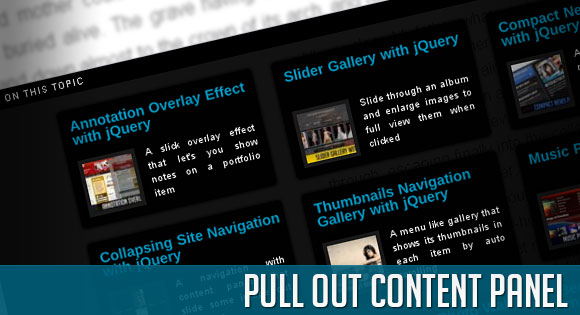
In this tutorial we will create a content panel that slides out at a predefined scroll position. It will reveal a teaser with related content and it can be expanded to full page size to show more. A custom slider allows to scroll through many items in the panel.
Depending on how many items can fit to the user’s screen, we will adapt the item container in order make the maximum number of items fit, centering it horizontally.
Since we want to use a little slider for the scrolling, we will be working with the jQuery UI library.
So, let’s get started with the markup.
The Markup
The HTML will have following structure:
<div class="pc_panel" id="pc_panel"> <div class="pc_label expand"></div> <div class="pc_label close"></div> <div class="pc_title">More on this topic</div> <div id="pc_wrapper"> <div id="pc_content"> <div class="pc_item"> <h2>Annotation Overlay Effect with jQuery</h2> <img src="images/22.jpg" alt=""/> <p> A slick overlay effect that let's you show notes on a portfolio item </p> <div class="pc_more">Annotation Overlay Effect with jQuery</div> </div> <div class="pc_item"> ... </div> ... <div class="clear"></div> </div> </div> <div id="pc_slider" class="pc_slider"></div> </div>
To add new item elements, we just need to repeat the structure of the div with the class “pc_item”.
Because we will want to make the whole item clickable, we will add the link of the respective article into a div element with the class “pc_more”.
In our jQuery function we will then take care of that. Of course, you can simple add an href to a link element, but we want to show you how you can trigger links to open by reading them out from an element.
Let’s take a look at the style.
The CSS
For the style, we will define the looks of the main panel and it’s content and we will also manipulate some classes of the jQuery UI elements.
Let’s start with the main panel:
.pc_panel{
	position:fixed;
	background:transparent url(../images/bgSlide.png) repeat top left;
	color:#fff;
	font-size:11px;
	line-height:14px;
	width:100%;
	right:0px;
	display:none;
	font-family:Arial, Helvetica, sans-serif;
}
We will use fixed positioning for the panel since we want to make it follow us when we scroll the page. The panel will be initially invisible and when we scroll to the trigger position, we will slide it in from the right.
In our jQuery we will set its right value to minus the window width and then we will animate it to right:0px.
The little icons on the right for exanding/collapsing and for closing the teaser panel permanently will have the following style:
.pc_label{
	width:20px;
	height:20px;
	position:absolute;
	top:0px;
	text-align:center;
	letter-spacing:2px;
	text-shadow:0px 0px 1px #fff;
	cursor:pointer;
}
.pc_panel .expand{
	background:#010101 url(../images/expand.gif) no-repeat center center;
	right:24px;
}
.pc_panel .collapse{
	background:#010101 url(../images/collapse.gif) no-repeat center center;
	right:24px;
}
.pc_panel .close{
	background:#010101 url(../images/close.gif) no-repeat center center;
	right:2px;
}
If you are using two classes on an element and you want the, let’s say, second class (in our case expand, collapse and close) to overwrite the properties of the first one, you need to make the definition for those classes more specific. That’s why we have our class “pc_label” and then we define the “stronger” classes by adding their parent (pc_panel).
The title for the panel will have the following style:
.pc_title{
	width:100%;
	height:20px;
	background:#000;
	font-size:9px;
	text-transform:uppercase;
	line-height:20px;
	text-indent:10px;
	letter-spacing:1px;
}
Each item will have the following style:
.pc_item{
	width:200px;
	height:120px;
	cursor:pointer;
	overflow:hidden;
	background:transparent url(../images/bgSlide.png) repeat top left;
	float:left;
	margin:5px 10px 10px 10px;
	-moz-border-radius:4px;
	-webkit-border-radius:4px;
	-moz-box-shadow:0px 0px 5px #000;
	-webkit-box-shadow:0px 0px 5px #000;
	box-shadow:0px 0px 5px #000;
}
.pc_item h2{
	padding:10px 0px 10px 10px;
	font-size:14px;
	height:32px;
	color:#009ac6;
	line-height:11px;
	clear:both;
}
.pc_item p{
	text-align:justify;
	font-size:10px;
	text-shadow:1px 1px 1px #000;
	padding:0px 10px 5px 10px;
}
.pc_item img{
	width:50px;
	float:left;
	margin:0px 10px 0px 10px;
	border:4px solid #191919;
	-moz-box-shadow:0px 0px 5px #000;
	-webkit-box-shadow:0px 0px 5px #000;
	box-shadow:0px 0px 5px #000;
}
.pc_more{
	display:none;
}
When hovering over an item we will add the class “selected” to it, in order to make it look different:
.pc_panel .selected{
	background:#222;
}
.pc_panel .selected img{
	border:4px solid #010101;
}
The wrapper around the items needs to have the following style because we want to apply the slider on the container:
.pc_wrapper{
	overflow:hidden;
	position:relative;
	margin-top:10px;
}
The slider itself will have an absolute position:
.pc_slider{
	position:absolute;
}
We want a customized look for the slider and the little slider handle, so we will overwrite the classes that come with jQuery UI:
.ui-widget-content {
	background:#000;
}
.ui-state-default, .ui-widget-content .ui-state-default{
	border:none;
	background-color:#aaa;
	outline:none;
	cursor:pointer;
	height:17px;
	width:10px;
	left:0px;
	margin-bottom:-10px;
}
And, finally, a little helper class to clear the float in the end of the items so that we can work with the height of it’s container:
.clear{
	clear:both;
}
And that’s all the style. Let’s look at the jQuery.
The JavaScript
The main idea is to make the panel appear at a certain position of the page. For that we will add a id=”pc_reference” to the last paragraph of our demo page because we want the panel to appear at the end of the page and show related items to the reader.
The shown panel will be of a specific height, revealing only the first row of related items/articles. When the user then expands the panel, it will occupy the full page and the user can use a scroll to see all items.
We want to have the possibility to expand the panel but also to remove it completely, since it could be annoying to the user (every time he scrolls past the specific trigger, it will appear).
Let’s first define some variables:
//window width and height
var window_w 					= $(window).width();
var window_h 					= $(window).height();
//the main panel div
var $pc_panel = $('#pc_panel');
//the wrapper and the content divs
var $pc_wrapper					= $('#pc_wrapper');
var $pc_content					= $('#pc_content');
//the slider / slider div
var $pc_slider					= $('#pc_slider');
//the element reference - reaching this element
//activates the panel
var $pc_reference 				= $('#pc_reference');

var maxWidth,maxHeight,marginL;
Now, we will call the function buildPanel(), that already constructs the panel like it will look, when we expand it:
buildPanel();

function buildPanel(){
	$pc_panel.css({'height': window_h + 'px'});
	hidePanel();
	//we want to display the items in a grid.
	//we need to calculate how much width and height
	//the wrapper should have.
	//we also want to display it centered, so we need to calculate
	//the margin left of the wrapper

	//First, lets see how much of height:
	//maxHeight = Math.floor((window_h-20)/135)*135;
	//20 => pc_titles height
	//135 => 125 of each items height plus its margin (10)
	maxHeight 		= Math.floor((window_h-20)/135)*135;
	//maxWidth = Math.floor((window_w-35)/220)*220;
	//220 = item width + margins (left and right)
	maxWidth 		= Math.floor((window_w-35)/220)*220;
	marginL  		= (window_w - maxWidth)/2;
	$pc_wrapper.css({
		'width' 		: maxWidth + 20 + 'px',
		'height'		: maxHeight +'px',
		'margin-left' 	: marginL + 'px'
	});

	//innitialize the slider
	try{
		$pc_slider.slider('destroy');
	}catch(e){}
	//total_scroll is the number of how much we can scroll
	var total_scroll = $pc_content.height()-maxHeight;
	//add a slider to scroll the content div
	//hidden until the panel is expanded
	if(total_scroll > 0){
		$pc_slider.slider({
			orientation	: 'vertical',
			max			: total_scroll,
			min			: 0,
			value		: total_scroll,
			slide		: function(event, ui) {
				$pc_wrapper.scrollTop(Math.abs(ui.value-total_scroll));
			}
		}).css({
			'height'	: maxHeight -40 + 'px',//40 extra
			'left'		: maxWidth + 20 + marginL + 'px',
			'top'		: 30 + 20 + 'px',
			//30 = 20 of title + 10 margin, 20 extra
			'display'	: 'none'
		});
	}
}
Initially, we want to hide the panel outside of the viewport on the right side, so we define the following function:
function hidePanel(){
	//165 => 20 pc_title + 120 item + margins
	$pc_panel.css({
		'right'	: -window_w + 'px',
		'top'	: window_h - 165 + 'px'
	}).show();
	try{
		//position the slider in the beginning
		slideTop();
	}catch(e){}
	$pc_slider.hide();
	$pc_panel.find('.collapse')
	.addClass('expand')
	.removeClass('collapse');
}
For our custom slider that will let us scroll through the items, we will define a function that resets it by sliding it all to the top:
function slideTop(){
	var total_scroll 	= $pc_content.height()-maxHeight;
	$pc_wrapper.scrollTop(0);
	$pc_slider.slider('option', 'value', total_scroll );
}
Now, we want to define what happens when we reach the element that has the ID “pc_reference” while we scroll our page. We need to get the distance from the top to slide the panel out at the right position, and hide it, if we are more up than the trigger again:
$(window).bind('scroll',function(){
	var distanceTop = $pc_reference.offset().top - window_h;
	if($(window).scrollTop() > distanceTop){
		if(parseInt($pc_panel.css('right'),10) == -window_w)
			$pc_panel.stop().animate({'right':'0px'},300);
	}
	else{
		if(parseInt($pc_panel.css('right'),10) == 0)
			$pc_panel.stop().animate({'right': -window_w + 'px'},300,function(){
				hidePanel();
			});
	}
}).bind('resize',function(){
	//on resize calculate the windows dimentions again,
	//and build the panel accordingly
	window_w 			= $(window).width();
	window_h 			= $(window).height();
	buildPanel();
});
When we click on the expand button, we animate the panel to the size of the window and reset the custom slider and show it:
$pc_panel.find('.expand').bind('click',function(){
	var $this = $(this);
	$pc_wrapper.hide();
	$pc_panel.stop().animate({'top':'0px'},500,function(){
		$pc_wrapper.show();
		slideTop();
		$pc_slider.show();
		$this.addClass('collapse').removeClass('expand');
	});
})
When we click on “collapse”, we will hide the slider and minimize the panel again:
$pc_panel.find('.collapse').live('click',function(){
	var $this = $(this);
	$pc_wrapper.hide();
	$pc_slider.hide();
	$pc_panel.stop().animate({'top':window_h - 165 + 'px'},500,function(){
		$pc_wrapper.show();
		$this.addClass('expand').removeClass('collapse');
	});
});
Clicking “close” will make the panel disappear permanently:
$pc_panel.find('.close').bind('click',function(){
	$pc_panel.remove();
	$(window).unbind('scroll').unbind('resize');
});
And finally, we want to add a hover effect to the items, and open a new window with the right location when the user clicks on it:
$pc_wrapper.find('.pc_item').hover(
function(){
	$(this).addClass('selected');
},
function(){
	$(this).removeClass('selected');
}
).bind('click',function(){
	window.open($(this).find('.pc_more').html());
});
And that’s it! We hope you enjoyed the tutorial and find it useful!


really nice that’s why i follow codrops on twitter
AMAZING! You guys are awsome! Thks 😉
I have 1600×900 desctop and i can not see scrollbar?
@Kika, for an alternative to show the panel when it’s in the viewport
include the following js file (in the downloadable zip file):
<script type="text/javascript" src="jquery.viewport.js"></script>Change the scroll event of the window to this:
if($pc_reference.is(‘:in-viewport’)){
if(parseInt($pc_panel.css(‘right’),10) == -window_w)
$pc_panel.stop().animate({‘right’:’0px’},300);
}
else{
if(parseInt($pc_panel.css(‘right’),10) == 0)
$pc_panel.stop().animate({‘right’: -window_w + ‘px’},300,function(){
hidePanel();
});
}
With this solution we check if our reference element is in the viewport, and if so, we slide out the panel. It’s actually a better solution, for cases when we don’t have a scrollbar. Hope it helps, cheers, ML
thanks a lot Mary Lou,
as always, the best Jquery tutorials over the globe!!!
thanks for sharing your knowledge with us,
all the best!!!
OMG! You did it again. So intuitive… Well done, Mary Lou!
Awesome Tutorial, thanks!
very very nice! 😀
Cool tutorial and the effect is nice to catch the user attention.
as phillips said, Irepeat: the best Jquery tutorials over the globe!!!
thanks for sharing your knowledge with us, congratulations for all the things you show !
Again a nice piece of code from you 🙂
Thanks for sharing your knowledge and art of coding
That’s fantastic! Nice work.
Hi Mary Lou
Great effet, and good hierarchic 😉
You complete the level
lol
Thanks for all
No doubt the best in the business!
great resource, i take this one thanks
maybe this would be great if you use a slide version of “slidenote.info” if closed could arise again with scroll upwards …
sorry my bad english….
awesome \m/
Pretty cool trick :). Grats!
Effect very interesting…
Thanks
Very good tool thanks for sharing
Is there a way to show the panel by default if you come to the site with a mobile browser (like webkit on iPhone or Android)?
Currently it renders nothing on the iPhone.
Umm I don’t get this?
if($pc_reference.is(‘:in-viewport’)){
if(parseInt($pc_panel.css(‘right’),10) == -window_w)
$pc_panel.stop().animate({‘right’:’0px’},300);
}
else{
if(parseInt($pc_panel.css(‘right’),10) == 0)
$pc_panel.stop().animate({‘right’: -window_w + ‘px’},300,function(){
hidePanel();
});
}
you said to change to that but I still don’t see the setup, basically my website has no scroll (one page) right… And I want it to display that bottom bar the whole time? How would I do that?
I haven’t looked into it, but I noticed that upon resize, the content panel is not redrawn until you scroll again.
Hey Guys.
Great work. Is there a way to use this for a whole own homepage. With a static startpage. The articles are linked on the bottom in “the slide”. Do i have to create for every new article a new copy of “index.html” and link it on the startpage?
Sorry for my bad english
RAYMOND
maybe change
//165 => 20 pc_title + 120 item + margins
$pc_panel.css({
‘right’ : -window_w + ‘px’,
‘top’ : window_h – 165 + ‘px’
}).show();
to
//165 => 20 pc_title + 120 item + margins
$pc_panel.css({
‘right’ : 0,
‘top’ : window_h – 165 + ‘px’
}).show();
good
very nice! thanks
Hi!
How to make it that panel will appear after clicking on an anything item?
Awesome tutorial! Is there a way to push the the footer area of a site down when this slides out? It covers the footer area of my site and I want the footer to still be visible.
Great Tutorial. Quick question, in this line
).bind(‘click’,function(){
window.open($(this).find(‘.pc_more’).html());
It opens the link in a new window, how can it be changed to open in the parent window (self) ?
Thanks For all your great work.
Same request as “DEANDRE” … how can we have the footer directly visible ?
Great code, BTW.
window.open($(this).find(‘.pc_more’).html(),”_self”);
Thanks Rubens works great.
Awesome Tutorial, thanks!
this does not work in i.e 6 properly
Hi,
very nice work thanks.
but i have a problem ;
This line:
var distanceTop =
$pc_reference.offset().top – window_h;
if($(window).scrollTop() > distanceTop){
if(parseInt($pc_panel.css(‘right’),10) == -window_w)
$pc_panel.stop().animate({‘right’:’0px’},300);
in Internet explorer got this error;
Message: ‘$ pc_reference.offset (). top’, null or not an object
Line: 974
Character: 6
Code: 0
i have 1280 x 800 monitor.
i cant see panel.
thank you.
I really like this tutorial. Thanks for the help!
Hi Mary Lou,
Thanks for sharing your work and writing tutorials for us non-experts.
I think this a beautiful bit of work and really close to what I’ve been trying to find a solution for.
I wonder if you can help me at all?
I’d like to create a site with a pull-out footer, one that works differently to this one though. Firstly I’d like it to be present on screen at all times. It would have a tab that, when clicked, would grow/slide up to cover most of the site. Almost every method I find seems to work by using ‘display: none’ so is no good to me. I need something only partially obscured to start with, that reveals more of itself when clicked.
I have found similar methods which start from the top/left/right but their code is all quite specific. I have tried changing the css and bits of the js but to no avail.
Completely understand if this is outside the scope of this page’s comments, thanks for reading either way.
Cheers
Chris
Thanks…useful post……..
Thank you so much for this tutorial, it works great.
However, I have your Twitter Tooltips installed also, found here: http://tympanus.net/codrops/2010/07/20/latest-tweets-tooltip/
After installing this Pullout Panel code, my Twitter Tooltip code stopped working.
Are these codes conflicting? I can’t seem to find where its breaking. Any help? Thanks!
Good job, I really like this!
Hi, total newbie here. How would I change the code to slide it out from the bottom of the page, not the right side? Thanks, Tom
Hi Mary, I would realy like to have the same effect but for an horizontal site. Which part of the code do I have to change? Thanks!