From our sponsor: Leverage AI for dynamic, custom website builds with ease.
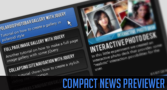
Today we will create a news previewer that let’s you show your latest articles or news in a compact way. The news previewer will show some list of articles on the left side and the preview of the article with a longer description on the right. Once a news on the left is clicked, the preview will slide in.
Let’s start with the markup.
The Markup
We will have a main container “cn_wrapper” that will contain a right element with the class “cn_preview” and a left one with the class “cn_list”. The preview div will contain content elements. Each one of them contains a preview image, a title and description along with some spans and a link to the real article.
In the list on the left side we will have the according short description items. We will also add a navigation for stepping through the pages in the end of that container:
<div class="cn_wrapper">
	<div id="cn_preview" class="cn_preview">
		<div class="cn_content" style="top:5px;">
			<img src="images/polaroidphotobar.jpg" alt=""/>
			<h1>Polaroid Photobar Gallery with jQuery</h1>
			<span class="cn_date">28/09/2010</span>
			<span class="cn_category">Tutorials</span>
			<p>In this tutorial we are going to create an...</p>
			<a href="http://tympanus.net/codrops/2010/09/28/polaroid-photobar-gallery/" target="_blank" class="cn_more">Read more</a>
		</div>
		<div class="cn_content">
			<img src="images/fullpageimagegallery.jpg" alt=""/>
			<h1>Full Page Image Gallery with jQuery</h1>
			<span class="cn_date">08/09/2010</span>
			<span class="cn_category">Tutorials</span>
			<p>In this tutorial we are going to create a stunning...
				</p>
			<a href="http://tympanus.net/codrops/2010/09/08/full-page-image-gallery/" target="_blank" class="cn_more">Read more</a>
		</div>
		...
	</div>
	<div id="cn_list" class="cn_list">
		<div class="cn_page" style="display:block;">
			<div class="cn_item selected">
				<h2>Polaroid Photobar Gallery with jQuery</h2>
				<p>Tutorial on how to create a gallery in polaroid style</p>
			</div>
			<div class="cn_item">
				<h2>Full Page Image Gallery with jQuery</h2>
				<p>Another tutorial on how to make a full gallery</p>
			</div>
			...
		</div>
		<div class="cn_page">
			...
		</div>
		<div class="cn_page">
			...
		</div>
		<div class="cn_nav">
			<a id="cn_prev" class="cn_prev disabled"></a>
			<a id="cn_next" class="cn_next"></a>
		</div>
	</div>
</div>
The first content item in the preview container will have already the style of being slided in, namely the position of top 5 pixels. All the other previews are “hidden” because they will have a top of 310 pixels.
The items list will be divided into pages where each page contains at most 5 item.
Let’s take a look at the style.
The CSS
We will use a lot of CSS3 properties to create some neat effects. We will use shadows, rounded borders and gradients with both RGB and hexadecimal values.
Let’s start with the main container. We will set it relative so that we can then use some absolute positioning inside of it:
.cn_wrapper{
	margin:90px auto 0px auto;
	width:500px;
	height:300px;
	position:relative;
	color:#fff;
	overflow:hidden;
	padding:5px;
	text-shadow:1px 1px 1px #000;
	border:1px solid #111;
	background-color:#333;
	-moz-box-shadow:1px 1px 4px #222;
	-webkit-box-shadow:1px 1px 4px #222;
	box-shadow:1px 1px 4px #222;
	-moz-border-radius:5px;
	-webkit-border-radius:5px;
	border-radius:5px;
}
The headings inside of our viewer will have the following style:
.cn_wrapper h1{
	font-size:20px;
	text-transform:uppercase;
}
.cn_wrapper h2{
	font-size:12px;
	border-bottom:1px solid #000;
	padding-bottom:4px;
	text-transform:uppercase;
}
The h2 is used in the preview list and we give it a bottom border to create a nice engraved line under it. This will work because we will give the p that follows it a top border with a lighter color.
The preview and the list will both be positioned absolute, so we will first define the common style and then we overwrite the left for the preview:
.cn_preview, .cn_list{
	width:250px;
	height:300px;
	position:absolute;
	top:2px;
	left:6px;
}
.cn_preview{
	left:255px;
}
Inside of the preview we will have several content elements that will be styled as follows:
.cn_content{
	border:1px solid #444;
	top:310px;/*5*/
	left:5px;
	width:219px;
	padding:10px;
	position:absolute;
	background-color:#101010;
	height:275px;
	-moz-border-radius:5px;
	-webkit-border-radius:5px;
	border-radius:5px;
}
These elements will be animated in the JavaScript. Initially, we want to hide them, so we set a top that is bigger than the whole wrapper itself. This is why we set the overflow of the wrapper as hidden, so that we will not see anything that moves out of the boundaries of the wrapper.
Now we will style the elements inside of the content div.
The image will always have the maximum width of 215 pixels in our case. Note that if you have differently sized images, you will have to adapt all the elements under it as well. In this case the image will have the height of 119 pixels. That’s the value we will base all the following elements’ heights on.
.cn_content img{
	width:215px;
	-moz-box-shadow:1px 1px 4px #000;
	-webkit-box-shadow:1px 1px 4px #000;
	box-shadow:1px 1px 4px #000;
}
The date and the category will be positioned absolutely at the bottom of the content div:
.cn_date{
	position:absolute;
	bottom:30px;
	right:8px;
	font-size:11px;
}
.cn_category{
	position:absolute;
	bottom:30px;
	left:8px;
	font-size:11px;
	padding:1px 3px;
	background:#ccc;
	border:1px solid #ddd;
	color:#000;
	text-shadow:-1px 0px 1px #fff;
	-moz-border-radius: 3px;
	-webkit-border-radius: 3px;
	border-radius: 3px;
}
The description, which is a p element will have a fixed height and if it is longer, it will be cut off:
.cn_content p{
	height:57px;
	margin-top:2px;
	overflow:hidden;
}
The more button which will be the link to the original article will be spiced up with some gradient, a box shadow and rounded borders at the bottom left and right to fit the content:
a.cn_more{
	position:absolute;
	padding: 4px 0px;
	left:0px;
	bottom:0px;
	width:236px;
	color:#fff;
	text-align:center;
	font-size:12px;
	letter-spacing:1px;
	text-shadow:1px 1px 1px #011c44;
	text-transform:uppercase;
	text-decoration: none;
	border:1px solid #4c7ecb;
	outline:none;
	cursor:pointer;
	background-color: #1951A5;
	background-image:
		-moz-linear-gradient(
			top,
			rgba(255,255,255,0.25),
			rgba(255,255,255,0.05)
		);
	background-image:
		-webkit-gradient(
			linear,
			left top,
			left bottom,
			color-stop(0, rgba(255,255,255,0.25)),
			color-stop(1, rgba(255,255,255,0.05))
		);
	-moz-border-radius: 0px 0px 5px 5px;
	-webkit-border-bottom-left-radius: 5px;
	-webkit-border-bottom-right-radius: 5px;
	-border-bottom-left-radius: 5px;
	-border-bottom-right-radius: 5px;
	-moz-box-shadow:1px 1px 3px #111;
	-webkit-box-shadow:1px 1px 3px #111;
	box-shadow:1px 1px 3px #111;
}
Changing the color of the font on hover will create a nice engraved effect:
a.cn_more:hover{
	color: #011c44;
	text-shadow: 1px 1px 1px #ccdffc;
}
Now we will style the items in the list. They will have a gradient as background which will change on hover. We will also apply the hover effect on the selected item.
.cn_item{
	border:1px solid #090909;
	cursor:pointer;
	position:relative;
	overflow:hidden;
	height:49px;
	color:#fff;
	padding:5px;
	margin:6px 5px 0px 0px;
	text-shadow:1px 1px 1px #000;
	background:#2b2b2b;
	background:
		-webkit-gradient(
			linear,
			left top,
			left bottom,
			from(#171717),
			to(#2b2b2b)
		);
	background:
		-moz-linear-gradient(
			top,
			#171717,
			#2b2b2b
		);
	-moz-box-shadow:1px 1px 3px #111;
	-webkit-box-shadow:1px 1px 3px #111;
	box-shadow:1px 1px 3px #111;
	-moz-border-radius:5px;
	-webkit-border-radius:5px;
	border-radius:5px;
}
.cn_item:hover, .selected{
	border-color:#4c7ecb;
	background-color: #1951A5;
	background-image:
		-moz-linear-gradient(
			top,
			rgba(255,255,255,0.25),
			rgba(255,255,255,0.05)
		);
	background-image:
		-webkit-gradient(
			linear,
			left top,
			left bottom,
			color-stop(0, rgba(255,255,255,0.25)),
			color-stop(1, rgba(255,255,255,0.05))
		);
}
The engraved line under the heading will also change color:
.cn_item:hover h2,
.cn_list .selected h2,
.cn_item:active h2{
	border-color:#2C5FAC;
}
.cn_item:hover p,
.cn_list .selected p,
.cn_item:active p{
	border-color:#527CBB;
}
The active pseudo class, i.e. when we click on an item will have an engraved text effect by using the following style:
.cn_item:active {
	color: #011c44;
	text-shadow: 1px 1px 1px #ccdffc;
}
The short description in a list item will have a fixed height and a top border which, together with the bottom border of the h2 will create an engraved looking line:
.cn_list p{
	height:29px;
	padding-top:2px;
	overflow:hidden;
	border-top:1px solid #333;
}
Let’s style the navigation now. We will set it absolutely at the bottom of our list container:
.cn_nav{
	width:55px;
	height:24px;
	position:absolute;
	bottom:0px;
	left:94px;
}
The next and previous elements will have the following common style:
a.cn_next, a.cn_prev{
	float:left;
	height:23px;
	width:23px;
	background-color:#212121;
	background-repeat:no-repeat;
	background-position:center center;
	cursor:pointer;
	outline:none;
	border:1px solid #111;
	-moz-border-radius: 5px;
	-webkit-border-radius: 5px;
	border-radius: 5px;
	-moz-box-shadow: 1px 1px 3px #000;
	-webkit-box-shadow: 1px 1px 3px #000;
	box-shadow: 1px 1px 3px #000;
}
Now we just set the individual styles which are the background images:
a.cn_next{
	background-image:url(../images/next.png);
}
a.cn_prev{
	margin-right:5px;
	background-image:url(../images/prev.png);
}
On hover we just change the background color:
.cn_nav a:hover{
	background-color:#101010;
}
When we click on a navigation item, we will move it down 1 pixel, so that it looks pressed. That we can do by setting the margin top to 1 pixel:
.cn_nav a:active{
	margin-top:1px;
	background-color:#000;
}
An inactive navigation element will have an opacity of 0.5:
.cn_nav a.disabled{
	opacity:0.5;
}
The last thing that we need to define is that the pages of the list are not visible. We will then make them visible in the JavaScript:
.cn_page{
	display:none;
}
That was the style. Now, let’s add the effects with jQuery!
The JavaScript
For the effects we will be using some easing so don’t forget to include the the jQuery easing plugin.
In our jQuery function we will start by defining some variables:
//caching
//next and prev buttons
var $cn_next	= $('#cn_next');
var $cn_prev	= $('#cn_prev');
//wrapper of the left items
var $cn_list 	= $('#cn_list');
var $pages		= $cn_list.find('.cn_page');
//how many pages
var cnt_pages	= $pages.length;
//the default page is the first one
var page		= 1;
//list of news (left items)
var $items 		= $cn_list.find('.cn_item');
//the current item being viewed (right side)
var $cn_preview = $('#cn_preview');
//index of the item being viewed.
//the default is the first one
var current		= 1;
For each item we store its index relative to all the document. We bind a click event that slides the current or clicked item up or down. Depending on the current item (if it comes before or after the newly clicked one), the clicked one will be moving from up or down:
$items.each(function(i){
	var $item = $(this);
	$item.data('idx',i+1);

	$item.bind('click',function(){
		var $this 		= $(this);
		$cn_list.find('.selected').removeClass('selected');
		$this.addClass('selected');
		var idx			= $(this).data('idx');
		var $current 	= $cn_preview.find('.cn_content:nth-child('+current+')');
		var $next		= $cn_preview.find('.cn_content:nth-child('+idx+')');

		if(idx > current){
			$current.stop()
					.animate({
						'top':'-300px'
					},600,'easeOutBack',function(){
						$(this).css({'top':'310px'});
					});
			$next.css({
				'top':'310px'
			}).stop()
			  .animate({
				'top':'5px'
			  },600,'easeOutBack');
		}
		else if(idx < current){
			$current.stop()
					.animate({
						'top':'310px'
					},600,'easeOutBack',function(){
						$(this).css({'top':'310px'});
					});
			$next.css({
				'top':'-300px'
			}).stop()
			  .animate({
				'top':'5px'
			  },600,'easeOutBack');
		}
		current = idx;
	});
});
Now we will define what happens when we click on the next in the navigation. The next page should fade in if it exists and the button needs to get disabled if there is no next page:
$cn_next.bind('click',function(e){
	var $this = $(this);
	$cn_prev.removeClass('disabled');
	++page;
	if(page == cnt_pages)
		$this.addClass('disabled');
	if(page > cnt_pages){
		page = cnt_pages;
		return;
	}
	$pages.hide();
	$cn_list.find('.cn_page:nth-child('+page+')').fadeIn();
	e.preventDefault();
});
The same holds for the previous page:
$cn_prev.bind('click',function(e){
	var $this = $(this);
	$cn_next.removeClass('disabled');
	--page;
	if(page == 1)
		$this.addClass('disabled');
	if(page < 1){
		page = 1;
		return;
	}
	$pages.hide();
	$cn_list.find('.cn_page:nth-child('+page+')').fadeIn();
	e.preventDefault();
});
To give the whole thing an even nicer look, we will cufonize the headings, by adding the following lines to the header of the HTML:
<script src="js/cufon-yui.js" type="text/javascript"></script>
<script src="js/Bebas_400.font.js" type="text/javascript"></script>
<script type="text/javascript">
	Cufon('.cn_wrapper h1,h2', {
		textShadow: '-1px 1px black'
	});
</script>
And that’s it! We hope you enjoyed this tutorial and found it useful!!


I am always amazed when I see your tutorials/articles.
At the moment you are really doing one of the best webdesign tutorials on the internet!
Bravo! Congrats!
Thank you! That’s very nice of you to say! We are glad you like it 🙂 Cheers, ML
djavupixel is simply right Mary Lou…. you really rock with jquery and you explain it so well and easy. Big respect!
Thank you Ralph! 🙂
Hi Mary Lou,
great… you really kill me …
just some constructive questions :
– quick html5 for remplace span by date.
– you dont use ul li for nav in preview news ?
– thanks for all always 😉
Nice work dude!
I am going to share it at htp://www.greepit.com
-Sarfraz
more interest, may be if any slide there…
amazing amazing….
thanks ^^
effects not working in ie8
@Jasmine, what do you mean? The effects work fine in IE8, but the CSS3 properties will obviously not be visible. Cheers, ML
wow i love your work..very good 🙂
your work is as beautiful as your avatar as well as you 🙂
ML, you just keep on amazing me! I have just done a combined newsfeed (RSS/FB/Twitter) using THREE different JS modules for each service, and now you come up with this beautifully done project. Absolutely stunning! Thank you for sharing as usual, and doing it with such excellence!
Hello its great nice looking and very well designed with css3 , well im thinking to add this to one website im working for I will remove the CSS3 shadows and other stuff and will keep it a little be more simple because the website need to be compatible with that thing called ie 6, 7 , 8 9 xD
thanks
Great stuff! Thank you!
Thank you for this handy utility.
The white description below the images is not showing in Google Chrome.
Have you taken a look at our online demo with Google Chrome? If you are using another font or font size, you need to adapt the heights of the description area. Cheers, ML
That’s weired! It’s working now.
When I checked the demo earlier, everything was fine except the description that was not working.
Hi,
great stuff! Is there any way to autoplay the items?
cheers
great , thanks a lot
Looks and works fine, but the markaup istn’s semantic – this is a problem with many plugins :/
@Cybernoxa, what exactly do you mean with “not semantic”, it is well-formed, tree-structured, it makes use of span div and p, and it has human readable CSS class names. How would you make it “more” semantic with the current HTML? And BTW, this is not a plugin… Cheers, ML
what i understand the idea itself a main thing and publishing the good idea with the inspiration (which always you do) will stop people to be away from your site.
love your tutorials…
is it you in cartoon??? you look like a bollywood actress.
veryyyy nice =OOOOOO
Great job! As always, your tutorials are fantastic!
Just like lebowski, I too would like to know if there is a way to autoplay the items.
@Mary Lou: Google Chrome has fun with the description text: http://screencast.com/t/muwcXVYzHbJt
OMG! 🙂 What version of Chrome is that? Thank you and cheers, ML
@Mary Lou: Google Chrome v. 6.0.472.63
@ngassmann, very strange, I have exactly the same version and I don’t have the problem. Maybe it’s because I define a height for the descriptions but not a width… Thank you and cheers! ML
very like !
question:
if i want to expand this?
how do i modify the list to view 5 and not 4 lists?
Cheers, Travis.
Great script!! ,
are there any autoplay features ?
Great job! thx
Hi,
amazing tut!
i’d like if it browse automatically the items, is it possible?
Great work.
How can it be possible to make it work in I.E (7 or 8).
Thanks
Thank you for this great tut its simply amazing!
One question, how can I have either 3 or 5 list items per ‘page’ instead of 4.
thanks again!
You can disregard my last comment It was so simple lol.
thanks for the amazing tut once again!
Awesome tutorial!! I would also like to know if it’s possible to have an auto-play function
Thanks!
Replacing the file cufon-yui.js with a new one from the following link
http://cufon.shoqolate.com/js/cufon-yui.js?v=1.09i
makes possible to have the excellent compact news reader working in I.E 9, for the people who need to use to and be compatible with most of the browsers.
Love these tutorials. Please keep on keeping on!
Can someone write this code that when click on nav new item show with fade effect.
Thanks
This is really cool! I love the final product.
thank youu jose lemos for the update fix for ie9
thank you mary lou for this awesome tutorial.
can we make the news list auto-play-rotate on a timed bases for each item. This one rocks.
coool stuff!
I tried expanding the News previewer to cover the whole page and the full news will be at the right hand side without read more, but it doesn’t works like your own.
How can I achieve that?
This is really fantastic!! I have one thing though – in IE 8 or 9 after I click on the prev or next nav buttons the entire left panel drops down 3px. Was wondering if anyone else has had this issue, or knows of a fix. So odd 🙂 Thanks!!
how to use it in wordpress
I’ve tried to download and install via plugin
but failed, “plugin does not have valid header”
how to fix it
thanks
This look great, buy i have a problem using is whith a Mysql database. I try to ad a php code to get the different news from my database, I don’t want to re-wright the page each time I have a new one, but it doesn’t work. Can someone help me?
i tested this in IE9 but the button text no appear and the menu cn_page no appear. can you test this why can´t see it.
I’m so amazed by your stuff, that I have to use it somehow. But, I have a question here: I put this previewer in a page, it works like a charm, no problems. However, when I put the script in a extern file, other than the html page, it ceases to work (in other terms, the plugin doesn’t work if the script is not located in the html page… to be clear). Did I missed something?
Thanks in advance
A happy reader.
First of all – GREAT previewer. I love the look.
I am trying to resize the whole thing… make it taller. I was able to do so, but the problem that I am running in to is that when I click on other previews, it doesn’t seem to reset the one that goes away back to the “top” value. So what happens is it looks great until you click on another preview and then they start showing up together and overlapping. Any help would be greatly appreciated! Thank you!
http://www.azcampers.com/Development/Development%202/index.html
Forgot my last comment, I realized that it is NOT a plugin. Hu!.
I made it a plugin (after one hundred millions tutorials I finally understood the differences…). Thanks your patience.
So first off… love this code, it’s perfect for what I need.
However, when coding, anytime I try to add other elements (like tables), because the margin for the wrapper is set to 90px, it offsets everything. So, I thought I’d do a general margin of 90. Turns out, the text jumps down like so
http://66.147.244.234/~pixelrep/archive.html
Any ideas?
Is there a way to make it automatically change items? So that it will change every, say 10 seconds to the next item in the list?
anyone can help me,, how to enter the code this code into my blog?