From our sponsor: Leverage AI for dynamic, custom website builds with ease.
In this tutorial we will create a simple smooth scrolling effect with jQuery. We will create a horizontal and a vertical website layout to show the effect. We will be using the jQuery Easing Plugin and just a few lines of jQuery.
So, let’s start!
The Markup
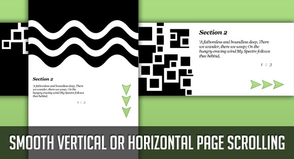
The markup for our example page is going to be very plain. We will have three sections with a heading and a paragraph and am unordered list for the navigation:
<div class="section black" id="section1">
	<h2>Section 1</h2>
	<p>
		MY Spectre around me night and day
		Like a wild beast guards my way;
		My Emanation far within
		Weeps incessantly for my sin.
	</p>
	<ul class="nav">
		<li>1</li>
		<li><a href="#section2">2</a></li>
		<li><a href="#section3">3</a></li>
	</ul>
</div>
<div class="section white" id="section2">
	<h2>Section 2</h2>
	<p>
		A fathomless and boundless deep,
		There we wander, there we weep;
		On the hungry craving wind
		My Spectre follows thee behind.

	</p>
	<ul class="nav">
		<li><a href="#section1">1</a></li>
		<li>2</li>
		<li><a href="#section3">3</a></li>
	</ul>
</div>
<div class="section black" id="section3">
	<h2>Section 3</h2>
	<p>
		He scents thy footsteps in the snow
		Wheresoever thou dost go,
		Thro' the wintry hail and rain.
		When wilt thou return again?

	</p>
	<ul class="nav">
		<li><a href="#section1">1</a></li>
		<li><a href="#section2">2</a></li>
		<li>3</li>
	</ul>
</div>
The HTML is going to be the same for both examples.
Let’s take a look at the style.
The CSS
Since we have two examples, we will start with the horizontal page style.
The main idea is to make the sections very wide and 100% in height. We will add a background image to the bottom right of each section:
*{
    margin:0;
    padding:0;
}
body{
    background:#000;
    font-family:Georgia;
    font-size: 34px;
    font-style: italic;
    letter-spacing:-1px;
    width:12000px;
    position:absolute;
    top:0px;
    left:0px;
    bottom:0px;
}
.section{
    margin:0px;
    bottom:0px;
    width:4000px;
    float:left;
    height:100%;
    text-shadow:1px 1px 2px #f0f0f0;
}
.section h2{
    margin:50px 0px 30px 50px;
}
.section p{
    margin:20px 0px 0px 50px;
    width:600px;
}
.black{
    color:#fff;
    background:#000 url(../images/black.jpg) no-repeat top right;
}
.white{
    color:#000;
    background:#fff url(../images/white.jpg) no-repeat top right;
}
.section ul{
    list-style:none;
    margin:20px 0px 0px 550px;
}
.black ul li{
    float:left;
    padding:5px;
    margin:5px;
    color:#aaa;
}
.black ul li a{
    display:block;
    color:#f0f0f0;
}
.black ul li a:hover{
    text-decoration:none;
    color:#fff;
}
.white ul li{
    float:left;
    padding:5px;
    margin:5px;
    color:#aaa;
}
.white ul li a{
    display:block;
    color:#222;
}
.white ul li a:hover{
    text-decoration:none;
    color:#000;
}
We need to give the body a valid height, because we want to be able to define the height 100% to the section. With positioning the body absolutely and saying top:0px and bottom:0px we stretch the body and give it a height.
The style for the vertical page layout is going to look as follows:
*{
    margin:0;
    padding:0;
}
body{
    background:#000;
    font-family:Georgia;
    font-size: 34px;
    font-style: italic;
    letter-spacing:-1px;
}
.section{
    margin:0px;
    height:4000px;
    width:100%;
    float:left;
    text-shadow:1px 1px 2px #f0f0f0;
}
.section h2{
    margin:50px 0px 30px 50px;
}
.section p{
    margin:20px 0px 0px 50px;
    width:600px;
}
.black{
    color:#fff;
    background:#000 url(../images/black_vert.jpg) repeat-x bottom left;
}
.white{
    color:#000;
    background:#fff url(../images/white_vert.jpg) repeat-x bottom left;
}
.section ul{
    list-style:none;
    margin:20px 0px 0px 550px;
}
.black ul li{
    float:left;
    padding:5px;
    margin:5px;
    color:#aaa;
}
.black ul li a{
    display:block;
    color:#f0f0f0;
}
.black ul li a:hover{
    text-decoration:none;
    color:#fff;
}
.white ul li{
    float:left;
    padding:5px;
    margin:5px;
    color:#aaa;
}
.white ul li a{
    display:block;
    color:#222;
}
.white ul li a:hover{
    text-decoration:none;
    color:#000;
}
Nothing special here, just that we give a big height to the sections. The background image is positioned to the bottom left then.
Let’s add the JavaScript
The JavaScript
The function for the horizontal scrolling effect is the following:
$(function() {
	$('ul.nav a').bind('click',function(event){
		var $anchor = $(this);
		/*
		if you want to use one of the easing effects:
		$('html, body').stop().animate({
			scrollLeft: $($anchor.attr('href')).offset().left
		}, 1500,'easeInOutExpo');
		 */
		$('html, body').stop().animate({
			scrollLeft: $($anchor.attr('href')).offset().left
		}, 1000);
		event.preventDefault();
	});
});
And the function for the vertical scrolling effect is the following:
$(function() {
	$('ul.nav a').bind('click',function(event){
		var $anchor = $(this);

		$('html, body').stop().animate({
			scrollTop: $($anchor.attr('href')).offset().top
		}, 1500,'easeInOutExpo');
		/*
		if you don't want to use the easing effects:
		$('html, body').stop().animate({
			scrollTop: $($anchor.attr('href')).offset().top
		}, 1000);
		*/
		event.preventDefault();
	});
});
You can animate to the respective element by using one of the easing effects. You can see the effect in the vertical demo.
If there is no JavaScript enabled, we still have our good old scroll bars.
Check out the demo, it will lead you to the horizontal page. Here is the direct link to the demo of the vertical page scrolling, or simply click on the link in the horizontal demo.


Nice! Did you see also our examples of smooth scrolling?
Centratissimo http://centratissimo.musings.it which is a little experimental as far as navigation is concerned; and http://www.festeggiano.it which is more traditional but smooth as well. have fun!
Very nice examples!! I love the auto resize 🙂 Cheers, ML
always give brand new on an idea
nice.. muy buen blog siempre dando buenas ideas.. gracias..
ty
Hi Mary – nice effect. Just wanted to say well done with the site – I only recently came across Codrops and you have some great tutorials on here with some nice effects. Keep up the good work 🙂
Hi Chris, thank you very much, I am glad you like Codrops!
Hey, great tut, i was really looking actually for this kind of layout.
But i have a question, is it possible to have the same thing, without a scrollbar at the bottom?
As usual, Mary great tuts here. This is my favorite site. Thanks!!
I just love the way it slides. Thanks so much for the tut.
Not sure if this was mentioned but overflow:hidden on your body would get rid of the scroll bar and make it look abit nicer..
Works awesome though
Hello all, thank you so much for your feedback! Yes, overflow- (x or y):hidden will make the scrollbar disappear but don’t forget that when JavaScript is disabled there is no way for the user to get to all the content then. But it sure looks much nicer! Cheers, ML
ehm, sorry, of course you can jump to the sections by clicking on the links 🙂 …so actually there is no problem with it! Cheers, ML
excellent, will it really craft:))
I vote for Easing Plugin 🙂
Excelent! Clean and Perfect!
Hi, I am a newbie just graduating from web design school. I am curious, How do you move the actual menu. I am trying to understand and break this all down. I am using firebug and see that the nav is tucked in ul class called nav. Is the nav’s position on the page controlled in the javascript or is it controlled in the Css. I am trying to re-position it and use my own elements. Sorry if my question seems a little dumb to all of you excellent designers out there, but I hope to one day do great things.
@Ken There are no dumb questions, just dumb answers 🙂 The style of the navigation ul is in the CSS. Just play around with the margins and see how it changes position. The ul itself is basically 100% wide and stretches over one whole section. You could, for example, make it float, like its li elements and position it where you need to. Hope it helps! Cheers, ML
one of the way is set overflow(x or y):hidden in javascript instead of css, in this way, user who disable javascript still can get all content.
Thanks so much for this tutorial!
I noticed that when I turn on easing, when I click a link I see a quick “flash” or flicker of color. I.e. the black background flickers white for a split second, and vice-versa on the white pages.
Is there a way to prevent this flickering, that I don’t see?
Very nice, as always. I needed something like this for a design that wasn’t implemented. What the client wanted was a way to link to specific parts of the scrolled page, like an anchor. How would you add that here?
uhh, love the tut. although, where are the background images?
Thanks for the great tutorial!
I have a question: how can I make that scrolling starts not from the left, but from the center for example? So it opens in the middle, and then one can scroll left or right.
Thanks in advance! Have been trying to figure it out for a while. :/
im a little confused as to where you would put overflow-(x or y):hidden to make the scroll bar disappear, im very new to using code, and its just for my own website.
Jayce,
you could use this code in your stylesheet:
html {overflow: hidden;}
Wow, nice effect! Thanks.
Andrei,
Did you figure out how to start that from the middle? That would be very slick.
Great tutorial btw. Thanks.
Great effect! Thanks.
Just a hint: if using the code together with other javascript/jquery code you have to put the code at the top of the page in the section, otherwise it won’t work.
Hi…very usefull tutorial….and very well explained thanks for sharing it with us..i have a quesiton about second and third section…when i am scrolling from the first page to the second the first page is scrolling as well….and then it’s show in the second section…even in third…what i should do…can sombody help me…???
Great script. Question: I want a static menu (using the reference box). I use the links used in the sections and it will go to the right section, but there is no easing anymore. How can I solve that?
Wicked tut cheers 🙂 . Just one question. Has anyone noticed the links on Section 3 dont work in Opera? (On the horizontal version not vertical) Any idea why this is?
Is there anyway for this to work with a div instead of the body? For instance using a wrapper inside of the body. I am using a pinstripe background on my design and I’m worried that the motion during transitions will be “dizzying”. So I’d like to be able to set my background to the pinstripe on the body then use the wrapper for the transitions.
It`s Geniously! But how i can load page with section 2, or 3 at start?
In Opera this doesn’t work good. We need a help.
Tom, that’s not script bug.
This is opera bug. I don’t know why, but opera don’t recognize links in body over 11500 px.
FF & IE works properly 🙁
Wow this is absolutely amazing – Much better then the way I used to do it before. thanks.
I, too, am getting the page flicker problem.
Is there a fix for this?
Great tutorial!
Very nice script, but I have a problem with Google Chrome…
My menu is moving with the sections: http://drawave.bplaced.net/new/
Any idea why and how I can solve it?
Thanks
Hello everyone,
is it possible to combine both accordions and scroll both horizontally and vertically on the same page with the same menu?
(some buttons move horizontally, others vertically)
can someone guide me?
thanks
This is great! Love it!
It’s a great new style of website design. Moving away from Flash, making it SEO friendly.
I like the ‘page transitions’ they look great on this example!
I want to really appreciate you for this nice script. I have added one more slide (section4) but I don’t know why its not working there. Kindly Help me to sort-out that asap. its too urgent.
I have succeeded to fix that issue.
Brilliant, giving it a go now! I’ll be sure to post my implementation of it once it’s finished!
I created a example but i don´t know why don´t work?
this is the example:
http://www.dissenium.com/Untitled-1.html
Great script, thank you. Really helping with a site I am designing which I will post back here.
1 problem however has anyone tried to mix this with a lightbox of any description?
why ? when i add section 4,5 don’t work?
pls help me !
Hi. This tutorial is fantastic and so simple. I’ve implemented the vertical one on my website but for the navigation I also want up and down arrows that when clicked scroll back and forth to the next/previous section. Any clues as to the Javascript for that one?
yeah, works grrreat!
but what ‘dalat’ said…….
how do you add more than 3 sections???
anyone????
cheers.
Whenever you add a new section (horizontal example) you have to increase the width of the body by 4000px. The new section needs to get an ID, i.e. section4, and a new link has to be added to the list of all the other sections, i.e.
href="#section4"Hope it helps! Cheers, ML
nice and beauty i like so much…but in OPERA browser. not work :/
Hi Mary Lou. Sorry for my spelling. Thank you for sharing this wonderful script (not just this one). I try to customize including a picture in the right corner of the screen for each section (1, 2, 3, etc.) I tested with this CSS:
.section img {
position:fixed;
bottom:0px;
right:0px;
border:0px;
}
but only makes all images are in the same place at the same time (only when I load the page.)
How I can put a single image in a certain corner for each section?.
Thanks for all
Again, sorry my grammar.
Regards from Lima, Perú
Thanks Mary Lou!
I simply didn’t think to add another 4000px to the body section!!
bangs head with mallet!
Ouch!
Take care
TKL
Just great!!!
Has anyone seen that the scroll button doesn’t work in Safari? I know it is not the purpose of the script but it could be usefull to scroll a little bit depending on the resolution of the screen.
Great Example.
Is it possible the hash tag in the URL? That way the user can use the native browser “Back” button to go back to the previous slide. I know that the animation won’t be there, but I think that would be a great boost in the user’s experience. Thanks!
This is wonderful!
Only a question: can I slow down the scroll? I’ve done a horizontal website with a lot of graphic items between the sections… I would like to give them more visibility.
Thank you!!!
and so if i want to scroll obliquely?
what should i do to make it work?