From our sponsor: Leverage AI for dynamic, custom website builds with ease.
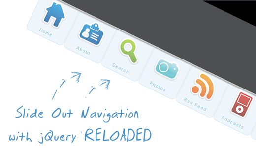
After I got a lot of feedback for the Beautiful Slide Out Navigation, I had some new ideas for a similar horizontal navigation. Thanks a lot to everyone!
Like Stefan Matei pointed out, it might be quite cute but we don’t want the user to hover over all options first, in order to see what menu items exit. So, I thought about labeling the menu items and making them stick out, so the user can always “see” what the navigation entails. Being in a horizontal position makes everything readable and when the user hovers over the label, the rest of the item with the icon will slide out.
Although this tutorial is related to the previous one, I will start again from scratch – for the readers that are only interested in this new navigation.
The icons that we will be using are from the Colorful Sticker Icon Sets 1, 2, 3 and 4 by DryIcons. (It is not allowed to redistribute them under the free license, so I cannot include them in ZIP file of this tutorial.)
Ok, let’s get to work.
1. The HTML Structure
The only thing we will need for the navigation is a simple unordered list with links and spans inside of the list elements:
<ul id="navigation">
 <li class="home"><a href=""><span>Home</span></a></li>
 <li class="about"><a href=""><span>About</span></a></li>
 <li class="search"><a href=""><span>Search</span></a></li>
 <li class="photos"><a href=""><span>Photos</span></a></li>
 <li class="rssfeed"><a href=""><span>Rss Feed</span></a></li>
 <li class="podcasts"><a href=""><span>Podcasts</span></a></li>
 <li class="contact"><a href=""><span>Contact</span></a></li>
</ul>
The spans will carry the names of your menu items.
The list is getting an ID because we want to refer to it later in the JavaScript. With jQuery, we will make the link items slide out whenever we hover over the li elements of the list.
2. The CSS
First, we define the CSS properties for the list:
ul#navigation {
    position: fixed;
    margin: 0px;
    padding: 0px;
    top: 0px;
    right: 10px;
    list-style: none;
    z-index:999999;
    width:721px;
}
We position the list in the top right corner of the page.
The navigation should always be accessible for the user, even if he scrolls down the page. So, the position should be fixed. Margin and padding are explicitly set to 0, since the unordered list has default values for them. The navigation should also be on top of all other elements on the page. That’s why we set the z-index very high. The width is defined here, because I want to make the elements inside of the list floating. If I would not give this list an explicit width though, they would start moving and overlapping each other once I start resizing the page. In order to avoid that your floating elements start to e.g. move down when you resize the window, always put them in a container with a fixed width. (721px is the sum of all the li elements)
Now, let’s look at the list element properties:
ul#navigation li {
    width: 103px;
    display:inline;
    float:left;
}
If you want a list to be shown horizontally, set the display of the elements to inline. This will make them be next to each other rather than under each other.
For the links in the list elements, we define the following CSS properties:
ul#navigation li a {
    display: block;
    float: left;
    margin-top: -2px;
    width: 100px;
    height: 25px;
    background-color: #E7F2F9;
    background-repeat: no-repeat;
    background-position: 50% 10px;
    border: 1px solid #BDDCEF;
    text-decoration: none;
    text-align: center;
    padding-top: 80px;
}
This is the common style for the link elements. We already define the properties for the background images that we will then put in separate class definitions. The text properties and the padding we need to set for the spans inside the link elements. The padding will push the spans to the bottom part.
Let’s add some rounded borders (they don’t work in Internet Explorer, though) and make the items semi-transparent:
ul#navigation li a {
    display: block;
    float:left;
    margin-top: -2px;
    width: 100px;
    height: 25px;
    background-color:#E7F2F9;
    background-repeat:no-repeat;
    background-position:50% 10px;
    border:1px solid #BDDCEF;
    text-decoration:none;
    text-align:center;
    padding-top:80px;
    -moz-border-radius:0px 0px 10px 10px;
    -webkit-border-bottom-right-radius: 10px;
    -webkit-border-bottom-left-radius: 10px;
    -khtml-border-bottom-right-radius: 10px;
    -khtml-border-bottom-left-radius: 10px;
    opacity: 0.7;
    filter:progid:DXImageTransform.Microsoft.Alpha(opacity=70);
}
The last filter property will make this work for Internet Explorer as well.
These were the common properties of all the link elements in the list. Now we will define the background image for the links in the specific list items:
ul#navigation .home a{
    background-image: url(../images/home.png);
}
ul#navigation .about a      {
    background-image: url(../images/id_card.png);
}
ul#navigation .search a      {
    background-image: url(../images/search.png);
}
ul#navigation .podcasts a      {
    background-image: url(../images/ipod.png);
}
ul#navigation .rssfeed a   {
    background-image: url(../images/rss.png);
}
ul#navigation .photos a     {
    background-image: url(../images/camera.png);
}
ul#navigation .contact a    {
    background-image: url(../images/mail.png);
}
When hovering over the elements, we want to change the background color in order to make them stand out a little bit more:
ul#navigation li a:hover{
     background-color:#CAE3F2;
}
Now we just need to add some style to the spans:
ul#navigation li a span{
    letter-spacing:2px;
    font-size:11px;
    color:#60ACD8;
    text-shadow: 0 -1px 1px #fff;
}
The text-shadow property will give the letters an engraved look (but it will not work in IE).
And that was the CSS part. Now, let’s take a look at the JavaScript that will give some life to the navigation.
The JavaScript
With jQuery we will first make all of the items disappear first in a “piano-like” way until the point that we can only see the text of the links. When hovering over an item, we will make the whole element slide out from the top. For all this, we define the following:
$(function() {
    var d=300;
    $('#navigation a').each(function(){
        $(this).stop().animate({
            'marginTop':'-80px'
        },d+=150);
    });

    $('#navigation > li').hover(
    function () {
        $('a',$(this)).stop().animate({
            'marginTop':'-2px'
        },200);
    },
    function () {
        $('a',$(this)).stop().animate({
            'marginTop':'-80px'
        },200);
    }
);
});
For creating the piano-like effect we define that for each of the link elements the top margin should be set to -80 pixels (this will make them move to the top outside of the screen). The effect for the first element should last 300 + 150 milliseconds and then each further element should disappear with an additional delay of 150 milliseconds.
When hovering, we want the specific link element to get a top margin of -2 pixels, and that nicely animated, and not too slow (200 milliseconds). Moving the mouse out shall put the link element back to it’s old position (-80 pixels). The stop() function “stops all the currently running animations on all the specified elements” which gives the beautiful effect when, for example, hovering over all elements very quickly.
And that’s it! I hope you like it – enjoy!